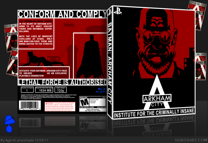
I guess I chose a rather Strange box for my 50th. Inspired mainly by the posters you see all around the game, also somewhat inspired by Billymans box - link
I made most of this using the pen tool in Photoshop, and I'm quite happy with it (especially with Stranges face.)
The focus on red is very different from the usual Arkham box, and it looks very awesome. While I think the front would have been cool if you had something symbolic in the reflection of his glasses, it's very well done. I don't have any complaints for the back, very nice job.
Strange's prominence on the front is refreshing, and the bold red/black color scheme continues the aesthetic seen in the propaganda-style billboards and signs littered throughout Arkham City. Nice work.
The back's effort in recreating a more comic book-esque layout is commendable, but somewhat poorly executed. Specifically, the manner in which Batman and the text are boxed in doesn't sit right with me. It's all too straight edge and clean for the concept to work properly.
#1, "I guess I chose a rather Strange box for my 50th."
Good joke :), really nice box, but I agree with #9 about Batman at the back though.
(it feels trapped inside the box instead of catwoman which works well in that part)
 Batman: Arkham City Box Cover Comments
I guess I chose a rather Strange box for my 50th. Inspired mainly by the posters you see all around the game, also somewhat inspired by Billymans box - link
I made most of this using the pen tool in Photoshop, and I'm quite happy with it (especially with Stranges face.)
It's been a fun 50 boxes, and here's to 50 more!
[ Reply ]
Very clean art and a very different box. I'm loving it.
And I hate to be "that guy", but you did spell "authorized" wrong.
[ Reply ]
Very nice, a bit like mine but enough still quite a lot of a difference.
That strange looks amazing as well, good job.
[ Reply ]
The focus on red is very different from the usual Arkham box, and it looks very awesome. While I think the front would have been cool if you had something symbolic in the reflection of his glasses, it's very well done. I don't have any complaints for the back, very nice job.
[ Reply ]
This is great, it has that clean-cut comical feel that I just love. Good job on this, I hope it gets into the hall.
[ Reply ]
Thanks guys! Appreciate it!
#2, I'm pretty sure both are applicable, one is Americanised (Americanized?) or something. Either way, both show up fine on my spell-checker.
#4, Originally it was the Batman logo in his glasses, but decided it looked too tacky, and turned it into the city.
Thanks again.
[ Reply ]
I approve
[ Reply ]
very original design, stands out from any other batman cover
[ Reply ]
Strange's prominence on the front is refreshing, and the bold red/black color scheme continues the aesthetic seen in the propaganda-style billboards and signs littered throughout Arkham City. Nice work.
The back's effort in recreating a more comic book-esque layout is commendable, but somewhat poorly executed. Specifically, the manner in which Batman and the text are boxed in doesn't sit right with me. It's all too straight edge and clean for the concept to work properly.
[ Reply ]
#1, "I guess I chose a rather Strange box for my 50th."
Good joke :), really nice box, but I agree with #9 about Batman at the back though.
(it feels trapped inside the box instead of catwoman which works well in that part)
Edited at 1 decade ago
[ Reply ]