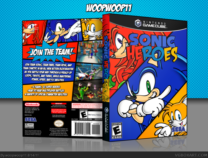
This is for the second round of Summer of Sonic. I took the sonic adventure art and made it into a comic style box for sonic heroes. I made the logo, the template is beardedwalrus's in the resources section.
Nice! First Entry in Summer of Sonic Round 2! I might give extensions until I get back after vacation, due to the fact your the only one who has posted it, and theres only two more days, and can you also change the tags to sos2011r2, so we can organize it better.
 Sonic Heroes Box Cover Comments
This is for the second round of Summer of Sonic. I took the sonic adventure art and made it into a comic style box for sonic heroes. I made the logo, the template is beardedwalrus's in the resources section.
[ Reply ]
Dude this is so clean! The colors are awesome and it has a comic book feel! Excellent work.
[ Reply ]
FAV! How did you got the comic idea?
Edited at 1 decade ago
[ Reply ]
Love it bro, the way you captured the Comic Book feel is beautiful.
Only one complaint, on the back you spelled it as "Team Chaotic". It's spelled "Team Chaotix".
[ Reply ]
#3, The heroes in the title made me think of superhero comics
#4, Yeah that was a typo and I guess when I checked for typos I forgot the real name
[ Reply ]
Not too bad!
[ Reply ]
get.your.comic.on.
Nice box!
I really like the halftone pattern and colors.
[ Reply ]
Nice! First Entry in Summer of Sonic Round 2! I might give extensions until I get back after vacation, due to the fact your the only one who has posted it, and theres only two more days, and can you also change the tags to sos2011r2, so we can organize it better.
Edited at 1 decade ago
[ Reply ]
Really nice job!
[ Reply ]
Simple but cool.
[ Reply ]
This is great. The colors work nicely with the comic theme.
[ Reply ]
This is EPIC good job !
[ Reply ]
Great, though I'm not too fond of the fots on the logo and the basic back's layout.
[ Reply ]
#13, 'fots' are those 'fucked up dots'? lol, just kidding.
Maybe because they're a bit light? Try to make the dots darker on the logo.
The logo would stand out more and it blends less with the background imo.
Edited at 1 decade ago
[ Reply ]
Awesome! I love the comic concept.
[ Reply ]
wow Sonic Comix Heroes
[ Reply ]
... again, why not a HoF ???
[ Reply ]
how wasnt this in the hall of fame i mean just look at it its amazing
[ Reply ]