Scorpion Soldier and Sens for the templates.
Jevangod for the DmC logo.
Yasny for the corner brushes. link
Function for the subtle grunge brushes. link
Ro-Stock for the Grunge frames brushes. link
Meth for his grungey lines brushes. link
and finally XResch for his basic chaos brushes link
I love that front!
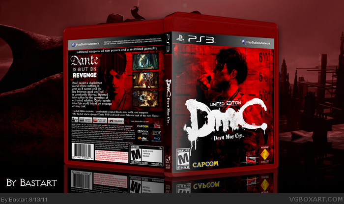
The back, however, is very generic and similar to previous backs you made in the past. Also, limited edition covers tend to have more simplistic and less generic backs. They also tell what's included in the limited edition and how it differs from regular edition.
I'm all for the front, the color scheme is simple but very effective. The white logo gives balance to the cover, and keeps it from getting bogged down in the dark, bloody red colors.
I have to agree with deiviuxs, the back is a little too standard for my tastes.
I think this update is worthy of a favorite. I'd consider the red template bordering on overkill, and since it's reserved for Greatest Hits, but it does little to detract from the box overall.
#7, Yeah, I know it's used for the Greatest Hits, but it wasn't really supposed to look official,
but it's much like the new Dante, hate it or love it lol
I really like the hard-cover boxes better. I think it fits well with a limited Edition, but I can't make them look good.
#8 Thanks, for the constructive criticism, always get a great input from you ;)
 DmC: Limited Edition Box Cover Comments
My DmC Limited Edition box. inspired by this link
lots of credits go to:
Scorpion Soldier and Sens for the templates.
Jevangod for the DmC logo.
Yasny for the corner brushes. link
Function for the subtle grunge brushes. link
Ro-Stock for the Grunge frames brushes. link
Meth for his grungey lines brushes. link
and finally XResch for his basic chaos brushes link
Edited at 1 decade ago
[ Reply ]
I love that front!
The back, however, is very generic and similar to previous backs you made in the past. Also, limited edition covers tend to have more simplistic and less generic backs. They also tell what's included in the limited edition and how it differs from regular edition.
[ Reply ]
I'm all for the front, the color scheme is simple but very effective. The white logo gives balance to the cover, and keeps it from getting bogged down in the dark, bloody red colors.
I have to agree with deiviuxs, the back is a little too standard for my tastes.
[ Reply ]
#2, Maybe your right about the back being to generic, I didn't really knew what to add as limited content?
I think I'll have to redo the back, I'll have an update asap.
Edited at 1 decade ago
[ Reply ]
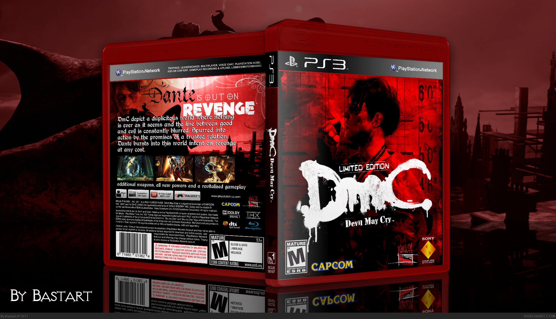
Updated the back.
- added a small line of limited content.
- new background image of Dante, to flow better with the front.
- adjusted the text and tagline.
Edited at 1 decade ago
[ Reply ]
How was this only favorited by me and one other person ?!
Edited at 1 decade ago
[ Reply ]
I think this update is worthy of a favorite. I'd consider the red template bordering on overkill, and since it's reserved for Greatest Hits, but it does little to detract from the box overall.
[ Reply ]
Looks much better with the updated back.
+FAV
[ Reply ]
#7, Yeah, I know it's used for the Greatest Hits, but it wasn't really supposed to look official,
but it's much like the new Dante, hate it or love it lol
I really like the hard-cover boxes better. I think it fits well with a limited Edition, but I can't make them look good.
#8 Thanks, for the constructive criticism, always get a great input from you ;)
Edited at 1 decade ago
[ Reply ]
Love the update, really good one!
[ Reply ]
#10, Thanks, I like your LIMBO box to ;)
Edited at 1 decade ago
[ Reply ]
Love it! Especially the color scheme. And the update looks great! :)
[ Reply ]
#12, Thanks! yeah, thanks to the suggestions of changing the back, it has improved I have to say so myself.
[ Reply ]