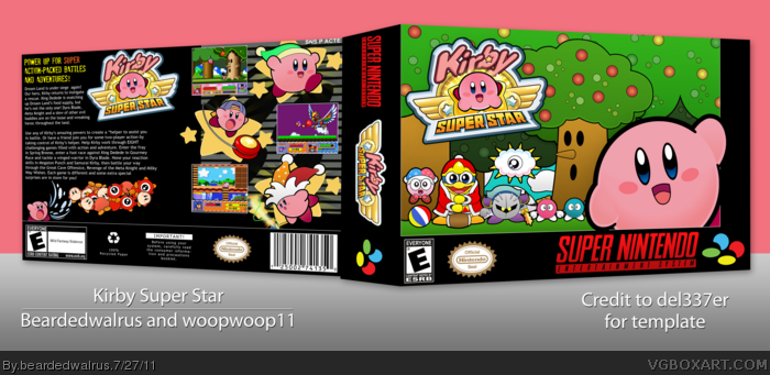
Worked on this front several months ago, but had no inspiration to make a back. Luckily, woopwoop came to the rescue and saved this box from abandonment. Not sure what all went in to the back, but the artwork on the front is all custom. Credit to Squall234 for the logo (Forgot to put him in the presentation).
The presentation on this is absolutely fantastic, on both the front and back. Nothing is overcrowded, the text on the back has a lot to it, but it still positioned well with everything else...I love this :3
I had a great time designing the back to complement your awesome custom art. For the artwork on the back, the yo-yo,beam, and air-sucking kirbys are partially traced and the rest is based off reference images.
I think the screenshots are far too close to the top of the box; the logo on the spine looks rather bland; I don't like that you repeated the logo on the back again; that tagline font doesn't suit the game, not even a bit; and the back itself looks way too text heavy on the synopsys, while it's not enough on the legal info.
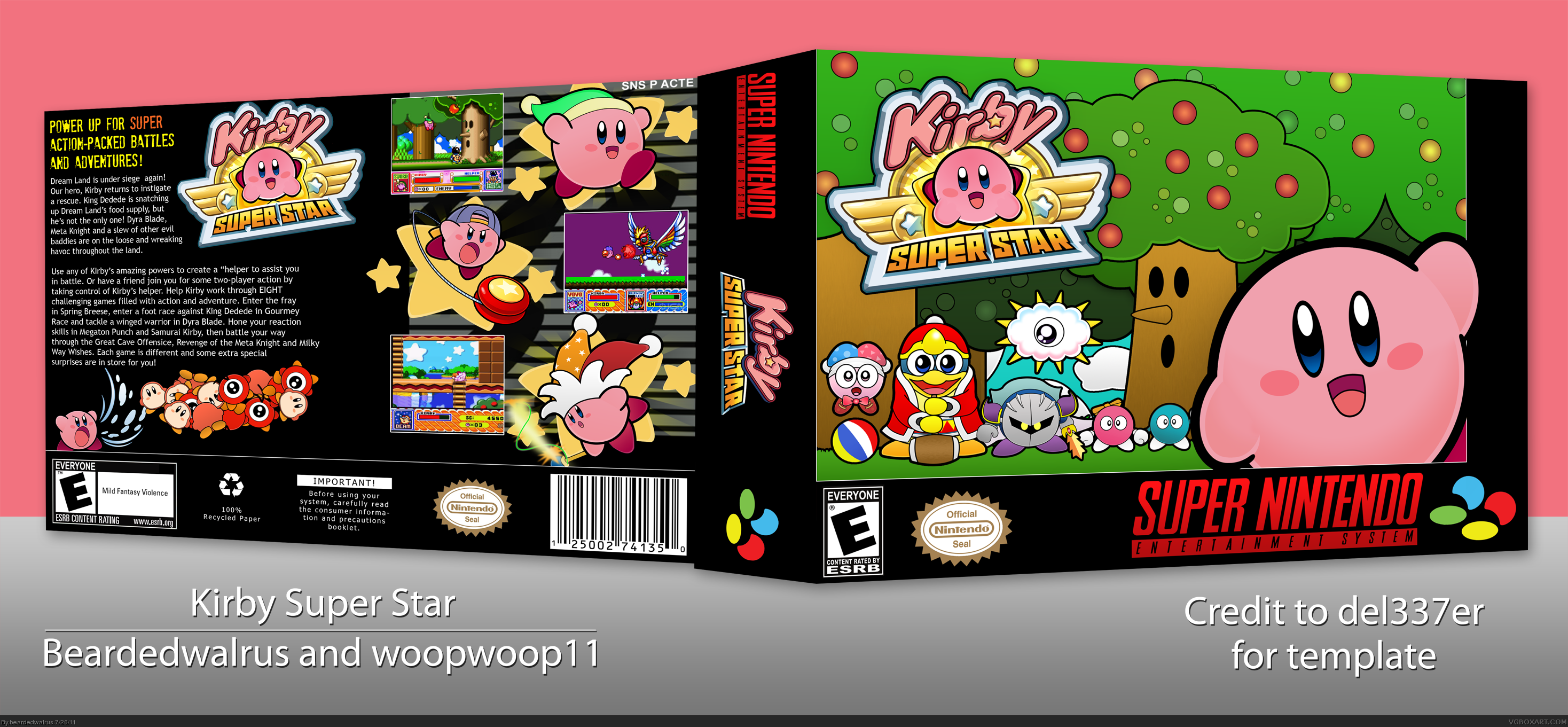
Updated with new spine logo. Just traced over those little ball-wing things on Squall's logo , put them on the sides of the logo, and gave it a stroke and bevel. Hopefully it looks better.
Nicely done, even for a world as minimal as Kirby's, the effort shows through the custom art. I would argue that the front comes off looking flat though, the characters' police line-up arrangement a bit stiff. The back perfectly replicates retro layouts of old, combining artwork with the retro look of clean text and neatly symmetrical screenshots.
 Kirby Super Star Box Cover Comments
Worked on this front several months ago, but had no inspiration to make a back. Luckily, woopwoop came to the rescue and saved this box from abandonment. Not sure what all went in to the back, but the artwork on the front is all custom. Credit to Squall234 for the logo (Forgot to put him in the presentation).
Enjoy!
[ Reply ]
The presentation on this is absolutely fantastic, on both the front and back. Nothing is overcrowded, the text on the back has a lot to it, but it still positioned well with everything else...I love this :3
[ Reply ]
Sorry I couldnt finish this but maybe sometime we can do a collab that I can finish due to of free time =) PS: AMAZING WORK.
[ Reply ]
Wow, a real professional job, guys!
Edited at 1 decade ago
[ Reply ]
I had a great time designing the back to complement your awesome custom art. For the artwork on the back, the yo-yo,beam, and air-sucking kirbys are partially traced and the rest is based off reference images.
[ Reply ]
#5, Really? Wow, I was convinced you used more official art than that. Excellent work making the art look official, man!
[ Reply ]
This deserves more attention.
[ Reply ]
I think the screenshots are far too close to the top of the box; the logo on the spine looks rather bland; I don't like that you repeated the logo on the back again; that tagline font doesn't suit the game, not even a bit; and the back itself looks way too text heavy on the synopsys, while it's not enough on the legal info.
Nice art on the front, though.
[ Reply ]
Been waiting to fav this. Great work.
[ Reply ]
looks good +fav
[ Reply ]
Updated with new spine logo. Just traced over those little ball-wing things on Squall's logo , put them on the sides of the logo, and gave it a stroke and bevel. Hopefully it looks better.
Edited at 1 decade ago
[ Reply ]
#12, Nice job man it looks alot better
[ Reply ]
Nice work.
[ Reply ]
I'm not much of a fan of the front, but the back is awesome. +fave
[ Reply ]
#15, What exactly is it you don't like about the front? I can't really pull much constructive criticism out of you simply stating you don't like it.
[ Reply ]
Nicely done, even for a world as minimal as Kirby's, the effort shows through the custom art. I would argue that the front comes off looking flat though, the characters' police line-up arrangement a bit stiff. The back perfectly replicates retro layouts of old, combining artwork with the retro look of clean text and neatly symmetrical screenshots.
[ Reply ]