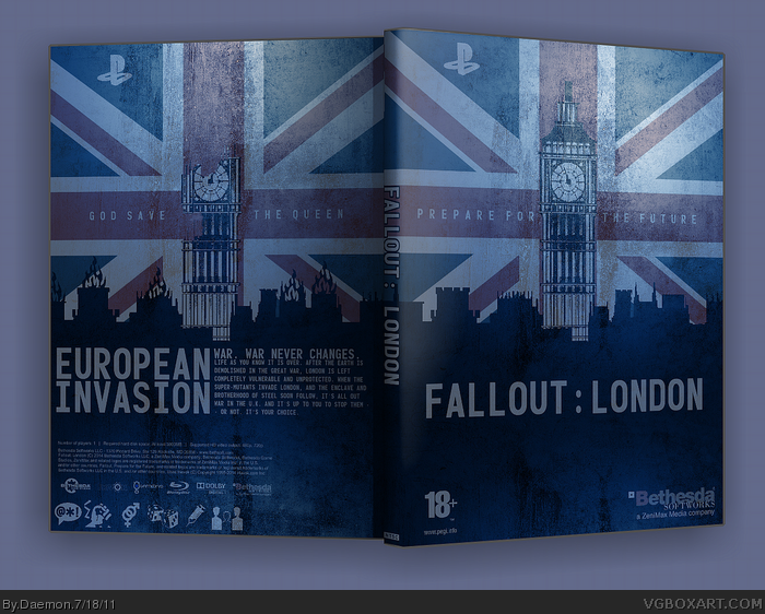
And now for a little something different with part two of my Fallout trilogy.
This is an idea I've been tossing around for a while after I heard the rumor that Fallout 4 may be set in London.
So, this is the sequel to my earlier Fallout 3: GOTY box. It is the second part of a planned trilogy. Expect New Vegas soon. Sure, I'm doing them out of order, but who cares?
Please comment if you favorite and tell me what you like about the box. Thank you and enjoy.
The only thing that bugs me is the Playstation logo, set to the right of the corner. I think you should just change the color and move it to the original position.
PleasepleasepleasepleasePLEASE re-write the description. Everything else looks good...maybe a bit too much negative space on the front, but I can see why you had the cityline placed that way.
#11, Just certain technical mistakes like "World War III" (Great War) and "evil organization known as the Enclave" (the Enclave isn't really evil. From a Fallout fan's point of view, it's a mess, but it may seem like just nitpicking to you.
In any case, don't let Mub see this or he's gonna be pissed.
Slick, stylish, clean, and suits Fallout. It feels destroyed, but looks nice and clean and the same time, it's a good vibe. The only complaint I have is that the spine is a bit skinny.
Oh my, now this is really great. The flag and transition between the front and back are pretty creative, and it fits Fallout well. I do agree with TrevOwnz that the whole "War, war never changes" thing is WAY too overused and it would have been better if you came up with something else, but this is still pretty awesome. Great job on this.
I like how the city skyline overlapping the flag also gives said flag a rugged, torn appearance. the blue tone overlaying the entire cover is a little much, but this is probably one of my favorites from you, recently.
 Fallout: London Box Cover Comments
And now for a little something different with part two of my Fallout trilogy.
This is an idea I've been tossing around for a while after I heard the rumor that Fallout 4 may be set in London.
So, this is the sequel to my earlier Fallout 3: GOTY box. It is the second part of a planned trilogy. Expect New Vegas soon. Sure, I'm doing them out of order, but who cares?
Please comment if you favorite and tell me what you like about the box. Thank you and enjoy.
[ Reply ]
Really cool... All though London doesn't seem like a good place for a Fallout game... But overall tue box art is awesome.
[ Reply ]
Wow, I love it.
[ Reply ]
Hmm...interesting idea and pretty well executed. I would probably center the logo though and the bottom back seems very cramped.
[ Reply ]
Love it man, nice work.
The only thing that bugs me is the Playstation logo, set to the right of the corner. I think you should just change the color and move it to the original position.
[ Reply ]
#5, Agreed.
Good work, I love this style.
[ Reply ]
It's awesome. I love how you put the flag in the background, and the colours are beautiful.
[ Reply ]
Thank you everyone.
#4, I can lower the size of the legal info and logos.
[ Reply ]
PleasepleasepleasepleasePLEASE re-write the description. Everything else looks good...maybe a bit too much negative space on the front, but I can see why you had the cityline placed that way.
[ Reply ]
This is great, and really creative!
[ Reply ]
#9, Rewrite the description in what way? I'm unsure what exactly you mean.
Edited at 1 decade ago
[ Reply ]
#11, Just certain technical mistakes like "World War III" (Great War) and "evil organization known as the Enclave" (the Enclave isn't really evil. From a Fallout fan's point of view, it's a mess, but it may seem like just nitpicking to you.
In any case, don't let Mub see this or he's gonna be pissed.
[ Reply ]
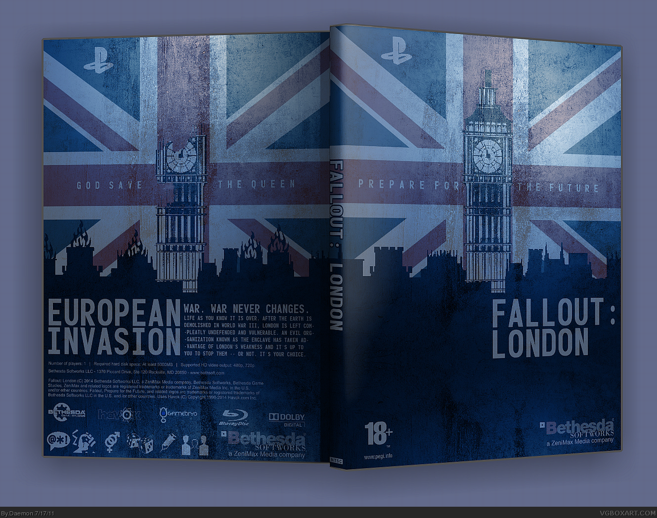
Update: Legal info and logos lowered in size, Fallout: London logo centered, and description text re-written.
[ Reply ]
The War Never Changes is used to much. I would have liked to see something a little different. Great layout I like it.
I would remove the PS logo from the back and move the front one more towards the corner and make it red.
Edited at 1 decade ago
[ Reply ]
Looks much better. Just add a barcode to the lower right of the back in order to fill that empty space.
[ Reply ]
Being british myself this box speaks a lot to me, very british and well stylised
[ Reply ]
Slick, stylish, clean, and suits Fallout. It feels destroyed, but looks nice and clean and the same time, it's a good vibe. The only complaint I have is that the spine is a bit skinny.
[ Reply ]
This is ridiculously sexy.
[ Reply ]
Oh my, now this is really great. The flag and transition between the front and back are pretty creative, and it fits Fallout well. I do agree with TrevOwnz that the whole "War, war never changes" thing is WAY too overused and it would have been better if you came up with something else, but this is still pretty awesome. Great job on this.
Edited at 1 decade ago
[ Reply ]
Looks hot.
[ Reply ]
I was thinking of this exact idea haha. I was considering New Yory too, but thats WAAAy to clichéd. Look sgreat anyway, just the title could have something better...
[ Reply ]
Your grunge boxes look great but be sure to put a variety of styles.
[ Reply ]
I like how the city skyline overlapping the flag also gives said flag a rugged, torn appearance. the blue tone overlaying the entire cover is a little much, but this is probably one of my favorites from you, recently.
Edited at 1 decade ago
[ Reply ]
The story is so contradictory and cringeworthily bad.
But nice box.
[ Reply ]
t's awesome but I'm disappointed that you didn't use an "Anarchy In The UK" tagline somewhere :P
[ Reply ]
rip in piece daemon.
[ Reply ]