[ Box updated on July 17th, 2011 ] [ original ]
 The Simpsons: Bart Vs The Space Mutants Box Cover Comments
Comment on RoarShark's The Simpsons: Bart Vs The Space Mutants Box Art / Cover.
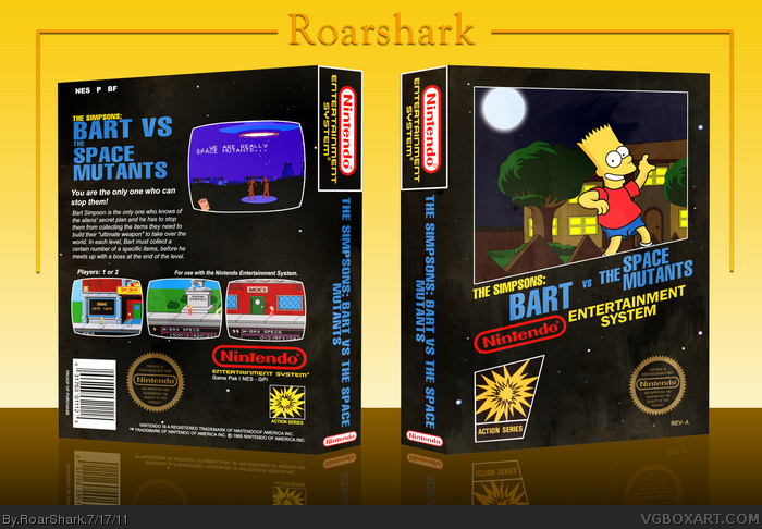
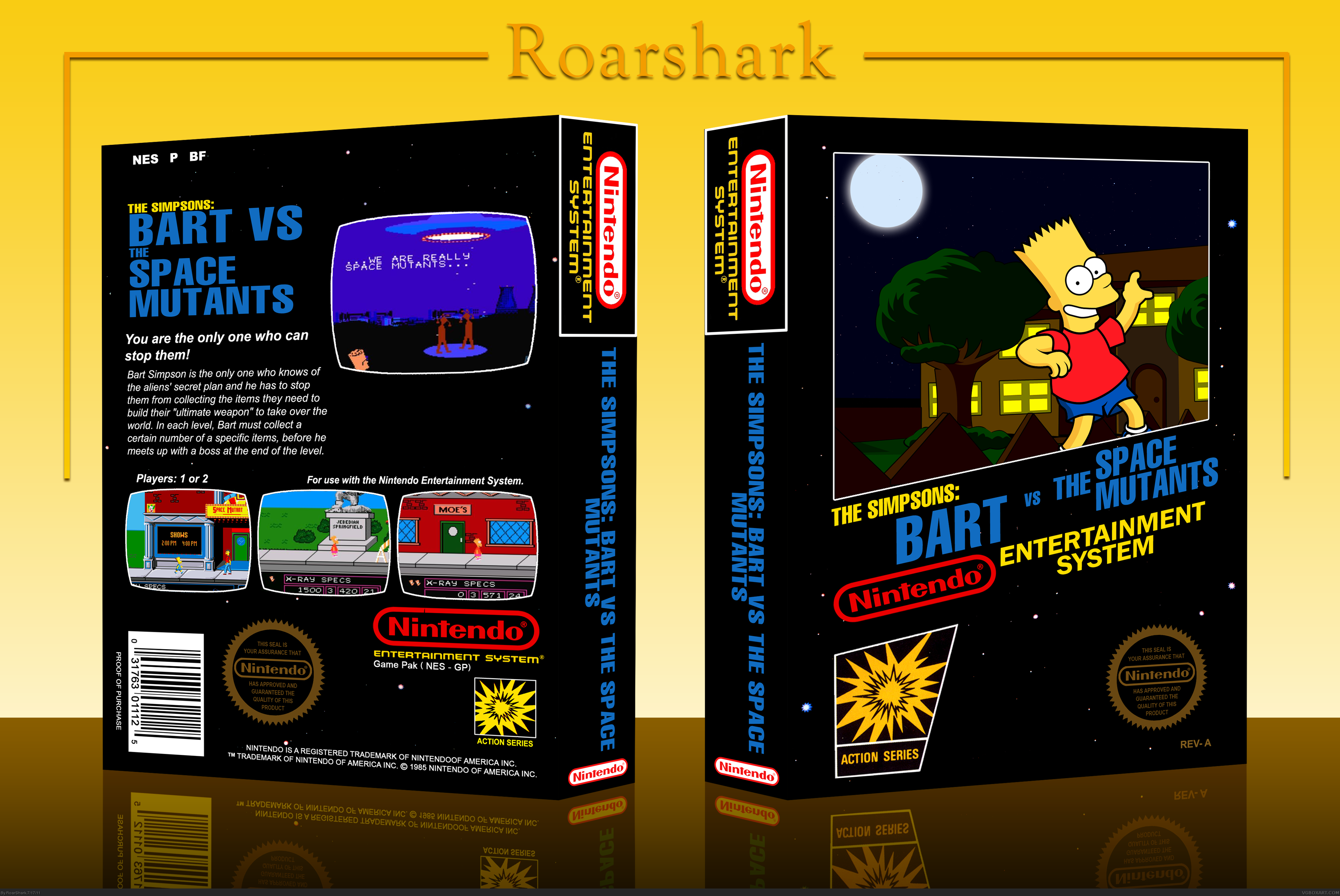
So here is my entry for the VGBA Cup Round 2. The theme was retro. I wanted to do a game that was different from Mario or Sonic. So I chose the Simpsons. This is custom art on the front, and official screens on the back. If you have any thoughts or critiques of this please do share. Thanks for viewing!
[ Reply ]
Amazing work, man. Great custom art. I wish in this case you could have had a modern template to work with, just to see what you would have done with it. My only issue is that it looks too digital. A paper effect overlay would have done wonders here.
[ Reply ]
Looks absolutely amazing. Just a question, what is bart doing with his left hand? It looks like he should be holding something that was left out, thats all.
[ Reply ]
It looks like it's imcomplete.
[ Reply ]
You left out the spray paint can that Bart's holding on the cover, but otherwise fantastic job. You did an amazing job re-drawing the artwork to be higher resolution and cleaner. Very impressive.
It's also refreshing to see this game being used. I owned it on the Sega Game Gear and had a blast playing it.
I agree with Thunder, in that some frayed corners, worn texture, and maybe faded colors would have done a world of good for this entry.
[ Reply ]
#2, I completely agree, I'll try that.
#3, IN the original he was holding a spray paint can. I was not sure if I would have time to finish if I added everything he was holding and had on.
#4, How so?
#5, Thanks, and I'll try to work on your suggestions.
[ Reply ]
Oh, I'd like to add to #4's comment. I think if the sky had some stars and/or clouds it might fill it up a bit more and help it look more complete.
[ Reply ]
#7, It does, check full view. Also im in the process of updating this right now. The update has a more worn out texture to the box.
[ Reply ]
It's good but it looks like it's not done.
[ Reply ]
#9, Again I ask, how so?
[ Reply ]
#10, I think they mean the left space on the front next to Bart, is kinda empty?
add a small character like Maggie, crawling on the grass field.
or as suggested, fill up the sky a bit with stars and small clouds.
anyway, really great work on the custom art, I like the background perspective with Bart a lot. Bart is a tad to bright imo. I know he is more to the front, like he's jumping over the fence, but the contrast of Bart doesn't match with the darker background.
Edited at 1 decade ago
[ Reply ]
Nice to see a box from you Roar, however, like others have mentioned. It does look a bit incomplete. You should add the spray can and maybe some teeth to Bart. Otherwise, this looks neat, clean, and awesome.
[ Reply ]
The template tweak you made is good, but could be better. It looks dusty and smudged, which is good, but I personally feel it should look more worn and torn. On the box itself, very clean and appealing, and captures the retro feel quite nicely.
[ Reply ]
Nice box! Gotta love The Simpsons, haha. Fav'd
[ Reply ]
I also noticed the can missing from Bart's hand, in fact that's the first thing I noticed. Pretty decent besides that, although I think that it looked better without the texture effects you put on it, not every retro box needs to look old and beat up.
Edited at 1 decade ago
[ Reply ]
I have always liked your custom artwork, and this is no exception. Great job!
[ Reply ]
hmm i really dont like the logo on the front looks thrown together, i dont know, but the rest is fine :)
[ Reply ]
I love The Simpsons, and this box too. :D
[ Reply ]
#17, The style of logos for NES boxes like this have them similar to this. The title of the game was incredibly long, so that is why it looks strung out on the front.
#15, I agree with you on the worn and torn look, but I am still pleased with the way it turned out. I will work on finishing off Bart with the spray can and I'll try to add another character to the front to make it look less 'empty',
Edited at 1 decade ago
[ Reply ]
This is awesome. The back is a little empty and the fence looks huge compared to bart.
[ Reply ]