I'm glad my last box was well received, however not as i would have liked...:p.
Anyway, this is my newest box and contribution to the Themes of the Month Competition 3.
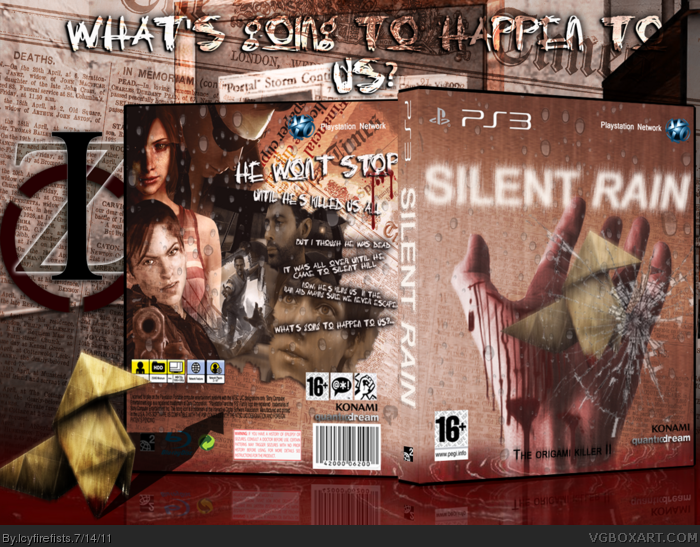
For the Crossovers, this game is a cross between Heavy Rain and Silent Hill. I think it came out pretty well, i've been working on this for months, with lapsed time and all and im just glad to have finished it. I really like it. I apologize if some of the text on the back is hard to read. Well i can't say much besides i hope you enjoy.
Oh and i hope you can tell that the hand was 'reaching for the cracked glass as a means of escaping its torment.
The front is good, but the back lets it down. The text placement and font choice aren't very appealing, and it makes the back look very messy. The presentation is also kind of overpowering the box.
Thanks, i never really wanted it looking official. i just wanted ot to look how the game feels as a mix between HR/SH amd how the emotions in both and blood and pain clash, and with the back i thought i did that pretty well. plus i wanted the newspaper feel of HR.
I really like the front! But the back is arranged a little confusingly. My main gripe is the text that is slanted and then goes over the face/nose of the one person. I do like it though, for the most part.
 Silent Rain Box Cover Comments
I'm glad my last box was well received, however not as i would have liked...:p.
Anyway, this is my newest box and contribution to the Themes of the Month Competition 3.
For the Crossovers, this game is a cross between Heavy Rain and Silent Hill. I think it came out pretty well, i've been working on this for months, with lapsed time and all and im just glad to have finished it. I really like it. I apologize if some of the text on the back is hard to read. Well i can't say much besides i hope you enjoy.
Oh and i hope you can tell that the hand was 'reaching for the cracked glass as a means of escaping its torment.
[ Reply ]
Looks like I got some Stiff Competition :P
[ Reply ]
Looks really good but blurry... Faved.
[ Reply ]
#3, It's actually meant to be blurry, to get the 'Raining Effect in'. Thank you very much.
[ Reply ]
The front is good, but the back lets it down. The text placement and font choice aren't very appealing, and it makes the back look very messy. The presentation is also kind of overpowering the box.
Edited at 1 decade ago
[ Reply ]
Magical said it best.
It's pretty hard to tell what's going on too.
[ Reply ]
Thanks, i never really wanted it looking official. i just wanted ot to look how the game feels as a mix between HR/SH amd how the emotions in both and blood and pain clash, and with the back i thought i did that pretty well. plus i wanted the newspaper feel of HR.
Edited at 1 decade ago
[ Reply ]
I really like the front! But the back is arranged a little confusingly. My main gripe is the text that is slanted and then goes over the face/nose of the one person. I do like it though, for the most part.
[ Reply ]
I love the front, but the text on the back ruins it for me...
[ Reply ]
The typography on the back needs work. But other than that...Woah.
[ Reply ]
My biggest problem is that the Origami doesn't look like it's in his hand, the angle is off. But I guess you really can't fix that.
Good job on the box.
[ Reply ]
Thank's alot man. It was good fun making this. Yeah i know, but its a real pain to figure out.
[ Reply ]