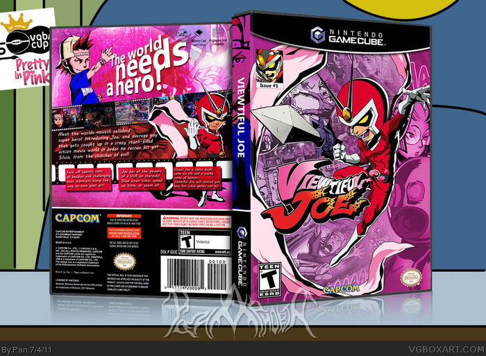
My entry for the pinky round. Yeah I chose kind of an easy game, but I think I made up for that by making the design different from all the other Viewtiful Joe boxes on the site.
I wanted to make a design that had pink as the main color, but wasn't glaringly obviously and 110% pink, so I left the colorful renders colorful. I tried to make the front look comic bookish, standard for Viewtiful Joe, but I tried to make the back look like and old movie/poster because that's what Viewtiful Joe is really all about.
Viewtiful Joe is a great game to use the pink color on without it looking forced. It's great because Joe is center stage, and he's red, so it stops the cover from looking to uncharacteristically pink, or too girlie. It also compliments the Viewtiful Joe logo, and his costume's color.
Even though I agree with Strike the Wolf about the text's font on the back, I have to say that this design is actually mind-blowing. I only wish you hadn't recolored Joe's skin on the back; and that you had put something at the back's bottom, so it doesn't look that empty.
 Viewtiful Joe Box Cover Comments
My entry for the pinky round. Yeah I chose kind of an easy game, but I think I made up for that by making the design different from all the other Viewtiful Joe boxes on the site.
I wanted to make a design that had pink as the main color, but wasn't glaringly obviously and 110% pink, so I left the colorful renders colorful. I tried to make the front look comic bookish, standard for Viewtiful Joe, but I tried to make the back look like and old movie/poster because that's what Viewtiful Joe is really all about.
[ Reply ]
This box is in mint condition
and not to be referred to as "Worst box ever"
Edited at 1 decade ago
[ Reply ]
Love it! Just don't like the text on the back.
[ Reply ]
Viewtiful Joe is a great game to use the pink color on without it looking forced. It's great because Joe is center stage, and he's red, so it stops the cover from looking to uncharacteristically pink, or too girlie. It also compliments the Viewtiful Joe logo, and his costume's color.
Great choice. This looks really good.
[ Reply ]
have to agree with STW here,
I don't really like the font you choosed for the back,
the rest is great! especially the front.
Edited at 1 decade ago
[ Reply ]
Even though I agree with Strike the Wolf about the text's font on the back, I have to say that this design is actually mind-blowing. I only wish you hadn't recolored Joe's skin on the back; and that you had put something at the back's bottom, so it doesn't look that empty.
[ Reply ]
#6, I didn't recolor Joes skin, it's part of the effect I used to make it look like an old school movie poster.
[ Reply ]
Perfect choice for the theme. In fact, it was one of the first games that came to mind what saw Round 1. Nice work, Pan.
[ Reply ]
I don't really have any gripes on this. Love it, man.
[ Reply ]
This looks really good, and excellent choice for the round.
[ Reply ]