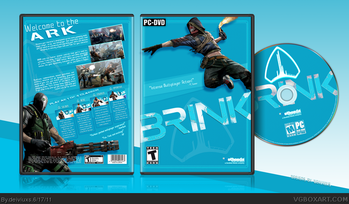
I'd offer a cookie if that guy at the bottom didn't look so out of place, I'd be nicer if you added a pic of the Ark itself instead.
Besides this, it's all very clean and nice
I think this actually supposes a big step forward from your previous boxes, though there's still things I don't like. The blurriness that seems to affect the tagline and the quote on the front (It may have something to do with the stroke, or with the dots background). There's an empty feeling at the left of the text boxes on the back, betwen them and the border. The word "ARK" on the tagline shouldn't be itallic, IMO. The stroke on the Bethesda logo on the front makes it hard to read, I'd remove it and add a drop shadow. Seems like you placed a bit of the back's reflection above the actual box (At the bottom). And finally, I think the bar code should say "Made in U.S.A.", as It's a NTSC cover.
I still like it, anyway.
#6, Man...aren't you are very detailed person..haha..thanks for the feedback but I like the cover as it is now. And those few small details do not bother me.
I'm starting to realize some of the best boxes on here are for the PC. Something about not having the branding all over the cover makes them much more clean and appealing. Great box though!
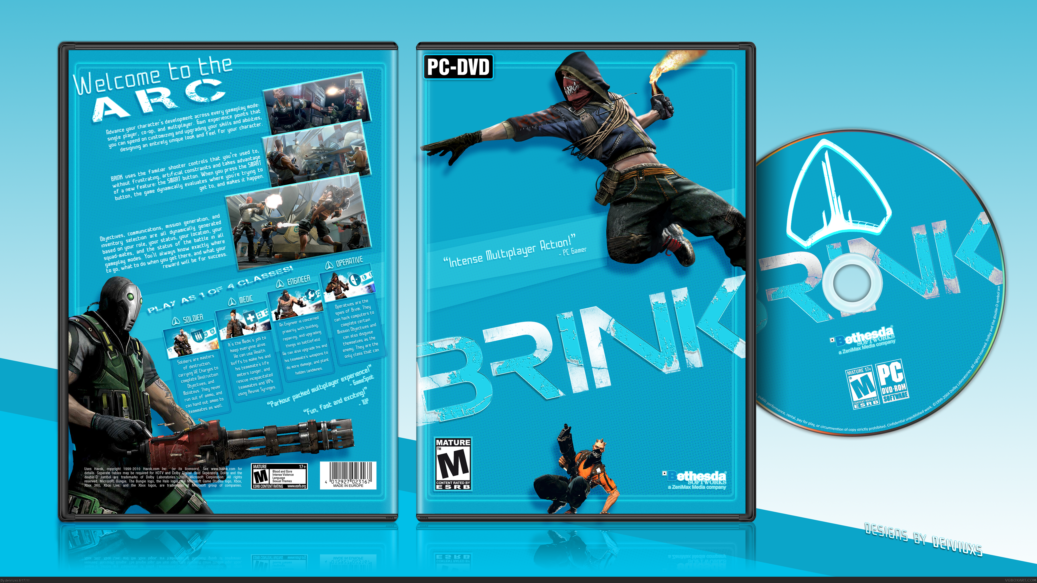
I've been waiting to comment on this so I could bump it back up. All I can say is wow, you did a fantastic job on this. The updated front looks much cleaner and flows with the rest of the box better, and the layout of the back is very professional. Nice job!
Thanks for your feedback guys, but I honestly don't find the shadow distracting. I wanted to make the guy on the front more 3D-like, thus why I added the shadow.
 Brink Box Cover Comments
Well, hello there...
Never played the game, 'cause I heard it sucks donkey balls.
It had nice art so..whatever..decided to make a custom cover for it.
Comments, favs, and cookies appreciated!
P.S. View full size, otherwise don't bother viewing it at all.
[ Reply ]
I'd offer a cookie if that guy at the bottom didn't look so out of place, I'd be nicer if you added a pic of the Ark itself instead.
Besides this, it's all very clean and nice
[ Reply ]
My only complaints are that the guy at the bottom of the front looks out of place and the games rated T not M
[ Reply ]
Yeah, I agree about the guy at the bottom on the front. Everything else is remarkable.
[ Reply ]
Due to a popular demand, the "guy" at the bottom on the front has been removed (he's pretty pissed for that).
Oh, and ESRB rating has been changed to Teen.
[ Reply ]
I think this actually supposes a big step forward from your previous boxes, though there's still things I don't like. The blurriness that seems to affect the tagline and the quote on the front (It may have something to do with the stroke, or with the dots background). There's an empty feeling at the left of the text boxes on the back, betwen them and the border. The word "ARK" on the tagline shouldn't be itallic, IMO. The stroke on the Bethesda logo on the front makes it hard to read, I'd remove it and add a drop shadow. Seems like you placed a bit of the back's reflection above the actual box (At the bottom). And finally, I think the bar code should say "Made in U.S.A.", as It's a NTSC cover.
I still like it, anyway.
[ Reply ]
Aaah much better. FAV
[ Reply ]
#6, Man...aren't you are very detailed person..haha..thanks for the feedback but I like the cover as it is now. And those few small details do not bother me.
[ Reply ]
Really nice, well done. It looks very sleek.
I don't like the drop shadow on the guy on the front though :/
[ Reply ]
I'm starting to realize some of the best boxes on here are for the PC. Something about not having the branding all over the cover makes them much more clean and appealing. Great box though!
[ Reply ]
This looks better than the official!!
[ Reply ]
Awesome job, man!
[ Reply ]
Thank you for your kind comments gentlemen.
[ Reply ]
I've been waiting to comment on this so I could bump it back up. All I can say is wow, you did a fantastic job on this. The updated front looks much cleaner and flows with the rest of the box better, and the layout of the back is very professional. Nice job!
[ Reply ]
Love this, it looks so official.
[ Reply ]
That's tight
[ Reply ]
If you ask me it's kind of plain, but i love the back, and i can see that a lot of work was put into it. Good job.
[ Reply ]
#15, Official?..haha..to me it's the opposite.
#17, I see why you would think it looks plain but I went for a more simplistic and stylish approach.
Oh, and the game is Free to play on STEAM until Sunday, so I suggest everyone to try it!
[ Reply ]
I like the design, but a part of me is thinking there is too much "blue".
[ Reply ]
#19, haha...I kinda went blue-crazy with this cover. It's the dominant color in the game so I decided to make it dominant on this case as well.
[ Reply ]
#9, Same.
[ Reply ]
I love the game, and the box. Great work. And I agree with #9.
[ Reply ]
Thanks for your feedback guys, but I honestly don't find the shadow distracting. I wanted to make the guy on the front more 3D-like, thus why I added the shadow.
[ Reply ]
Bump for hall, this is just too fantastic.
[ Reply ]
At first it seems kinda plain, but i'd replace that statement with "clean", very nice.
[ Reply ]
Your work is unparalleled Brother,Good Luck . . .
[ Reply ]