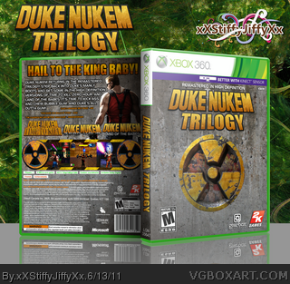
View in full! I present to you, the Duke Nukem HD Remastered Trilogy. This HD game package contains remastered versions of Time to Kill, Zero hour, and Land of the Babes. Thank you for all the help I received in the WiP thread. Enjoy :)
Also, I added the "Better With Kinect" part to the template because I thought of how cool it would be to be able to actually flip off enemies and bash on enemies with insults...just a little idea I had lol
I also love the presentation. On the box itself: The front is a bit plain, which isn't necessarily bad, but the back is great. Love the screen borders, very creative. Great work!
I would pay all kinds of good money to play Zero Hour in HD with some checkpoints. You've definitely got my mouth watering here...overall, a pretty good arrangement overall, in my opinion.
 Duke Nukem Trilogy Box Cover Comments
View in full! I present to you, the Duke Nukem HD Remastered Trilogy. This HD game package contains remastered versions of Time to Kill, Zero hour, and Land of the Babes. Thank you for all the help I received in the WiP thread. Enjoy :)
Also, I added the "Better With Kinect" part to the template because I thought of how cool it would be to be able to actually flip off enemies and bash on enemies with insults...just a little idea I had lol
Logo: tmrd
Edited at 1 decade ago
[ Reply ]
Kinect kinda confused me but other than that, this box is pretty awesome.
[ Reply ]
Nice work man!
[ Reply ]
I like how you blended the hazard logo into the front, but that's about all I like about the box. It's just not very attractive, to be honest.
[ Reply ]
Good work. I'm not a Duke Nukem fan, but shouldn't the collection contain the ORIGINAL three games and not the spinoffs?
[ Reply ]
I like it. For some reason its all really pixelated in full view though :/
[ Reply ]
Thanks for the love guys! :)
#5 I wanted to do the original 3 but then that would be really hard to put the first 2 Duke Nukem games in 3D lol look it up and you'll know why xD
#6 Hmmm, I don't seem to be having that problem :/
[ Reply ]
#7, Hmm, that's weird. Its not massively pixelated, but its enough to throw me off a bit. Only the box though, the presentation is fine.
[ Reply ]
#8 Well the image is 6.11 MB large so that could possibly contribute to the problem lol
Edited at 1 decade ago
[ Reply ]
I also love the presentation. On the box itself: The front is a bit plain, which isn't necessarily bad, but the back is great. Love the screen borders, very creative. Great work!
[ Reply ]
#8, I have the same problem.
[ Reply ]
I like this. :) But I think the font for the description on the back could be better.
[ Reply ]
Aside from the hazard logo, the rest isn't in my liking.
[ Reply ]
Nice, I really like the front. As TMRD said it's kinda pixelated, but still good. Well done.
[ Reply ]
I really like the nuclear symbol with the pictures inside it.
[ Reply ]
Thank you for the critique guys! :) I'll see what else I can do to improve it
[ Reply ]
I would pay all kinds of good money to play Zero Hour in HD with some checkpoints. You've definitely got my mouth watering here...overall, a pretty good arrangement overall, in my opinion.
[ Reply ]