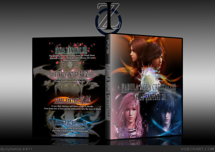
Okay, this is my TOTM contribution. Don't know what to say about it besides that i really love it. I hope you guys like. The custom logo on the front is a composite logo made from the logos of Type Zero, XIII, and Versus XIII
thanks arby, i thought that devlopper logos and legal information would have impaired it in some way. I tried. I know its a little too simple, but i thought it was worth its look.
To be honest, when I look at this, I don't think "simple and clean". The logo placement as well as the artwork looks a bit messy and cluttered together, especially against the black background. The front fares similarly. I think you could have come up with a better concept to represent Fabula Nova Crystallis than simply placing the heads of each game's protagonist on the front.
Yeah, I probably could have. But this box was screaming simplicity in my head when I was making it and I thougt it was pretty simple. And the heads of the FBC characters all matched in a similar fashion unlike some other renders, so I took the chance. I couldn't think of any other way that would equally represent each FBC story
Yeah, I probably could have. But this box was screaming simplicity in my head when I was making it and I thougt it was pretty simple. And the heads of the FBC characters all matched in a similar fashion unlike some other renders, so I took the chance. I couldn't think of any other way that would equally represent each FBC story
It's not bad, but I don't think it's too great.
The front is kinda cool, kind of a Soul Calibur feel.
But all the black.. feels like there should have been more of a BG than just empty black.
The back with the logos is alright, but it could have been done alot better.
There are some minor quality issues aswell..
 Fabula Nova Crystallis Box Cover Comments
Okay, this is my TOTM contribution. Don't know what to say about it besides that i really love it. I hope you guys like. The custom logo on the front is a composite logo made from the logos of Type Zero, XIII, and Versus XIII
[ Reply ]
It's nice... But something turns me off... Lack of developer logos and information regarding the system...
[ Reply ]
thanks arby, i thought that devlopper logos and legal information would have impaired it in some way. I tried. I know its a little too simple, but i thought it was worth its look.
[ Reply ]
Back is nice, but could use more text, and legal yada yada. Still great though.
[ Reply ]
To be honest, when I look at this, I don't think "simple and clean". The logo placement as well as the artwork looks a bit messy and cluttered together, especially against the black background. The front fares similarly. I think you could have come up with a better concept to represent Fabula Nova Crystallis than simply placing the heads of each game's protagonist on the front.
[ Reply ]
Yeah, I probably could have. But this box was screaming simplicity in my head when I was making it and I thougt it was pretty simple. And the heads of the FBC characters all matched in a similar fashion unlike some other renders, so I took the chance. I couldn't think of any other way that would equally represent each FBC story
[ Reply ]
It's not bad, but I don't think it's too great.
The front is kinda cool, kind of a Soul Calibur feel.
But all the black.. feels like there should have been more of a BG than just empty black.
The back with the logos is alright, but it could have been done alot better.
There are some minor quality issues aswell..
[ Reply ]