I really wish you had made the back text in the same font style as the logo text on the front, but other than that this is very well done. Simple. Colorful. Effective.
#3, I like to stick to this rule as well. Occasionally I'll make a more elaborate background (Such as my Sonic or Portal boxes) but usually I'll try for something nice, soothing, and in no way distracting.
This looks great. I could absolutely see it being an officially released cover for the movie.
 Monsters, Inc, Box Cover Comments
My first box in almost a year. Woah.
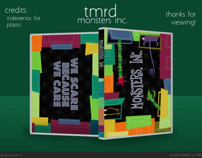
Based off my favourite movie intro scene ever.
[ Reply ]
Nice! The presentation's a bit bland.
[ Reply ]
#2, I have it for all my boxes. I like them to look uniform. I don't want anything too exciting, it'll take away from the box.
[ Reply ]
Damn, this is really nice.
[ Reply ]
Nice.
[ Reply ]
I love it.
[ Reply ]
Thanks guys :)
[ Reply ]
Not so sold on the back but overall you've got a really good style happening here.
[ Reply ]
I really wish you had made the back text in the same font style as the logo text on the front, but other than that this is very well done. Simple. Colorful. Effective.
[ Reply ]
#9, I wanted to, haha. I lost the psd file and I thought it was still ok to post.
[ Reply ]
I think the colors and everything work but this doesn't represent the movie well enough.
[ Reply ]
#11, This artstyle and idea isn't something I made up. Its from the intro to the movie.
[ Reply ]
<3
[ Reply ]
#11: Monsters hiding in closets. That's a well enough representation.
Nicely done, tmrd.
[ Reply ]
Haha thanks people.
[ Reply ]
I can't believe I missed this. Good job encapsulating the Monsters Inc. style. Definitely needs more attention!
[ Reply ]
#16, Thanks :)
[ Reply ]
Wow, the front is amazingly amazing, back could have a bit more going on, but still great work none-the less :D
[ Reply ]
#18, Thanks. I had finished the front but had no ideas for the back but I wanted to post it. :3
Edited at 1 decade ago
[ Reply ]
HAWT!
[ Reply ]
#20, Squall<3
[ Reply ]
Love
[ Reply ]
#22, Thanks man :)
[ Reply ]
Love this design tmrd! :)
[ Reply ]
#3, I like to stick to this rule as well. Occasionally I'll make a more elaborate background (Such as my Sonic or Portal boxes) but usually I'll try for something nice, soothing, and in no way distracting.
This looks great. I could absolutely see it being an officially released cover for the movie.
[ Reply ]
Thanks to both of you. And all of you guys who helped get this to hall :)
[ Reply ]
Perfect. I first thought the main title written vertically wouldn't look that good, but it actually looks rad, great job.
[ Reply ]
Thanks again! I guess I was really persistant with that as I wanted to design a horizontal box haha. I guess it turned out okay after all.
[ Reply ]