![]() »
»
[ Box updated on May 15th, 2011 ] [ original ]
 Red Dead Redemption Box Cover Comments
Comment on crysomemore's Red Dead Redemption Box Art / Cover.
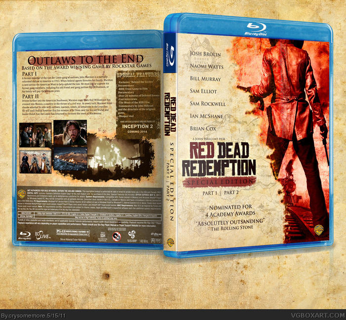
So yeah, I made an RDR movie box. I'll let the box speak for itself.
Temp. by ScorpionSoldier.
[ Reply ]
You win.
[ Reply ]
I like this!
There are a few minor things that could be changed though IMO. I think on the front the 'Part 1 | Part 2' text needs to be moved down a bit so that it isn't touching the red background of the 'special edition' text. On the back the text descriptions look a bit stuffed up. It has the first part of the sentence then just cuts off onto the next line for both the description of part 1 and part 2.
I would love to see a 3D version of the box art too!
Great job though!! Love the 'sneak peek at Inception 2' and the cast sounds pretty good! :-D
[ Reply ]
#2 Coming from you, that means a lot. :D
#3 Yeah, I was actually thinking the exact same thing when I noticed what I did with the "SE" text and you also make a good point with the text at the back.
As for the 3D version, well that's not exactly my forte (even though I've been boxarting for 3 years now :|) but I'll try my best to make one in the event I come across an appropriate template. ;)
[ Reply ]
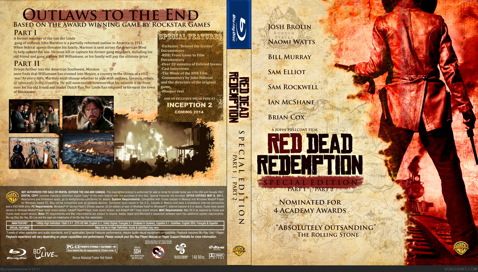
UPDATED
Now with a 3D Temp by Sens.
[ Reply ]
0__0
[ Reply ]
The 3D made this twice as better.
[ Reply ]
Proper template makes all the difference. Great job!
[ Reply ]
Whoa.
[ Reply ]
This is fantastic, a killer idea that you've pulled off flawlessly.
[ Reply ]
#4, I mean it, this is fantastic.
The layout on the front it gorgeous, what with the names, and the page tear/burned thing.
Although, I think I may have chose some different colors. (the red stuff)
The back is great too, if I were to change anything it would be the text;
"PART 1
blah blah blahh
PART 2
Derp derp blahh"
I would move that down so there's the same space between it and the tagline, as there is between it and the screenshots.
Other than that, you aced it, IMO.
[ Reply ]
If this were real it would be the first good movie based off a game. Good box too.
[ Reply ]
#12, Indeed, this movie would kick major assage.
[ Reply ]
Wow, thanks a lot guys.
I don't think I've ever gotten this much positive reception...ever!
:D
[ Reply ]
This is amaizing bro, nice work.
[ Reply ]
#12 & #13 that would depend on who directs it to be honest.
[ Reply ]
Inception 2 preview is the only bad thing about it besides the resolution of it. By that I mean I wish it was at a bit of a higher resolution so everything wasn't so blurry.
[ Reply ]
I don't like the quality of this box, but you did a good job!
[ Reply ]
Great job with the 3D!! It looks fantastic! The fixes you made a great :-D
I'm gonna author fav you now!
[ Reply ]
Love it!
[ Reply ]
You know, now you mention it Brian Cox would be AWESOME as Edgar Ross!!
Anyways good job all round, it's all woven together brilliantly and masterfully, needs HOF now!!
[ Reply ]
#21 Getting HOF would be SO awesome. It would be my first.
[ Reply ]
#16, Well the box does say nominated for 4 academy awards. My original comment was reffering to if this box were official, sorry if i was unclear. :P
[ Reply ]
Interesting concept, and nice execution.
[ Reply ]
That is awesome!!!! I wouldn't be surpised if it get HOF 10/10
[ Reply ]
Impressive
[ Reply ]
Nice. + FAV
[ Reply ]
WHOOOOOOOOP!!
[ Reply ]
#23 oh yes, fair call :P!
Congrats on the Hof too! Well deserved.
[ Reply ]
My box got Hall of Fame'd? My box? HOF!?!
OOOHHHHHHMAAAHHHGAAAAHD!!!!!
*dies*
[ Reply ]
Oh and once again, thanks to everyone for all the praise. :D
[ Reply ]
no offense, but this is really boring looking
[ Reply ]
#32, kthxbye
[ Reply ]
The first words that came to my mind when I saw this box in HOF were "Hell Yeah!"
Great box and congrats on your 1st (and hopefully no the last) HOF!
[ Reply ]
Huh, congrats on this Hall entry. It seems to look better each time I see it.
[ Reply ]
Nice box and great idea! Hollywood needs a good western movie again, It's been too long
[ Reply ]
#36, True Grit called..
[ Reply ]
#16, It says John Hillcoat so I think it would be in good hands ;)
Terrific box and I really like the cast.
[ Reply ]
Can't remember what movie actually looks exactly like that on the front with the white/picture thing but yeah. this looks fantastic! great job!
[ Reply ]
#39
I got the front pic from "3:10 to Yuma".
But uhhh...white? Where?
[ Reply ]
Thats what it was!! haha.
Nothing.
[ Reply ]
printable :P
[ Reply ]
Billy Murray, no...replace him with Dan Akroyd!
[ Reply ]
#42
Just to let you know since you commented on my deviantArt page...
Yeah, I'm the same guy. No one is stealing anything.
[ Reply ]
Just one word. Bravo.
[ Reply ]
I kinda feel awful that I haven't been able to make a box that outdoes this quality since I posted it...
[ Reply ]
muito bom esse site
[ Reply ]