Well, there isn't much to say except credit to console-covers.com for the printable template and muchos gracias to the kind dwellers of the VGBA forums who helped me with their feedback =].
Critique/comments/feedback, as usual, is very much appreciated ;D!
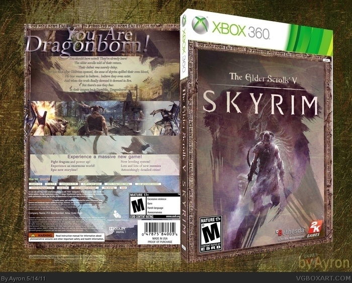
I know the text on the back is a bit illegible in the 3d view, so please look at the printable version for the uncompressed, detailed version.
The quality of some of the stuff on the back is questionable (the border, some of the text, a couple images) and the "You are Dragonborn!" text looks very out of place. The shadow on it makes it look almost 3D, so it appears to be popping off of the box which wouldn't be so bad except that it looks like it's not actually a part of the box.
The front is very cool with its paint like style as is the border and brush patterns areound the text. As already mentioned, the only thing I don't like is that the tagline looks a bit weird as its not centered, looks too 3-d and is going into the border
I'm inclined to disagree with a few others on the back. It's unique in a way, and stays true to a certain style that you carry over from each of your covers. I quite like the tagline, and the design in general is pretty great. I might suggest something more interesting be done with the features text towards the bottom, as it's a bit drab.
The front's gorgeous in it's simplicity. The muted colors look superb, and the new logo is a much better fit.
#17, you're right. thanks for the feedback!
however, due to my recent display of artistic talent, I'm afraid that a 3rd masterworks is hardly ever going to happen.
Well i do check in from time to time, i just haven't made a boxart in ages! Thanks for the comment. It's really cool to see my work of several years ago still get attention :)!
@Ayron After all these years, this box is still great. Cannot imagine what it must feel like to see something you made in the HOF after a couple of years.
 The Elder Scrolls V: Skyrim Box Cover Comments
Wheewiee, that's been a while!
Well, there isn't much to say except credit to console-covers.com for the printable template and muchos gracias to the kind dwellers of the VGBA forums who helped me with their feedback =].
Critique/comments/feedback, as usual, is very much appreciated ;D!
I know the text on the back is a bit illegible in the 3d view, so please look at the printable version for the uncompressed, detailed version.
-Sander
Edited at 1 decade ago
[ Reply ]
Nice comeback!
[ Reply ]
The only thing I don't like is the tagline on the back stretching over the box border, besides that this has an excellent feel to it.
[ Reply ]
Yay!
[ Reply ]
BRB while I try to think of one word to describe the inspiration you just gave me.
[ Reply ]
YESYESYES!
[ Reply ]
The quality of some of the stuff on the back is questionable (the border, some of the text, a couple images) and the "You are Dragonborn!" text looks very out of place. The shadow on it makes it look almost 3D, so it appears to be popping off of the box which wouldn't be so bad except that it looks like it's not actually a part of the box.
[ Reply ]
The front is very cool with its paint like style as is the border and brush patterns areound the text. As already mentioned, the only thing I don't like is that the tagline looks a bit weird as its not centered, looks too 3-d and is going into the border
[ Reply ]
I'm inclined to disagree with a few others on the back. It's unique in a way, and stays true to a certain style that you carry over from each of your covers. I quite like the tagline, and the design in general is pretty great. I might suggest something more interesting be done with the features text towards the bottom, as it's a bit drab.
The front's gorgeous in it's simplicity. The muted colors look superb, and the new logo is a much better fit.
[ Reply ]
I dunno but it's kind a messy :/
[ Reply ]
Thanks for the feedback, everyone.
The reason why I chose to do the tagline as I've done it is that if I'd had centered it, it would've made the text look a bit odd and unaligned.
I understand the criticism though, it's just a personal preference, I assume ;).
[ Reply ]
God, it's good to see lost children returning to VGBA xD.
Very nice work, although the background makes the box a little confusing. Something simpler would compliment the box better, I think.
[ Reply ]
looks good Ayron :P...you're still active?
[ Reply ]
The typography seriously leaves something to be desired, but that front...dear Lord, that's amazing.
[ Reply ]
#12-14, I know I'm a bit rusty. Thanks for the feedback, though. It's good te see how some people still look at my work after all this time.
[ Reply ]
Idk about this one , seems more like a Dragon Age cover, the feel is very much like an Anime or like a Final Fantasy thing
Edited at 1 decade ago
[ Reply ]
the back is hard to read you should tweak that and the word "dragonborn!" should be centered otherwise this deserves to be your 3rd masterwork
[ Reply ]
#17, you're right. thanks for the feedback!
however, due to my recent display of artistic talent, I'm afraid that a 3rd masterworks is hardly ever going to happen.
[ Reply ]
I love the front! Well deserved, congrats. You probably will never read this, though :P
[ Reply ]
Well i do check in from time to time, i just haven't made a boxart in ages! Thanks for the comment. It's really cool to see my work of several years ago still get attention :)!
[ Reply ]
@Ayron After all these years, this box is still great. Cannot imagine what it must feel like to see something you made in the HOF after a couple of years.
Good to hear you check in from time to time :)
[ Reply ]
@aldimon Hahahha well it's honestly really weird!
[ Reply ]
Congrats Ayron,Really Great And Deserved Hof . . .
[ Reply ]
Thank you very much!
[ Reply ]
Congrats Brother ;)
[ Reply ]
And thank you as well, mate
[ Reply ]
Very Good Ayron....
[ Reply ]
Why thank you ;)
[ Reply ]