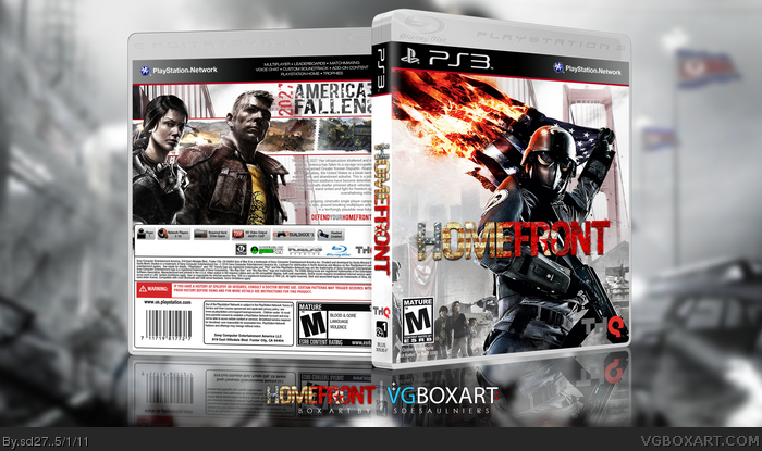
Credits:
Homefront Logo - Spiderpig24
Template - ScorpionSoldier
I was really enjoying this game before PSN went out. I wanted to get back into doing box art and I had all these Homefront wallpapers sitting around, so I put this together. Thoughts?
Front is nice but those two renders on the back take too much space which makes description text too small (hard to read too) and in general back seems a bit simplistic.
I like it, these guys seem to disagree with the whole 'large character' thing; but it directs the eye to the text, which in a cover is important. It's simple yet effective. I also like the front, it's a change from the original and is different from most of the ones found on here.
 Homefront Box Cover Comments
Credits:
Homefront Logo - Spiderpig24
Template - ScorpionSoldier
I was really enjoying this game before PSN went out. I wanted to get back into doing box art and I had all these Homefront wallpapers sitting around, so I put this together. Thoughts?
[ Reply ]
Front is nice but those two renders on the back take too much space which makes description text too small (hard to read too) and in general back seems a bit simplistic.
[ Reply ]
The text on the back should be black and not gray, so it can stand out more.
[ Reply ]
I agree with #2 I really like the front but on the back the writing is kinda hard to read.4.5/5 For me because i really like the coloring.
[ Reply ]
Deiviuxs is right. The size of the characters pushes all other elements to the side. There needs to be more of a balance between the two.
[ Reply ]
I like it, these guys seem to disagree with the whole 'large character' thing; but it directs the eye to the text, which in a cover is important. It's simple yet effective. I also like the front, it's a change from the original and is different from most of the ones found on here.
[ Reply ]
good work. but where is the imprimable version
[ Reply ]