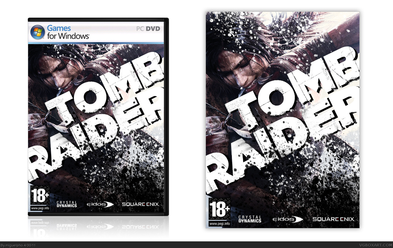
Cool update. Typography's simple, but it works well and fits almost seamlessly with the image. The only issue is the large black space behind and to the sides of Lara. Blending scenery within the splatter shouldn't be too difficult, and would improve the design by leaps and bounds.
#8, I have some issues with the black space to the sides of Lara. I tried splatter but it didn't look fine... any ideas? I didn't put anything behind lara because of the legal content; I actually darkened the splatter up a bit because of it. As of blending scenery and splatter, I didn't quite understand what you are suggesting.
 Tomb Raider Box Cover Comments
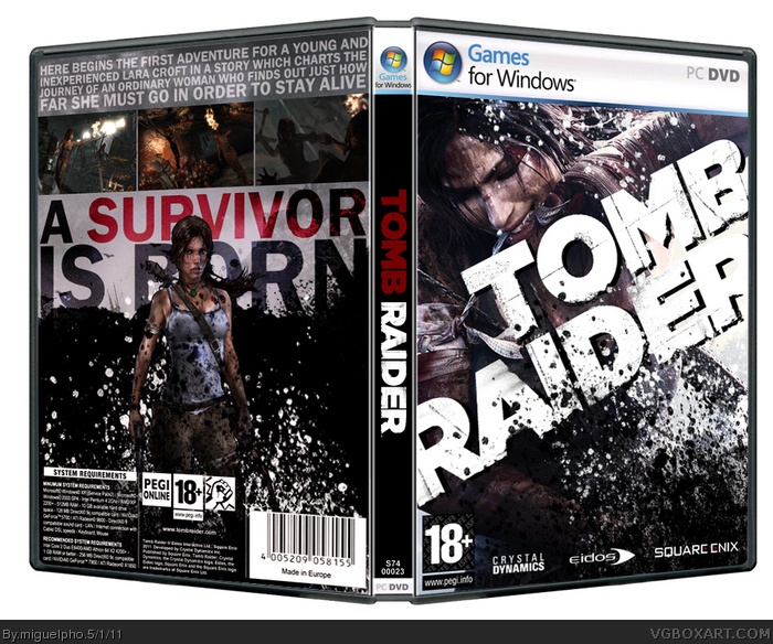
I am currently working on a back cover! Hope you like this.
[ Reply ]
Waiting for a back, whenever you finish it.
[ Reply ]
I like what you've done so far! The cover looks very eye catching.
Can't wait to see the back :-D
[ Reply ]
The splatters work right here, I like it. Looking forward to the back.
[ Reply ]
I've done a back cover, but I would like critiques first, please: link
lol, sorry couldn't wait to publish it here.
Edited at 1 decade ago
[ Reply ]
nice ; )
[ Reply ]
Thank you all! :D
[ Reply ]
Cool update. Typography's simple, but it works well and fits almost seamlessly with the image. The only issue is the large black space behind and to the sides of Lara. Blending scenery within the splatter shouldn't be too difficult, and would improve the design by leaps and bounds.
[ Reply ]
THAT's what i'm talkin about!
[ Reply ]
THAT's what i'm talkin about!
[ Reply ]
#8, I have some issues with the black space to the sides of Lara. I tried splatter but it didn't look fine... any ideas? I didn't put anything behind lara because of the legal content; I actually darkened the splatter up a bit because of it. As of blending scenery and splatter, I didn't quite understand what you are suggesting.
Thanks! :D
[ Reply ]
NICE.
[ Reply ]