[ Box updated on May 3rd, 2011 ] [ original ]
 Eternal Darkness: Sanity's Requiem Box Cover Comments
Comment on Masloff's Eternal Darkness: Sanity's Requiem Box Art / Cover.
[ Box updated on May 3rd, 2011 ] [ original ]
Comment on Masloff's Eternal Darkness: Sanity's Requiem Box Art / Cover.
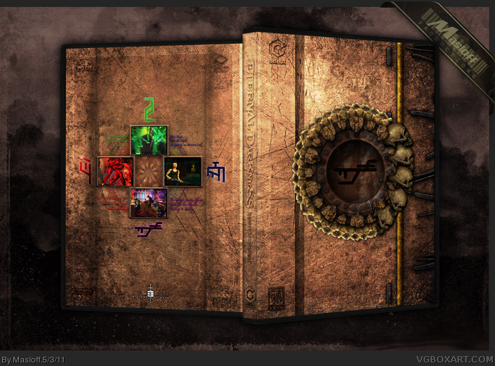
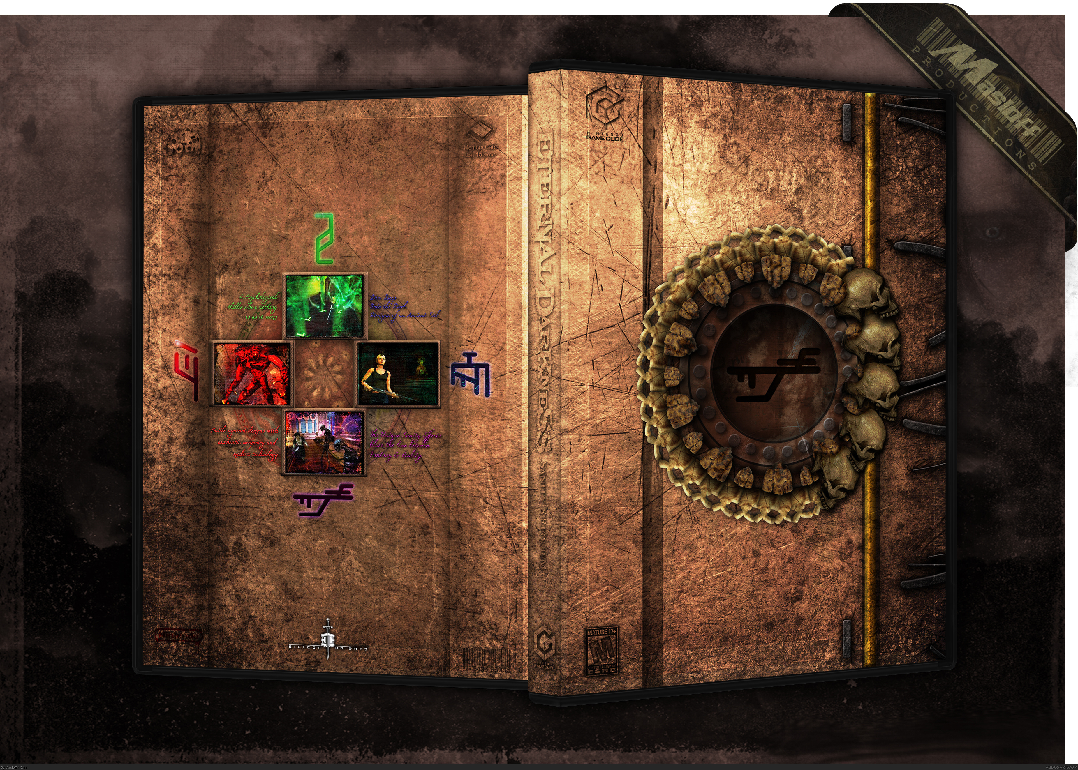
I wanted to make another Eternal Darkness box since I finally played through the game and realised that my box doesn't match the game at all. I thought Pan had a good idea remaking the book, so I wanted to try to make mine look more like the book.
Almost everything on this box was drawn or textures. Except the skulls.
[ Reply ]
I less than 3 you. To the fifth.
[ Reply ]
No more comments? Come on people! This box is far better than your first Eternal Darkness box, there are minor things I don't like about it and you know what they are, but you replicated the Tomb of Eternal Darkness quite nicely.
[ Reply ]
Using the Tome as the cover is a great idea, and really sets the mood of the game.
[ Reply ]
Great work!
[ Reply ]
I think you did a great job, but the text on the back hurts the suspension of disbelief as far as it looking like an ancient tome, and putting the logos and brand names, and especially the barcode, also hurts it. The barcode more so than anything, since it wouldn't even be scannable. It would look better to not have it at all.
I do like how subtle the Gamecube logo and the memory card information is, though. With stuff like this, I'm typically against any kind of design choices that says "I'm a video game cover" and not "I'm a historic book." But in this case they're subtle enough it's not that disruptive, and I applaud you for your ability to keep them there, but keep them on the down-low.
[ Reply ]
it's a very good idea, but not working that well. I just have to agree with #6 (yeah, you can believe that).
logos have to be clearly visible, specially the ratings. and I don't get the reason behind making the silicon knights the only, real visible logo either... Maybe you should add a transparent slipcase with all the logos, just like they made did with Lords of Shadow (etc.).
[ Reply ]
Nice!
However, I barley even saw the GameCube mark and the ESRB.
Maybe you could make those less subtle?
Anyways, It's a great box!
[ Reply ]
Goddamn you, I had the same idea.
[ Reply ]
Printable added
[ Reply ]