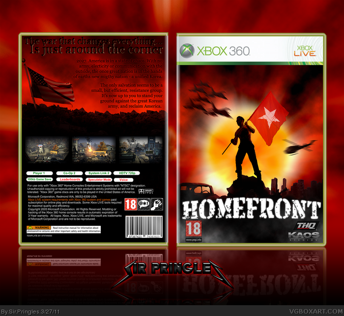
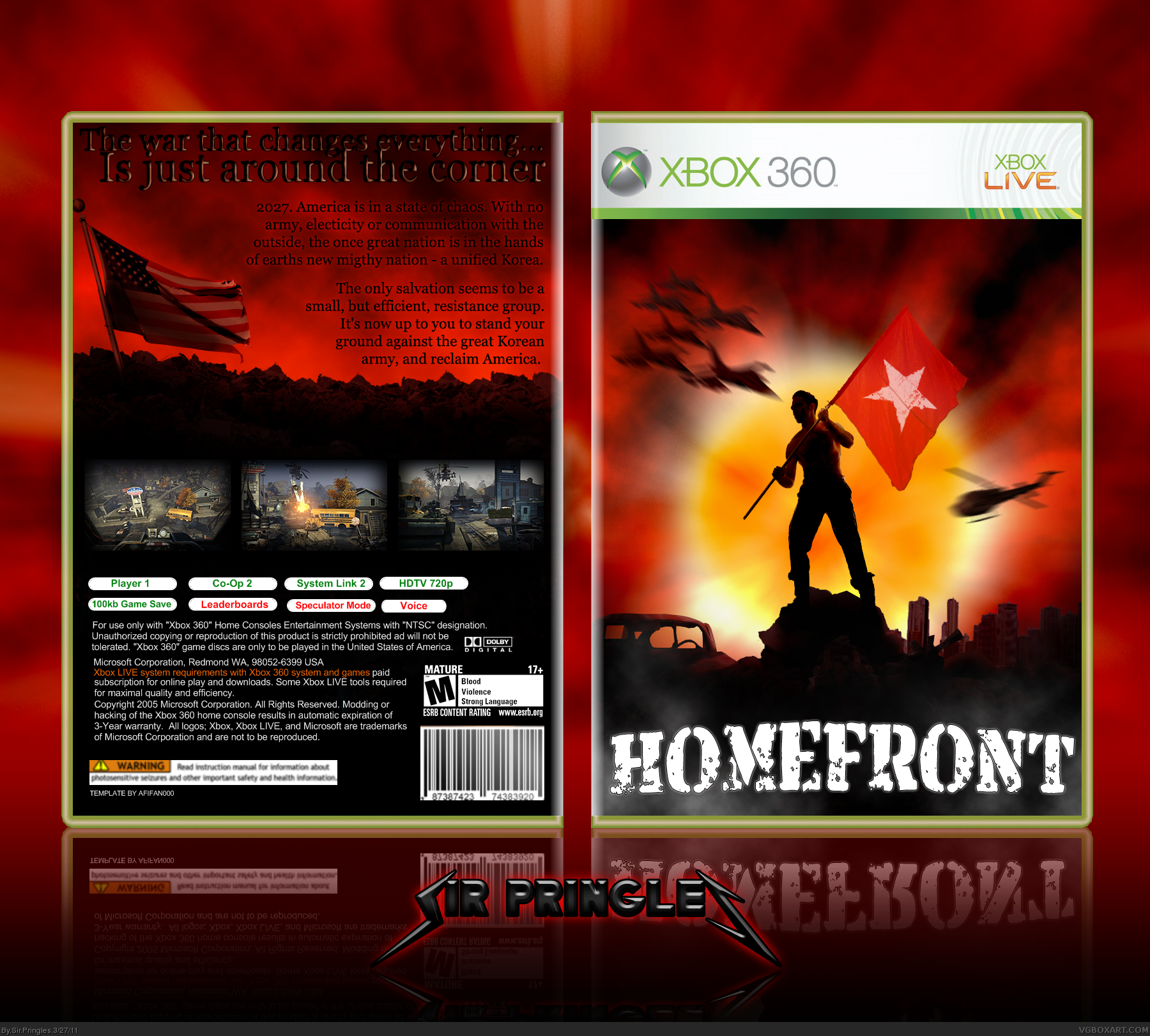
Yep, It's Homefront. I didn't want to use the official renders, so I went for something different, in a kind of 50's propaganda-look.
Thanks to afifan000 for the template, and to deividas for the help in the forum!
I was supposed to write it in my original post, but the site wouldn't let me.
There was no logic place to put any develeloper logos or ratings without messing up the layout.
Thank you! :)
The logo should be higher, IMO, it looks very strange where it is.
Having the logo higher in order to make room for the rating and dev logo shouldn't do any harm.
I don't know about this. I really don't get a propaganda poster vibe from this. The logo is really quite ugly, and I think you'd be better off using the official. Also, the motion blur on the jets and helicopter on the front is way too intense. And I don't think the picture you used looks good. I think you would do well to use official artwork.
The back is extremely bland. The font you used for the tagline, as well as the effects you added to it, make it look really ugly. I also don't think the description font works well, and the use of real pictures is just strange looking. Also, the way you did the screenshots is quite ugly. It would be better if you used borders.
 Homefront Box Cover Comments
Yep, It's Homefront. I didn't want to use the official renders, so I went for something different, in a kind of 50's propaganda-look.
Thanks to afifan000 for the template, and to deividas for the help in the forum!
Comments and critique welcome!
[ Reply ]
Front's interesting, should really have Pegi/ESBR rating and THQ logo's on the front though, the back's not as
[ Reply ]
(sorry accidently clicked submit)
... good, it's the screenshot part, needs work, but overall it's interesting and nice so i'll fav' :')
[ Reply ]
I was supposed to write it in my original post, but the site wouldn't let me.
There was no logic place to put any develeloper logos or ratings without messing up the layout.
Thank you! :)
[ Reply ]
The logo should be higher, IMO, it looks very strange where it is.
Having the logo higher in order to make room for the rating and dev logo shouldn't do any harm.
[ Reply ]
I tried doing that, but it left a big gap. But I'll try! Thanks!
[ Reply ]
Updated with dev logos and ratings. Changed it to PEGI instead of ESRB, it looked better.
[ Reply ]
Nice bro.
[ Reply ]
Looks awesome, except its rated 16 but ill ignore that and ill give you a 9/10 + fav :)
[ Reply ]
#9 - It's rated 15 in the uk
[ Reply ]
Its neat, but the back lets it down, plus the back fonts could be better imo.
[ Reply ]
#9: Sorry, didn't know that. ^^ IT was rated M in ESRB, so I just guessed that meant 18. :P
#11: Any suggestions? :)
[ Reply ]
Just a minor spelling error. You spelled mighty "migthy". Otherwise, +fav.
[ Reply ]
#13: Oh, I'll fix that as soon as I can. ^^
[ Reply ]
I don't know about this. I really don't get a propaganda poster vibe from this. The logo is really quite ugly, and I think you'd be better off using the official. Also, the motion blur on the jets and helicopter on the front is way too intense. And I don't think the picture you used looks good. I think you would do well to use official artwork.
The back is extremely bland. The font you used for the tagline, as well as the effects you added to it, make it look really ugly. I also don't think the description font works well, and the use of real pictures is just strange looking. Also, the way you did the screenshots is quite ugly. It would be better if you used borders.
[ Reply ]