This is another box for my fantasy game; I really think it would be a great concept for a shooter.
Also, I know I had a typo in the description; if I fixed it the whole text layout would be thrown off.
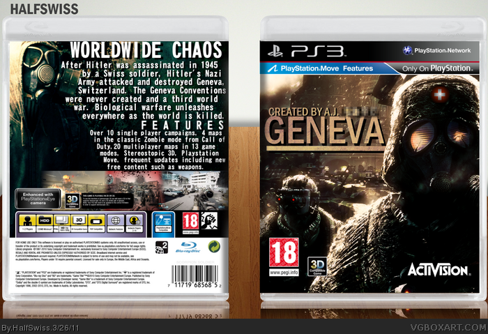
The developer logo, the rating and the 3D logo on the front should be placed lower, closer to the border.
Overall, I like the front's design, but the back's typography and scheenshots placement is horrible, to be honest.
 Geneva Box Cover Comments
This is another box for my fantasy game; I really think it would be a great concept for a shooter.
Also, I know I had a typo in the description; if I fixed it the whole text layout would be thrown off.
[ Reply ]
The front kicks ass, but the back is kinda boring.
[ Reply ]
#2, was originally seeming the other way around, but I fixed it so much it reversed.
[ Reply ]
one mistake, only sony computer entertainment has got right to produce game on ps move, but box is pretty good ;)
[ Reply ]
#4, waitwat? Third party publishers can't add Playstation Move compatability?
[ Reply ]
Great box. 5/5
[ Reply ]
Your text is absolutely horrid (typography and the text itself,) but the front design is pretty sweet.
[ Reply ]
The developer logo, the rating and the 3D logo on the front should be placed lower, closer to the border.
Overall, I like the front's design, but the back's typography and scheenshots placement is horrible, to be honest.
[ Reply ]
Eh, I thought the typography looked pretty good originally...
[ Reply ]
It's interesting, and the front is cool, but the back is suffering from some overbearing text. It's too large and occupying too much space.
[ Reply ]
I'm going to re-do the back; expect an update soon.
[ Reply ]
This is alternate history, right? Because if not then you really need to brush up on your history.
[ Reply ]
#12, obviously...
[ Reply ]