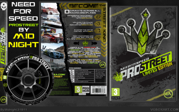
This one was meant to be uploaded on the "Kick Start" day.Just finished it.
Comments and favs are as always appreciated.
If anyone needs/wants a printable of the cover or label don't hesitate to ask.
Thanks Aelixus and Thro I uploaded a non-capitalized printable for you although I still prefer the capitalized version.Thanks for the feedback nevertheless.
Pretty unique and creative design you have going on. I dislike description text on the back though. It's just too colorful and I would have used a different font for it. Also, the presentation is too distracting and makes the whole thing too confusing and "messy" to look at.
 NFS: Prostreet Limited Edition Box Cover Comments
This one was meant to be uploaded on the "Kick Start" day.Just finished it.
Comments and favs are as always appreciated.
If anyone needs/wants a printable of the cover or label don't hesitate to ask.
[ Reply ]
Did you have a WiP of this something like that? This is extremely familiar to me. Idk, beautiful work anyway.
[ Reply ]
I like it but I think it would have looked better if the description text wasn't capitalized.
[ Reply ]
#2, Same, I'm almost positive I've seen this before.
[ Reply ]
#2,4 You are right guys I had a WiP some time ago and decided to finish it today.
Thanks for favs and comments
[ Reply ]
Really really awesome! Your boxes always have impressive look! I really digging to it!
[ Reply ]
Thanks Aelixus and Thro I uploaded a non-capitalized printable for you although I still prefer the capitalized version.Thanks for the feedback nevertheless.
[ Reply ]
Hate the game, love the cover :D
[ Reply ]
that is amazing!
[ Reply ]
Bump
[ Reply ]
Pretty unique and creative design you have going on. I dislike description text on the back though. It's just too colorful and I would have used a different font for it. Also, the presentation is too distracting and makes the whole thing too confusing and "messy" to look at.
P.S. the design for the disc is ingenious! :)
[ Reply ]
This is hot!!!
[ Reply ]