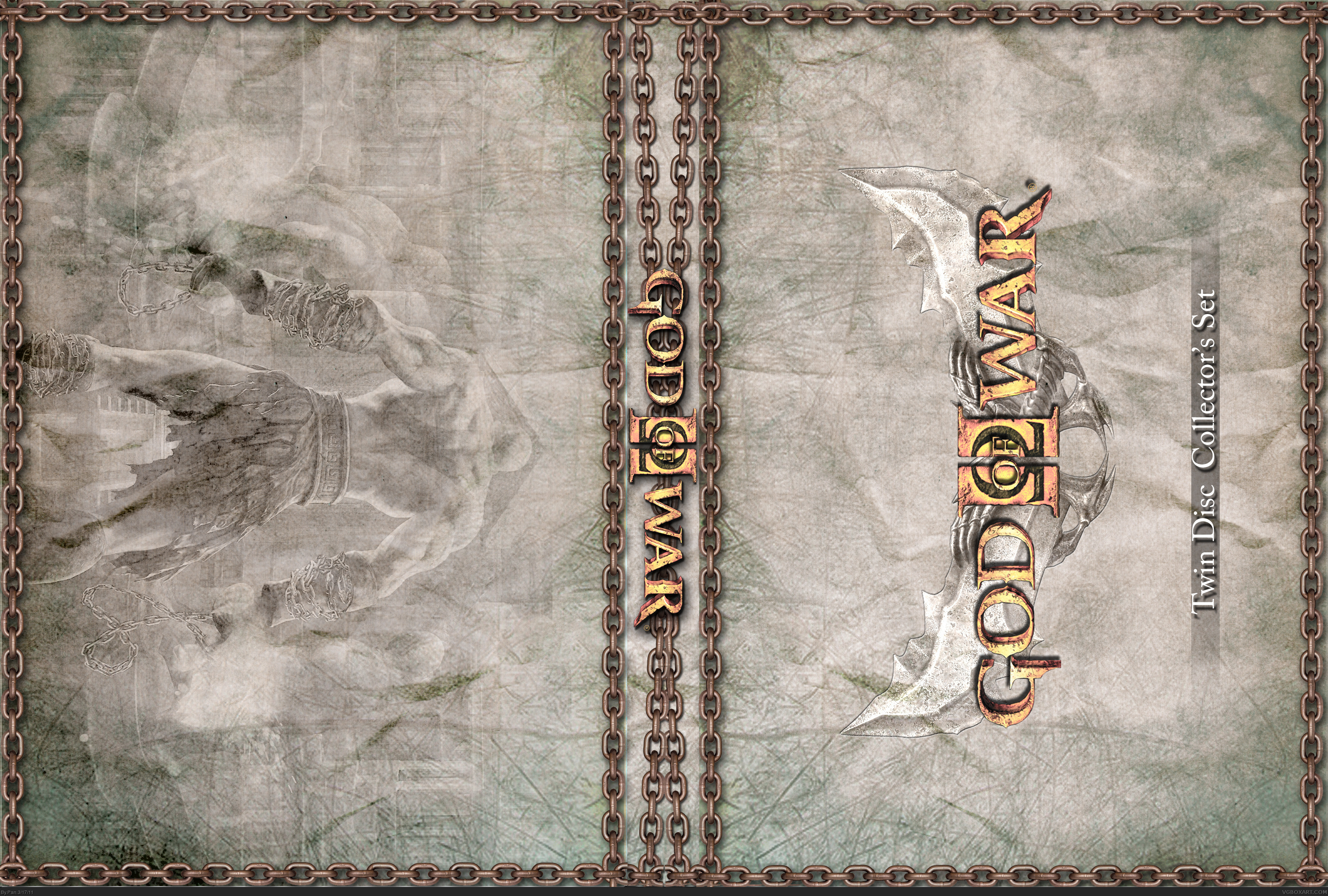
V1 is the printable slipcover
Printable is the actual cover.
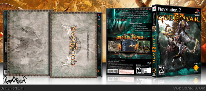
This started out as a God of War I box, but I used the wrong artwork so I converted it to II. Front is inspired by this link and this link
The slipcover was inspired by this: link
I think the back looks a bit too simple. Even though you have quite a lot going on, everything is so blue it creates the illusion of emptiness. A greater variety in colors would really improve this box IMO. Also, there's a typo on the back (God If War).
Other than that, I really do like this box and I feel good about faving.
#10, I wanted that text to stand out just a bit more than the rest, any suggestions on how to do that better?
#9 I wanted the box to have the same color scheme overall, Kratos only has that color because I wanted it to look like some of the clouds from behind him were overlaying him.
 God of War II Box Cover Comments
V1 is the printable slipcover
Printable is the actual cover.
This started out as a God of War I box, but I used the wrong artwork so I converted it to II. Front is inspired by this link and this link
The slipcover was inspired by this: link
Comments appreciated.
[ Reply ]
Amaizing
[ Reply ]
Back seems rushed but overall design looks good.
[ Reply ]
:O
[ Reply ]
#3, Same
[ Reply ]
#2, I agree, it's quite wonderphul.
[ Reply ]
I came.
[ Reply ]
#3, The back wasn't really rushed, I just didn't take the extra time to polish it up. Thanks for the comments guys.
[ Reply ]
I think the back looks a bit too simple. Even though you have quite a lot going on, everything is so blue it creates the illusion of emptiness. A greater variety in colors would really improve this box IMO. Also, there's a typo on the back (God If War).
Other than that, I really do like this box and I feel good about faving.
[ Reply ]
It looks good, but I am not feeling the maroon color you used on the text.
[ Reply ]
#10, I wanted that text to stand out just a bit more than the rest, any suggestions on how to do that better?
#9 I wanted the box to have the same color scheme overall, Kratos only has that color because I wanted it to look like some of the clouds from behind him were overlaying him.
[ Reply ]
#11, To me it would look fine with a drop shadow without the border.
[ Reply ]
I agree with Throavium regarding the thick maroon stroke around the synopsis, but practically everything else is excellent.
[ Reply ]
I've updated the back, tell me what you think.
[ Reply ]
The update is great.
[ Reply ]
The update is much better. Good work, Pan.
[ Reply ]