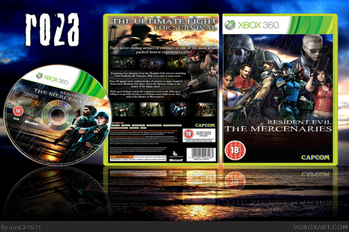
Hey guys. Been working on this all morning. Was SUPPOSED to do English work but fuck it. Most of the renders and images I made myself, except the Jill/Chris, Josh, Wesker and Leon/Krauser renders which I got off Google so I cant give specific names for credit but credit to those who made the renders and partial credit to Indexenos for the disc template. Not much else to say except enjoy!
I like the idea, but a couple things I noticed in full view, on the front:
1) The artwork is pretty blurry, and a little difficult to look at. 2) My biggest concern is the drastic difference in color and lighting between characters. The two center chars have high contrast and a strong blue tone, while everyone else is generally unchanged and bland in comparison. 3) My last issue with the front, is having drop shadows against a sky background. It looks strange to me.
On the back, something about the arrangement I really do like, and translates the idea of an action-packed multiplayer game quite well. Again, clearing up the blurriness issue, and maybe a more interesting font type, and it'd be much improved.
#4 yeah i kinda see alot of that now. the monitors at college are pretty low res so I miss alot of those little things. ill try and fix as much of it as I can tomorrow. thanks forpointing it out! :3
The biggest issue I have with this design is the lighting of each render in the front; it's not consistent, and the contrast/color clashes with each other. The lighting of Chris, Claire, HANK, and Wesker are noteworthy of this. You should try to use a certain color scheme so that the design looks neatly put together, and maybe darken HANK and Wesker to give the illusion of depth that they are far away, or something like that.
The back is organized really well though. However, I really don't like the drop shadow on the tagline to be quite honest.
Overall, not bad. You may need to work with the colors of the renders to get the desired effect of the design, but I like the concept you tried going for.
#6 yeah, i tried to have a crack at the lighting issuses but had no luck. I did hangehe Criss/Jill render on the front though. For some reason the box is not updateing right now but probably a good thing. gives me the chance to take your ideas into account. and the HUNK and Wesker renders arent really meant to be far away just there to stand out. ill have a go at some of your ideas and see if i can figure out any way to make the colour scheme more inkeeping. and i had to use the glow on the tagline otherwise most of it became illegible due to the white in the explosion. thanks though man, some great ideas i can have a crack at!
Oh and thanks SpyPilot! You are my 1000th favouritee! *Special Cookie*
Last time I tried a comment edit didnt work so I'm gonna hav eto re-post.
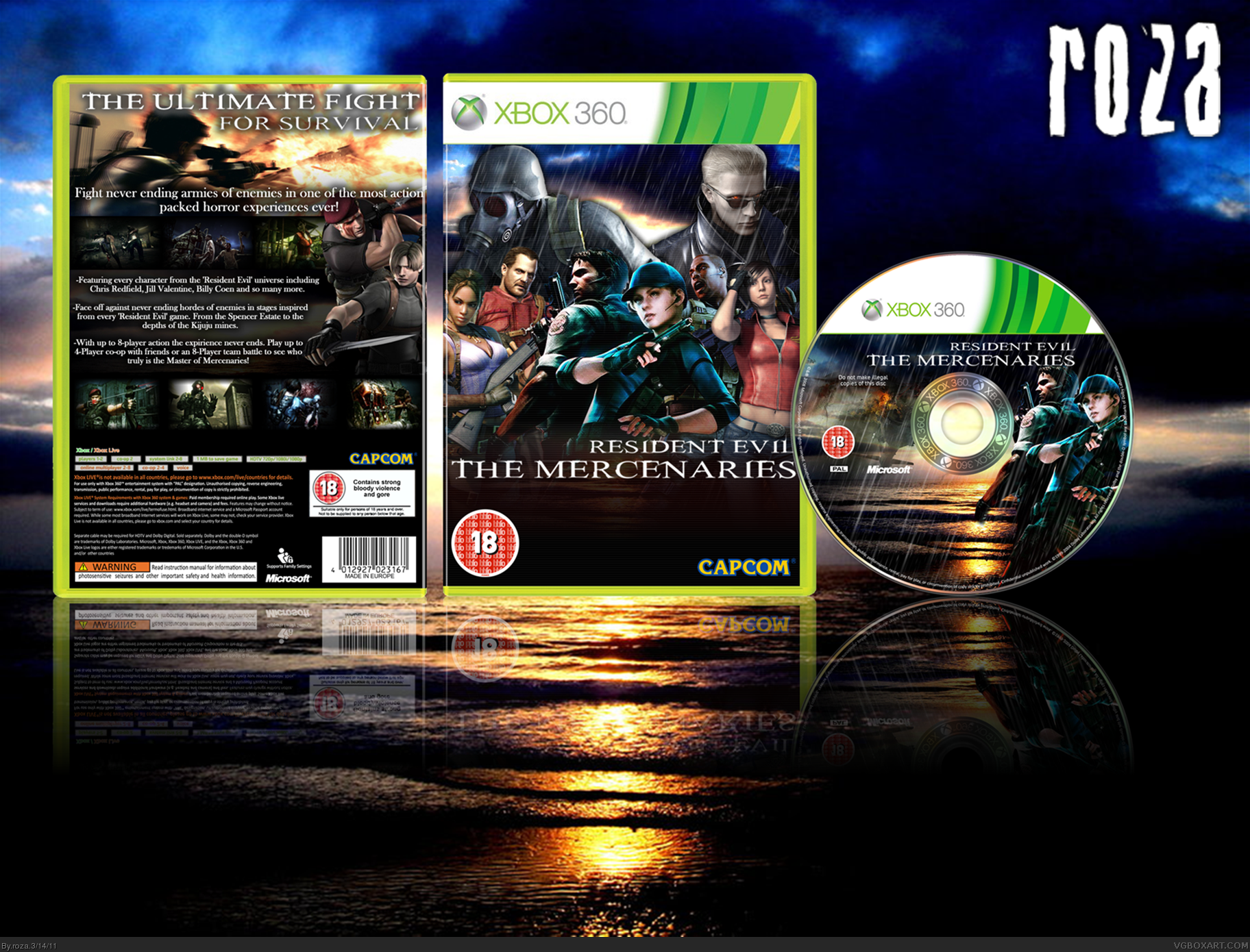
OK I got the update to work. Turns out updates can't be 6mb+ so I had to do some resizeing on Paint. The Chris and Jill Renders are my own, changed the layout set up, added some more effects to the disc and removed the glow behind HUNK and Wesker.
#19 I'm not sure man. I used DaFont.com and printscreened the text cause I did it at college and they have blocks on downloading or installing new software including fonts. I think it was in Modern Gothic so search through untill you find it. The info text is just a standard pre set font though
 Resident Evil: The Mercenaries Box Cover Comments
Hey guys. Been working on this all morning. Was SUPPOSED to do English work but fuck it. Most of the renders and images I made myself, except the Jill/Chris, Josh, Wesker and Leon/Krauser renders which I got off Google so I cant give specific names for credit but credit to those who made the renders and partial credit to Indexenos for the disc template. Not much else to say except enjoy!
[ Reply ]
Pretty cool
;)
[ Reply ]
#3 Thanks :)
Oh and I nearly forgot; Credit to Eggboy for the rain!
[ Reply ]
I like the idea, but a couple things I noticed in full view, on the front:
1) The artwork is pretty blurry, and a little difficult to look at. 2) My biggest concern is the drastic difference in color and lighting between characters. The two center chars have high contrast and a strong blue tone, while everyone else is generally unchanged and bland in comparison. 3) My last issue with the front, is having drop shadows against a sky background. It looks strange to me.
On the back, something about the arrangement I really do like, and translates the idea of an action-packed multiplayer game quite well. Again, clearing up the blurriness issue, and maybe a more interesting font type, and it'd be much improved.
[ Reply ]
#4 yeah i kinda see alot of that now. the monitors at college are pretty low res so I miss alot of those little things. ill try and fix as much of it as I can tomorrow. thanks forpointing it out! :3
[ Reply ]
The biggest issue I have with this design is the lighting of each render in the front; it's not consistent, and the contrast/color clashes with each other. The lighting of Chris, Claire, HANK, and Wesker are noteworthy of this. You should try to use a certain color scheme so that the design looks neatly put together, and maybe darken HANK and Wesker to give the illusion of depth that they are far away, or something like that.
The back is organized really well though. However, I really don't like the drop shadow on the tagline to be quite honest.
Overall, not bad. You may need to work with the colors of the renders to get the desired effect of the design, but I like the concept you tried going for.
[ Reply ]
#6 yeah, i tried to have a crack at the lighting issuses but had no luck. I did hangehe Criss/Jill render on the front though. For some reason the box is not updateing right now but probably a good thing. gives me the chance to take your ideas into account. and the HUNK and Wesker renders arent really meant to be far away just there to stand out. ill have a go at some of your ideas and see if i can figure out any way to make the colour scheme more inkeeping. and i had to use the glow on the tagline otherwise most of it became illegible due to the white in the explosion. thanks though man, some great ideas i can have a crack at!
Oh and thanks SpyPilot! You are my 1000th favouritee! *Special Cookie*
[ Reply ]
Last time I tried a comment edit didnt work so I'm gonna hav eto re-post.
OK I got the update to work. Turns out updates can't be 6mb+ so I had to do some resizeing on Paint. The Chris and Jill Renders are my own, changed the layout set up, added some more effects to the disc and removed the glow behind HUNK and Wesker.
[ Reply ]
I don;t like all the black space on the front, and there seems to be too many renders.
Front - 6/10
Back - 8/10
The back is done well.
[ Reply ]
The front's nice, but the back could be better :$
Still a good worthy of a small Fav' though :')
[ Reply ]
Nice job, I really like the back.
[ Reply ]
#9-11 Thanks :3
It's weird. I felt that the back was the weakest part and yet near enough everyone seems to love it...
[ Reply ]
Not bad...
[ Reply ]
I missed this...
Anyway the back is great, the front could be improved (the emptiness at the bottom bothers me). Other then that good job.
+fav
[ Reply ]
One thing I'd suggest is having everyone on the front tinted the same color. Perhaps the icy blue that already can be found on Jill.
[ Reply ]
#15 hmm. if i can find the spare time ill give it a whirl. never been good at re-colouring but ill try
[ Reply ]
#6, I agree
[ Reply ]
Me gusta. : )
[ Reply ]
what type of text did you use for the back and headline?
[ Reply ]
#19 I'm not sure man. I used DaFont.com and printscreened the text cause I did it at college and they have blocks on downloading or installing new software including fonts. I think it was in Modern Gothic so search through untill you find it. The info text is just a standard pre set font though
[ Reply ]