*If you're going to view, please do so in FULL AND PRINTABLE for best quality*
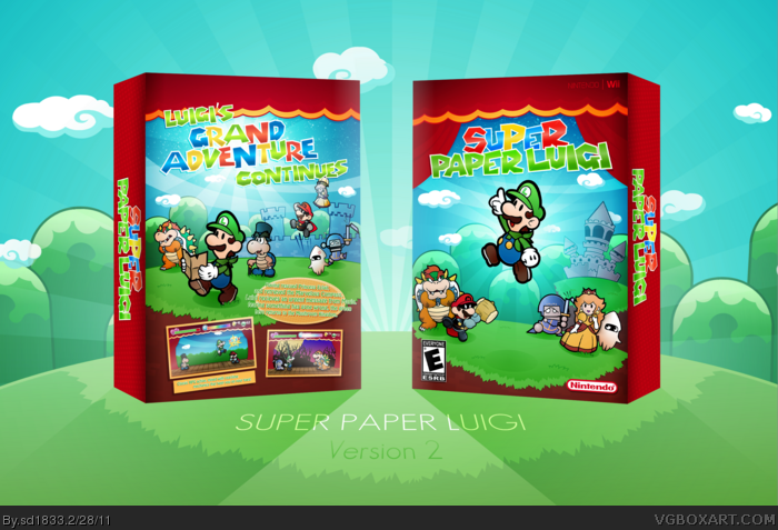
The amount of time that went into this design is... substantial to say the least. It started when LooseJuice suggested I try my hand at a Nintendo-themed case. I felt it was the perfect opportunity to return to the Paper Luigi "series" with a sequel, and this is the result!
The idea behind the game is relatively simple. Essentially taking story elements from Super Paper Mario (Mario taking Luigi's place as Mr. L to Mr. M for example), although it'd largely be it's own game, rather than a simple character switch.
I really enjoyed making this, especially since it's been over a year since my last effort in a more light-hearted, Mario-style case. Comments and critique are, of course, always welcome. Thanks guys. :D
I like it!! But I prefer your Paper Luigi box a looott more. I got some critiques :)
FRONT:
1) The logo is too colorful and rainbow-y! Its white edges don't really match the rest of the box either, with the thick black outlines and all. It looks out of place. If you could make a logo that looked more like the real Super Paper Mario logo, but really luigi-themed, that would be nice.
2) It bothers me that Luigi isn't really in the center, but kinda shifted to the left. He's also a bit high to be centered vertically.
3) The jumping lines under Luigi don't look tooo great. I don't like the idea of showing motion on the box. It would be better without that, because its obvious he's jumping anyway and it doesn't look very attractive.
4) Luigi has no shadow.
5) I wish everything matched the same artstyle, but its inconsistent. The hills, theater curtains, and logo have no thick black outlines while the castle and characters do.
Everything else on the front looks great. I hope you can fix these things. Now, moving on to the back.
BACK:
1) See #1 on the critiques for the front.
2) I'm not a fan of how contrasted Luigi looks. For some reason, he seems better lit on the front (even if they are the same). His hair is just too black and his skin too white.
3) The description text is kinda hard to read, the way it blends in so much. I also think it would look better in some kinda box rather than on the grass like that.
4) See #5 on critiques for the front.
I in no way hate the box (I favorited it, didn't I?). These are just little things that if fixed, would make a huuge difference. :)
#6: Thanks, so much for the in-depth critique. Looking at it again, the contrasts and motion lines on Luigi are a bit strange. And try to find a new way to present the synopsis. As for the art style, I choose the more simplistic strokes to give it a cleaner look. Everything outlined in black looked a bit much when I tried it.
#7: I'm glad, thank you.
#8: I understand your views on the tagline. As I've mentioned before, I have a thing for really bright, vibrant colors. I may tone it down a little, but I personally like the colors.
#12: Facing in the same direction? Not sure what you mean exactly, but I appreciate the kind words.
#14: It varies, depending on what you're looking at. A lot of the characters were heavily edited (Mr. M), while others were I essentially made from scratch (front Luigi) since there were no proper images of him in that pose. The logo was custom, and I made certain aspects of the environment.
I'll work on an update later today. Adding darker strokes around the edges of the environment, adjusting the lighting on Luigi, and find a new way to present the synopsis. Thanks guys.
Alright, I've updated this. Through my own skills I wasn't able to correct all issues YoshiStar mentioned, some looked quite awful when I tried them myself. I did fix the lighting on Luigi, made the synopsis more legible/stylish, and adjusted the colors a bit. I tried adding some thick, dark strokes around the environment, but it seriously didn't fit well at all. And I decided to keep the tagline/logo as they are, as I personally like them.
#16: I just didn't know if you meant through the design itself or the presentation. Still, thanks for your previous comment.
One thing I dont like is the bright colors. The font colors are so bright that they almost blend in with the background. You should use satin on them. Do an overlay with black. Should make them alot more visible.
Thanks everyone, for the comments, critique and the Hall entry as well.
#25: I can see the resemblance, and I'll take that as a compliment. Thanks, it's nice to get approval from seemingly the biggest Mario fan on the site.
 Super Paper Luigi Box Cover Comments
Sexy
[ Reply ]
*If you're going to view, please do so in FULL AND PRINTABLE for best quality*
The amount of time that went into this design is... substantial to say the least. It started when LooseJuice suggested I try my hand at a Nintendo-themed case. I felt it was the perfect opportunity to return to the Paper Luigi "series" with a sequel, and this is the result!
The idea behind the game is relatively simple. Essentially taking story elements from Super Paper Mario (Mario taking Luigi's place as Mr. L to Mr. M for example), although it'd largely be it's own game, rather than a simple character switch.
I really enjoyed making this, especially since it's been over a year since my last effort in a more light-hearted, Mario-style case. Comments and critique are, of course, always welcome. Thanks guys. :D
#1: Thanks for the quick reply.
[ Reply ]
Reminds me of a YoshiStar box, in a good way.
[ Reply ]
#3: Thanks, and YoshiStar's work was an inspiration for me. I hope it doesn't come off as a copy or something, though.
[ Reply ]
Love it.
[ Reply ]
I like it!! But I prefer your Paper Luigi box a looott more. I got some critiques :)
FRONT:
1) The logo is too colorful and rainbow-y! Its white edges don't really match the rest of the box either, with the thick black outlines and all. It looks out of place. If you could make a logo that looked more like the real Super Paper Mario logo, but really luigi-themed, that would be nice.
2) It bothers me that Luigi isn't really in the center, but kinda shifted to the left. He's also a bit high to be centered vertically.
3) The jumping lines under Luigi don't look tooo great. I don't like the idea of showing motion on the box. It would be better without that, because its obvious he's jumping anyway and it doesn't look very attractive.
4) Luigi has no shadow.
5) I wish everything matched the same artstyle, but its inconsistent. The hills, theater curtains, and logo have no thick black outlines while the castle and characters do.
Everything else on the front looks great. I hope you can fix these things. Now, moving on to the back.
BACK:
1) See #1 on the critiques for the front.
2) I'm not a fan of how contrasted Luigi looks. For some reason, he seems better lit on the front (even if they are the same). His hair is just too black and his skin too white.
3) The description text is kinda hard to read, the way it blends in so much. I also think it would look better in some kinda box rather than on the grass like that.
4) See #5 on critiques for the front.
I in no way hate the box (I favorited it, didn't I?). These are just little things that if fixed, would make a huuge difference. :)
[ Reply ]
#4, In no way does it look like a copy.
[ Reply ]
Love it! I'm not a fan of the logo (and the tagline) though, they are a bit too bright and shiny.
[ Reply ]
Matthew you never dissapoint. Everything about your designs has been clean and sleek, I am glad I author favorited you long ago.
[ Reply ]
#6: Thanks, so much for the in-depth critique. Looking at it again, the contrasts and motion lines on Luigi are a bit strange. And try to find a new way to present the synopsis. As for the art style, I choose the more simplistic strokes to give it a cleaner look. Everything outlined in black looked a bit much when I tried it.
#7: I'm glad, thank you.
#8: I understand your views on the tagline. As I've mentioned before, I have a thing for really bright, vibrant colors. I may tone it down a little, but I personally like the colors.
#9: Thanks Jesse. I appreciate it.
[ Reply ]
luigi is awesome and so are you.
nintendo totally need to make a game like this.
[ Reply ]
The back and The front look towards one direction, I don't know, just look weird. Anyway, I love this box. :D
[ Reply ]
I love this, but I don't like how the word Super is rainbow. It's unnecessary.
[ Reply ]
Right quick, is any/all of this custom?
[ Reply ]
#12: Facing in the same direction? Not sure what you mean exactly, but I appreciate the kind words.
#14: It varies, depending on what you're looking at. A lot of the characters were heavily edited (Mr. M), while others were I essentially made from scratch (front Luigi) since there were no proper images of him in that pose. The logo was custom, and I made certain aspects of the environment.
I'll work on an update later today. Adding darker strokes around the edges of the environment, adjusting the lighting on Luigi, and find a new way to present the synopsis. Thanks guys.
[ Reply ]
#15, lol, my bad English, never mind...
[ Reply ]
This is top stuff.
[ Reply ]
It's beautiful.
I'm so glad I can finally author-fav you.
[ Reply ]
this some awesome work. keep it up.
[ Reply ]
Alright, I've updated this. Through my own skills I wasn't able to correct all issues YoshiStar mentioned, some looked quite awful when I tried them myself. I did fix the lighting on Luigi, made the synopsis more legible/stylish, and adjusted the colors a bit. I tried adding some thick, dark strokes around the environment, but it seriously didn't fit well at all. And I decided to keep the tagline/logo as they are, as I personally like them.
#16: I just didn't know if you meant through the design itself or the presentation. Still, thanks for your previous comment.
#17-19: Thanks alot, guys.
[ Reply ]
One thing I dont like is the bright colors. The font colors are so bright that they almost blend in with the background. You should use satin on them. Do an overlay with black. Should make them alot more visible.
[ Reply ]
#21: Did you look at the printable? All text is perfectly visible in high-resolution.
[ Reply ]
looks similar to your Paper Luigi Marvelous Compas box (it showed up as a Random MW box right next to this) but I still love it! great work!
[ Reply ]
I love the Bloopers' face.
Although I do not like the logo and tagline, this is extremely well done =)
[ Reply ]
I thought for sure this was a Yoshistar box. It has his type of lighting and style. Anyway, this is seriously fantastic! One of your best!
[ Reply ]
Thanks everyone, for the comments, critique and the Hall entry as well.
#25: I can see the resemblance, and I'll take that as a compliment. Thanks, it's nice to get approval from seemingly the biggest Mario fan on the site.
[ Reply ]
where did you paint
[ Reply ]
i love it where did you paint
[ Reply ]