nomoononfront [ Buy Final Fantas... at Amazon ] By Sarashi 46 on February 22nd, 2011 No Printable Available Final Fantasy Versus XIII Box Cover Comments Comment on Sarashi's Final Fantasy Versus XIII Box Art / Cover. Cancel Reply Sarashi 46 [ 1 decade ago ] Credit to Master_General for the template, Sens for the 3D Plastic. [ Reply ] amad2 30 [ 1 decade ago ] This is awesome but the back is a little plain and that blur on the screenshots doesnt look good. [ Reply ] sd1833 48 [ 1 decade ago ] Not bad, but still suffers from familiarity, from your previous FF cases. You tend to do very well when branching out to different games, considering your Portal and RS2 cases were some of your best yet. [ Reply ] Sarashi 46 [ 1 decade ago ] #3, I was thinking that exactly when I looked at it just now. [ Reply ] tleeart 45 [ 1 decade ago ] Looks very slick and official. [ Reply ] Unknown Flames 33 [ 1 decade ago ] Looks really official, I love the layout on the back. [ Reply ] White_Dove 38 [ 1 decade ago ] Looks great, just needs some uniqueness. :p I like the back and don't really mind the blur on the screenshots, it looks nice. ~NF [ Reply ] Box 34 [ 1 decade ago ] You did a good job given the limited material. However, I think the front is way too dark, and it makes the logo look really out of place. [ Reply ]
 Final Fantasy Versus XIII Box Cover Comments
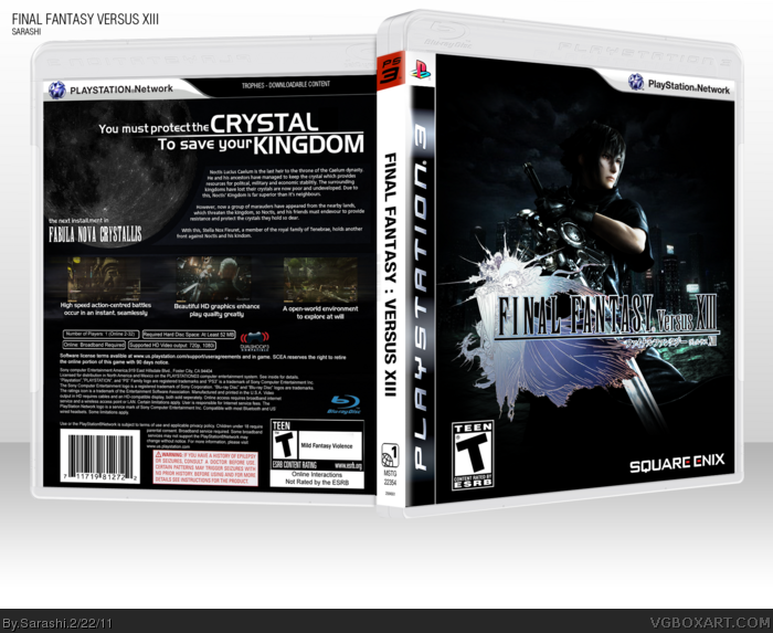
Credit to Master_General for the template,
Sens for the 3D Plastic.
[ Reply ]
This is awesome but the back is a little plain and that blur on the screenshots doesnt look good.
[ Reply ]
Not bad, but still suffers from familiarity, from your previous FF cases. You tend to do very well when branching out to different games, considering your Portal and RS2 cases were some of your best yet.
[ Reply ]
#3, I was thinking that exactly when I looked at it just now.
[ Reply ]
Looks very slick and official.
[ Reply ]
Looks really official, I love the layout on the back.
[ Reply ]
Looks great, just needs some uniqueness. :p
I like the back and don't really mind the blur on the screenshots, it looks nice.
~NF
[ Reply ]
You did a good job given the limited material. However, I think the front is way too dark, and it makes the logo look really out of place.
[ Reply ]