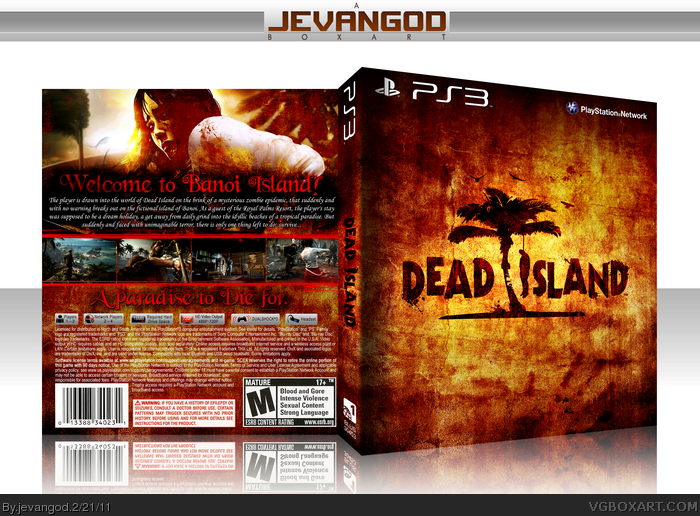
My new box. I really love working with Textures now. I love the way they come out. Not much artwork was released so I used what I had. I wanted to make the front have a dark feeling, after all there is someone hanging themselves in the logo. I also added a bloody hand print on the front. The font I used on the back I thought is perfect. Its sort of a mix between Alice in Wonderland and a grunge font. I wanted the font to mean something. Like this isnt your ordinary Island. Your in an evil wonderland. So I hope you guys like it.
#5, IDK. I actually like it. Its suppose to be a resort, and they are usually fancy. Thats the feeling I want this box to have. Grunge, but still have a little bit of the resort feeling still with in it.
The only problem I see with the synopsis font is the swirly-curls. I thought it looked bizarre before I identified the problem and realized what you were going for. I'd say good work but there isn't a whole lot going. The texture and color work is nice given the limited resources. But once again, the back is very typical looking. Saying you just don't make exciting back layouts isn't good enough. You are more than capable of making something more than the usual. It's kind of frustrating to be honest. :/
Idk how i feel about this one. I usually love your boxes and without question ur awesome. I wish u made this with a lighter theme to it. Its too dArk and grungy. Dead island is different from every other zombie game because of the atmosphere feel it has. Suposed to be a bright theme and still have the feeling of death. Wish u went in that direction. Still a kickass box, but i think it has too much of a feeling like ever other zombie game.
Curious as to what you can do with covers when art for these games actually come out, for instance, Tomb Raider, Uncharted 3, etc.
You're probably going to end up making a second cover for each of these games once more art is released. Not waiting long enough can have some of them looking kind of uninspired. Decent job here though.
#14, Actually no. It depends on the artwork. I had enough artwork to make a descent boxart and thats what I did. I went for descent. Nothing too big or extreme. Just getting use to using textures.
I've got mixed feelings in regards to the font on the back, i think a bold grunge typeface could have worked better, however its not like its spoiling it as it works with your whole "resort feeling" concept. Overall though i like it, colour burnt effect on the front and all.
As usual, kick ass work.
On another note, i cannot wait for this game to come out, it looks like something pretty special from the trailer.
Nice work, considering the lack of artwork I have to say the texturing is pretty damn good and gives it an old, dark tone that sets the game up perfectly.
 Dead Island Box Cover Comments
My new box. I really love working with Textures now. I love the way they come out. Not much artwork was released so I used what I had. I wanted to make the front have a dark feeling, after all there is someone hanging themselves in the logo. I also added a bloody hand print on the front. The font I used on the back I thought is perfect. Its sort of a mix between Alice in Wonderland and a grunge font. I wanted the font to mean something. Like this isnt your ordinary Island. Your in an evil wonderland. So I hope you guys like it.
[ Reply ]
just make sure you don't overuse working with textures...
[ Reply ]
this box is to die for.....
[ Reply ]
#2, Im not. It just seemed to work well with my last two boxes. I use textures on all my boxes, but not as much as I do like on my last two.
[ Reply ]
Dang, beat me to it. :P
Nice box, not sure I like the synopsis font though.
[ Reply ]
#5, IDK. I actually like it. Its suppose to be a resort, and they are usually fancy. Thats the feeling I want this box to have. Grunge, but still have a little bit of the resort feeling still with in it.
[ Reply ]
The only problem I see with the synopsis font is the swirly-curls. I thought it looked bizarre before I identified the problem and realized what you were going for. I'd say good work but there isn't a whole lot going. The texture and color work is nice given the limited resources. But once again, the back is very typical looking. Saying you just don't make exciting back layouts isn't good enough. You are more than capable of making something more than the usual. It's kind of frustrating to be honest. :/
[ Reply ]
Idk how i feel about this one. I usually love your boxes and without question ur awesome. I wish u made this with a lighter theme to it. Its too dArk and grungy. Dead island is different from every other zombie game because of the atmosphere feel it has. Suposed to be a bright theme and still have the feeling of death. Wish u went in that direction. Still a kickass box, but i think it has too much of a feeling like ever other zombie game.
[ Reply ]
Wow! The brushes you have used are very effictive, but the tagline blends in with the orange too much.
[ Reply ]
This box is cool, but these effects used too much.
[ Reply ]
as there's mostly only the logo on the front, i don't think the effect is overused. and i really like the back
[ Reply ]
lol, that's the stone texture I gave you. Isn't it?
[ Reply ]
#12, One of them. You gave me two.
[ Reply ]
Curious as to what you can do with covers when art for these games actually come out, for instance, Tomb Raider, Uncharted 3, etc.
You're probably going to end up making a second cover for each of these games once more art is released. Not waiting long enough can have some of them looking kind of uninspired. Decent job here though.
[ Reply ]
#14, Actually no. It depends on the artwork. I had enough artwork to make a descent boxart and thats what I did. I went for descent. Nothing too big or extreme. Just getting use to using textures.
[ Reply ]
I've got mixed feelings in regards to the font on the back, i think a bold grunge typeface could have worked better, however its not like its spoiling it as it works with your whole "resort feeling" concept. Overall though i like it, colour burnt effect on the front and all.
As usual, kick ass work.
On another note, i cannot wait for this game to come out, it looks like something pretty special from the trailer.
[ Reply ]
Printable added!!!!!
[ Reply ]
Great texture and colors. I like the front especially.
[ Reply ]
I love it! Though I think it would be awesome if "die" was in a different font. :D
[ Reply ]
#19, I don't think the font is that bad. Yea, I think I could of found a better font, but the font isn't all that bad.
[ Reply ]
Nice work, considering the lack of artwork I have to say the texturing is pretty damn good and gives it an old, dark tone that sets the game up perfectly.
Nice work as always. :)
[ Reply ]
Very simple cover, only one texture in all and one picture. Texture is good but other elements not. But this is only my opinion.
[ Reply ]
#22, lol. One texture? More like 6 piled on with grunge brushes.
[ Reply ]
This would looks a lot better if i didn't feel like i was looking at another Resident Evil 5 boxart.. it's okay though.
[ Reply ]