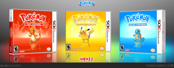
Anyways, the Nintendo-logo is not the real one. They changed it some years ago and it's gray now and the white 3DS-box seems a bit more wide on the real package.
I agree with Wasa-bi. It's very simple, but it's also really nice looking. I definitely like the fact that they're all very uniform but also have their individual features that add flare without disrupting the theme or pattern.
I really like them, and I might end up favoriting before all is said and done.
Thanks for the favs. & there were two reasons I redesigned the logo, one because I wanted a logo that matched all 3 boxes, and two is I dont really care for the yellow/blue combo in the real logo. It was actually when I messed around and made the blue logo, I thought hmm I want to make a box using this lol. It was originally going to just be blue version then I decided it would be cooler to do all 3 (and that way I didn't have to make a back! I hate making backs)
I usually don't fav boxes without a back but this is just so simple and so beautiful that it made me smile and live some nostalgia. And I think thats at least worth a fav.
This is great. I love how you incorporated the different elements of the Pokemon in the background, as well as make the logo's blend in with it. Like Wasa-Bi said, it's simple, but it works. Faved!
Doesn't look like anything special, really. I feel you put quantity over quality.
The reflections are really quite off on each Pokemon, and without any sort of transparency, it doesn't actually look like a reflection at all. The plastic template is very low-quality. How each element is faded is also very abrupt, and while not too noticeable on the Yellow and Blue versions, the flames look strange on the Red version.
Alright I was able to find them, and added the printable. But when I made it I'm not sure it was the right dimensions, and I didn't make a back for any of them, and only created a spine for the Red Version
looks rubbish. So babyish, kids don't want weak looking characters with a dumb smile on their face. They want huge, powerful monsters with superpowers blowing fire out their asses. grow some balls nintendo!! whats with all this baby Sh*t??? Your older stuff was the best. Rant over.. lol
 Pokemon Red, Yellow, & Blue Box Cover Comments
Credit goes to Ninty for the template, well only the side part on Blue Version is what I used from it but still.
[ Reply ]
Not sure about the changed colors at the Pkémon-logos but I can see what you were aiming for and it sure is working. Simple, but working.
Anyways, the Nintendo-logo is not the real one. They changed it some years ago and it's gray now and the white 3DS-box seems a bit more wide on the real package.
[ Reply ]
I agree with Wasa-bi. It's very simple, but it's also really nice looking. I definitely like the fact that they're all very uniform but also have their individual features that add flare without disrupting the theme or pattern.
I really like them, and I might end up favoriting before all is said and done.
[ Reply ]
#2, I don't understand the gray logo.
[ Reply ]
Really awesome job man, looks great.
[ Reply ]
This box proves that simple Pokémon boxes work when they're done properly.
[ Reply ]
Pure.
[ Reply ]
Thanks for the favs. & there were two reasons I redesigned the logo, one because I wanted a logo that matched all 3 boxes, and two is I dont really care for the yellow/blue combo in the real logo. It was actually when I messed around and made the blue logo, I thought hmm I want to make a box using this lol. It was originally going to just be blue version then I decided it would be cooler to do all 3 (and that way I didn't have to make a back! I hate making backs)
[ Reply ]
I usually don't fav boxes without a back but this is just so simple and so beautiful that it made me smile and live some nostalgia. And I think thats at least worth a fav.
[ Reply ]
The second I saw this I thought HoF.
[ Reply ]
I don't see anything special here honestly. It's just three renders on different colored BGs and different colored logos.
[ Reply ]
Very sleek, simple and clean. It deserves a fav.
[ Reply ]
EDIT: What font do you use for your Username logo?
[ Reply ]
#13, This one link
[ Reply ]
This is great. I love how you incorporated the different elements of the Pokemon in the background, as well as make the logo's blend in with it. Like Wasa-Bi said, it's simple, but it works. Faved!
[ Reply ]
I wish.
[ Reply ]
Doesn't look like anything special, really. I feel you put quantity over quality.
The reflections are really quite off on each Pokemon, and without any sort of transparency, it doesn't actually look like a reflection at all. The plastic template is very low-quality. How each element is faded is also very abrupt, and while not too noticeable on the Yellow and Blue versions, the flames look strange on the Red version.
[ Reply ]
Orgasmic :D I especially love the mirror effect; good job!
[ Reply ]
Great Box Art!!
[ Reply ]
Really Simple, yet really good. + Fav
[ Reply ]
This box art is the reason that I joined this web-site.
[ Reply ]
dude.....YES! I would love if they remade this.
[ Reply ]
PS. Printable please?
[ Reply ]
I'm not sure if I still have the printables.. I'll check though
[ Reply ]
Alright I was able to find them, and added the printable. But when I made it I'm not sure it was the right dimensions, and I didn't make a back for any of them, and only created a spine for the Red Version
[ Reply ]
@Wenis good on ya, it looks great!
[ Reply ]
Well deserved
[ Reply ]
I agree
[ Reply ]
Thanks! My second HoF box ever.. so happy
[ Reply ]
about damn time! congrats man
[ Reply ]
These one of the best boxes ever to be on VGBA! In fact, the first VGBA box I ever saw! Thanks Wenis!
[ Reply ]
Very lovely Wenis. A true masterpiece. I really love it.
[ Reply ]
Thanks!
[ Reply ]
looks rubbish. So babyish, kids don't want weak looking characters with a dumb smile on their face. They want huge, powerful monsters with superpowers blowing fire out their asses. grow some balls nintendo!! whats with all this baby Sh*t??? Your older stuff was the best. Rant over.. lol
[ Reply ]
ahh this is fan art lool my bad. Use it as constructive criticism ;)
[ Reply ]