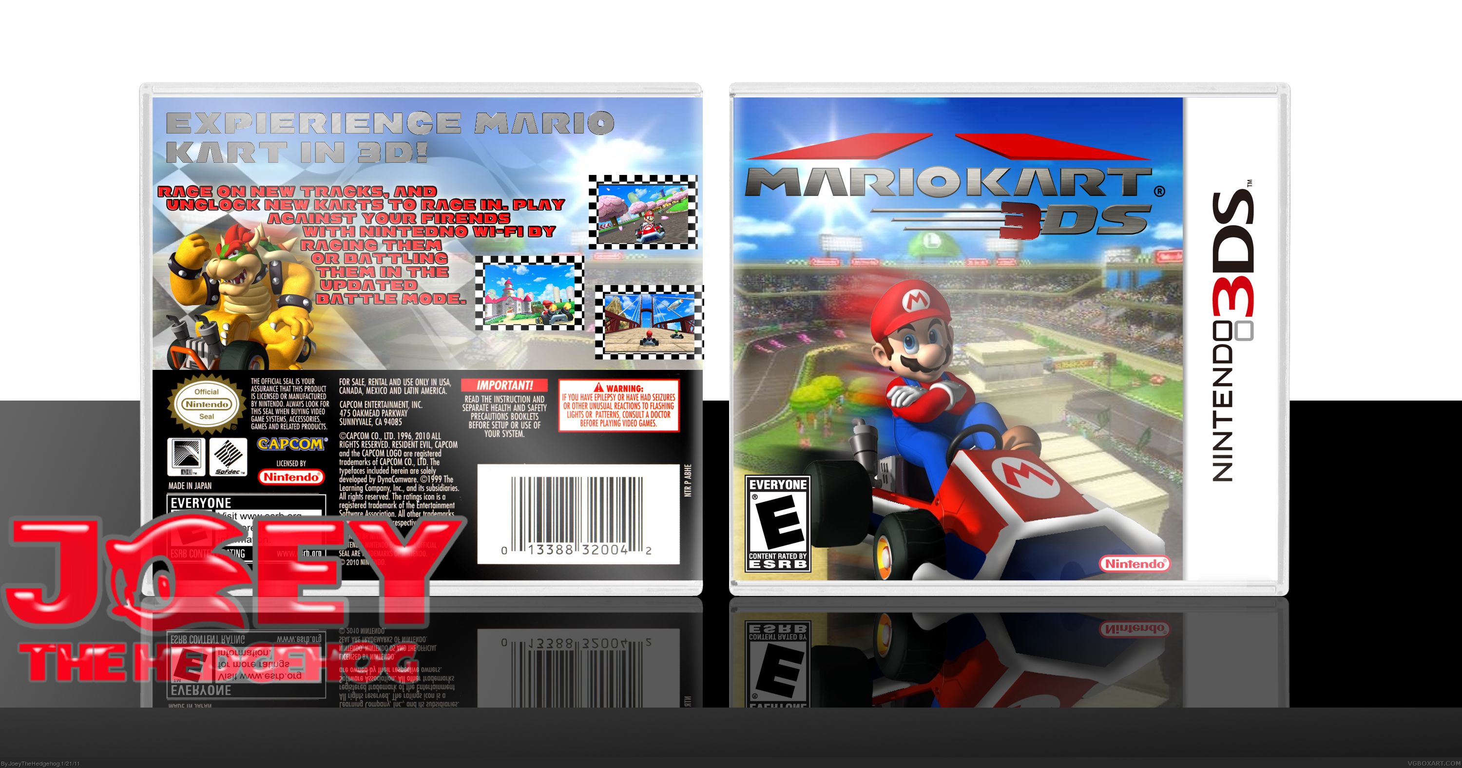
This needs a lot of work. One of the first things I noticed was the logo. The added 3 really looks awful. You could have made an official looking one fairly easy by editing the D or S into a 3. Another is the layout of the front. Mario is just kinda floating there above the track. It doesn't look too bad, but it's a little generic for a kart racing box. The back is quite a bit better, but the description text sticks out a lot, and the font/color doesn't go with the rest of the box. It's a nice attempt, but with some more work this could be a lot better.
I agree with spiderpig24 on the majority of things here. Firstly, yeah, the logo is really bad. The 3 sticks out like a sore thumb, sorry. Try going into one of the request threads in the forums, like stevencho's, if you are unable to do this yourself. Secondly, that background, of both front and back, is really blurry. Terribly so. You should either change the background, or shrink the box so that the background will fit better without being stretched. The mario isn't very well rendered-there is a faint white line running around him. Try fixing that up too. The layout of the front, as spiderpig said, lacks originality and makes no sense. Why is mario randomly shooting across the middle of the track? The motion blur looks really bad also.
The back has a decent layout, it just doesnt have the looks that you might have hoped for. This is because none of the colours go together and it all looks kind of sloppy. Add a stroke (outline) to the tagline to make it more visible. You should change the synopsis to a font that has uppercase and lowercase, and to a single colour, maybe with a stroke or drop shadow. You want the synopsis to be readable and neat. Finally, move the middle screenshot up so it actually is centred vertically.
Sorry, all these suggestions might sound tedious, but they are all improvements that could make this box better.
 Mario Kart 3DS Box Cover Comments
Wanted to make a 3DS box, so here it is. I made the kart that mario uses on ds into the one from the 3ds. Enjoy.
~Credit~
Template-jevangod
Logo, Borders-me
[ Reply ]
This needs a lot of work. One of the first things I noticed was the logo. The added 3 really looks awful. You could have made an official looking one fairly easy by editing the D or S into a 3. Another is the layout of the front. Mario is just kinda floating there above the track. It doesn't look too bad, but it's a little generic for a kart racing box. The back is quite a bit better, but the description text sticks out a lot, and the font/color doesn't go with the rest of the box. It's a nice attempt, but with some more work this could be a lot better.
[ Reply ]
#2, could you give me some suggestions on what font for the back, and maybe a logo?
[ Reply ]
Try to add some more characters to the front...
[ Reply ]
I agree with spiderpig24 on the majority of things here. Firstly, yeah, the logo is really bad. The 3 sticks out like a sore thumb, sorry. Try going into one of the request threads in the forums, like stevencho's, if you are unable to do this yourself. Secondly, that background, of both front and back, is really blurry. Terribly so. You should either change the background, or shrink the box so that the background will fit better without being stretched. The mario isn't very well rendered-there is a faint white line running around him. Try fixing that up too. The layout of the front, as spiderpig said, lacks originality and makes no sense. Why is mario randomly shooting across the middle of the track? The motion blur looks really bad also.
The back has a decent layout, it just doesnt have the looks that you might have hoped for. This is because none of the colours go together and it all looks kind of sloppy. Add a stroke (outline) to the tagline to make it more visible. You should change the synopsis to a font that has uppercase and lowercase, and to a single colour, maybe with a stroke or drop shadow. You want the synopsis to be readable and neat. Finally, move the middle screenshot up so it actually is centred vertically.
Sorry, all these suggestions might sound tedious, but they are all improvements that could make this box better.
[ Reply ]
#5, thanks, I'll get on that now.
[ Reply ]
The only real problem is the 3, but everything else looks ok!
[ Reply ]
Box update not working, just click version 1.
[ Reply ]
im unbanned? yay?
[ Reply ]
#9, Don't spam.
[ Reply ]
hey, #5, the front's not HORRIBLE. But it does need some fixing up. the back is pretty cool.
[ Reply ]