This box was made only for an empty case I had. And yes it is pretty bad. But I thought there might be something to it. Plus I have not had much time for anything lately. (my life is pretty much sucking) but yeah. ... Tell me what it needs. ... No worries I'm making more boxes soon. (I hope)
#1, If you think it's "pretty bad," why not post it in the WIP first?
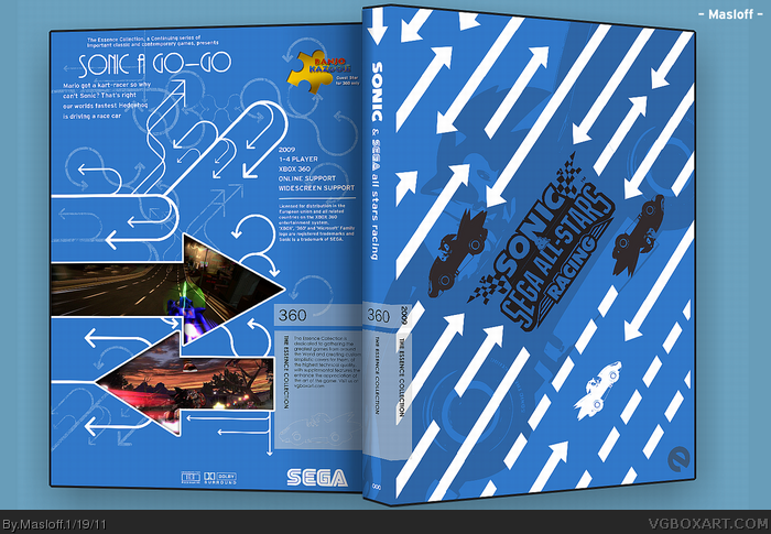
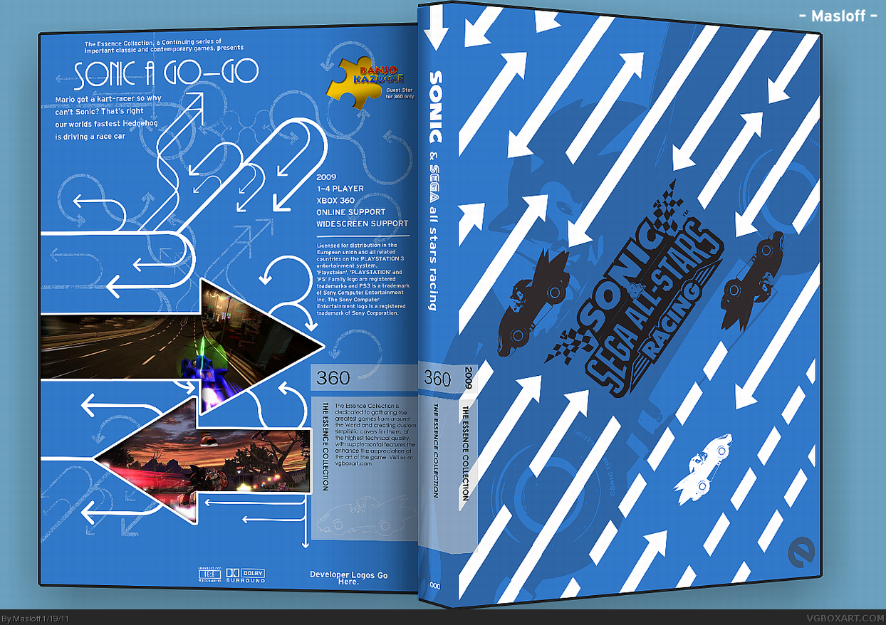
Having said that, I really like it. The front has a lot going on yet is simple at the same time. It does a great idea of representing a racing game (specifically speed). I like all of the curved arrows on the back. To me they represent the turns and confusion of a rally course.
What I don't like, is that it appears incomplete (Developer Logos Here). Also, I wouldn't mention Mario specifically by name on an Xbox product.
I'd be happy to fav this box if it were finished. It's really good.
A really unique way to show the series and it definitely defines its "essence" :) I really like this box and its a really good idea. Hope it gets well. +fav +auth fav.
 Sonic & Sega All-Star Racing Box Cover Comments
This box was made only for an empty case I had. And yes it is pretty bad. But I thought there might be something to it. Plus I have not had much time for anything lately. (my life is pretty much sucking) but yeah. ... Tell me what it needs. ... No worries I'm making more boxes soon. (I hope)
[ Reply ]
I like it.
[ Reply ]
#1, If you think it's "pretty bad," why not post it in the WIP first?
Having said that, I really like it. The front has a lot going on yet is simple at the same time. It does a great idea of representing a racing game (specifically speed). I like all of the curved arrows on the back. To me they represent the turns and confusion of a rally course.
What I don't like, is that it appears incomplete (Developer Logos Here). Also, I wouldn't mention Mario specifically by name on an Xbox product.
I'd be happy to fav this box if it were finished. It's really good.
[ Reply ]
#2, Thanks, glad you do.
[ Reply ]
Edited at 1 decade ago
[ Reply ]
Excellent.
[ Reply ]
Btw, was the tagline a reference to this?
link
[ Reply ]
#6-7, Thanks, nice try but no. (but that could work to in any case)
but it was actully this -> link
[ Reply ]
I think you overused the arrows and stripes in the front. That's making the box kind of unbalanced, as the arrows in the back look way more lighter.
[ Reply ]
#9, Yeah I did feel that. But I did not want to do to much of the same thing. I kinda just let go with this one. Like I said - It's pretty bad.
[ Reply ]
A really unique way to show the series and it definitely defines its "essence" :) I really like this box and its a really good idea. Hope it gets well. +fav +auth fav.
[ Reply ]