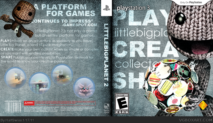
Dunno... on the first look it may be good, on the second it's a bit "meh".
For example: Why does the playstation 3 on the front have a shadow, the other text not? This seems inconsistent. The font you used on the back is too thin and bright for the fond you used. Adding a shadow, like you did on the PS3 on the front, may help a bit.
The barcode is working with a transparent background, but only if it stands out! It does not on your back.
The warning on the back should not be transparent as well. It's way too much in the background that way and warnings are important.
Not sure about sackboy covering some of the text on the back...
You did try some "button" look on the screenshots, right? Nice idea, but the execution is not very well done. Again it's blending too much into the background. Look at the buttons on the front - they are flashy. Try to catch that look for the screenshots!
The front of this box always brings a smile to my face :)
I think the back needs some work though. The writing is a little hard to read and seems to blend all into one. I like the idea of the screenshots being stickers but it doesn't look right. They are a little washed out and the layout of them doesn't look natural.
 Little Big Planet 2 Box Cover Comments
Nice, back screens are a little weird though.
[ Reply ]
I like the cover alot. The back seems a bit empty though
[ Reply ]
It's way too simple for my tastes.
[ Reply ]
Dunno... on the first look it may be good, on the second it's a bit "meh".
For example: Why does the playstation 3 on the front have a shadow, the other text not? This seems inconsistent. The font you used on the back is too thin and bright for the fond you used. Adding a shadow, like you did on the PS3 on the front, may help a bit.
The barcode is working with a transparent background, but only if it stands out! It does not on your back.
The warning on the back should not be transparent as well. It's way too much in the background that way and warnings are important.
Not sure about sackboy covering some of the text on the back...
You did not mind the type area!!! link
You did try some "button" look on the screenshots, right? Nice idea, but the execution is not very well done. Again it's blending too much into the background. Look at the buttons on the front - they are flashy. Try to catch that look for the screenshots!
[ Reply ]
The front of this box always brings a smile to my face :)
I think the back needs some work though. The writing is a little hard to read and seems to blend all into one. I like the idea of the screenshots being stickers but it doesn't look right. They are a little washed out and the layout of them doesn't look natural.
Fantastic front though :)
[ Reply ]