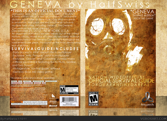
This doesn't really look like an official survival guide to me. If this is supposed to be an official government handout I would think it would use graphic-ish symbols, and look more like the Dead Rising 2 art that mchapra used on his recent box. The image you used is terrifying and would scare survivors shitless. It's like there are 2 separate themes on your box that don't go together.
Neat and unique idea but I don't think the execution is the best.
My main problem is with the back. There's way too much text on the back. If you wanted to just have the text on the back, then you could have spaced it out a bit more and maybe experimented with typography so it doesn't look like a page from the book.
 Geneva Box Cover Comments
This is my fantasy game.
[ Reply ]
Not bad. Overused grunge texture though and quite alot of text.
[ Reply ]
This doesn't really look like an official survival guide to me. If this is supposed to be an official government handout I would think it would use graphic-ish symbols, and look more like the Dead Rising 2 art that mchapra used on his recent box. The image you used is terrifying and would scare survivors shitless. It's like there are 2 separate themes on your box that don't go together.
[ Reply ]
The Typography is kinda off when you have January and December. All the white could be a little stronger so you can read it easier.
[ Reply ]
This is sweet, I love the story.
[ Reply ]
#3, that's kind of how messed up the government is now due to the war in this game.
[ Reply ]
Neat and unique idea but I don't think the execution is the best.
My main problem is with the back. There's way too much text on the back. If you wanted to just have the text on the back, then you could have spaced it out a bit more and maybe experimented with typography so it doesn't look like a page from the book.
[ Reply ]
#7, it's supposed to look like a book, though.
[ Reply ]
Pretty cool, I really dig the front. Too much crowded text on the back though, I suggest making more breathing room.
[ Reply ]