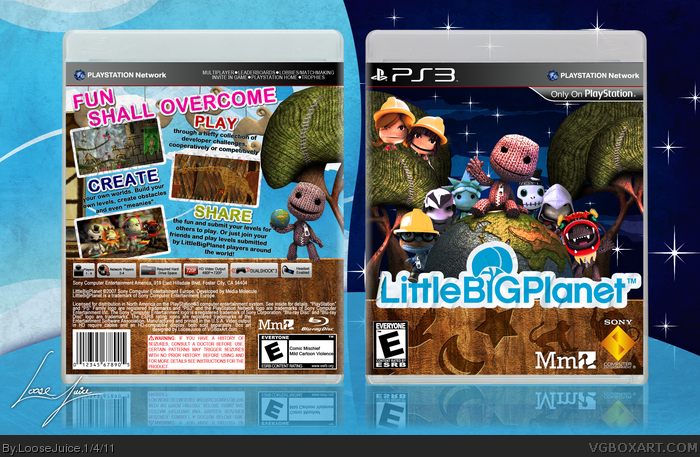
IÂ’ve been hearing about how good LittleBigPlanet was since the gameÂ’s release, but I only recently decided to purchase and begin playing it myself. While I havenÂ’t completed the entire game, I can say with certainty that it is gorgeous and inspired me to make this box. I knew from the start that I wasnÂ’t going to be making anything really groundbreaking in terms of design. A lot of great artists from this site have already made really well thought out and creative boxes that I wonÂ’t top. My goal was, then, to make a quality box that, while not as creative, could certainly hold its own. The result was this box. I had a lot of fun making it and I really like the outcome. As with all of my boxes, the WIP thread was absolutely invaluable in the creation of this box. From start to finish, this box took me about four days. Credit for the template goes to Jevangod, credit for the dragon Sackboy on the front (heÂ’s the one farthest to the right) goes to stevencho, and I know someone from this site rendered the Altair Sackboy but I canÂ’t remember who and I canÂ’t find the thread for it (sorry). If you see any render thatÂ’s yours up there, just drop a comment as over the span of making this box IÂ’ve switched the renders so many times I really canÂ’t remember who rendered what. Hope you guys like it.
I don't have any problems with this, other than the night sky. While what you have now is better, their jagged edges and generally pixelated look clash against the rest of the box. If they were smoother, and maybe had a faint glow, it'd look much better.
You succeeded in your goal though, this is something good enough to be on store shelves and while it doesn't set itself apart from the pack, it's not flawed in any real technical matter. The sticker shapes carved into the wood are a nice touch though.
Well, my first complaint is that the image you uploaded is enormous. I'm on a slow connection, so you're not doing me any favors :-p. Anyway, to the box. Technically, everything is here. Logo, tagline, screenshots, descriptive text, dev logos, it's all there. Stylistically, it still needs a bit of work. You're talking about Little Big Planet, here... make your back look like a level. Don't have screenshots floating willy-nilly, have them hanging from the "ceiling" and interacting with Sackboy. Maybe he's rolling one into place or something, idk. Same with the taglines. They're all just sitting there. Make them part of the design, part of the world, part of the level. Turn them into a sticker, have them on a sign, something. Integrate these parts into your existing design. As for the front, having the two girls on one side and no one on the other feels a bit strange. It's not symmetrical. As for the planet, and Sack Boy, I actually feel like you would have been better off leaving out most of the extra characters except for maybe two, who could have been rolling in the globe that Sack Boy is sitting on or something. Just to keep it simple.
#7, I really appreciate the honest critique. I guess in the future, I need to really pay more attention to the game design and theme. I'm still a little green though, so hopefully that comes with time.
This is well done, nice job. I do suggest trying to rework the bottom parts of both the front and back. Right now it seems like it's just there to fill extra space and the transition is quite awkward for both of them.
This box at first glance looks good to the eye. Looking back at your W.I.P. thread however I liked the old daytime background on the front better than this night time one. Next, the transition into the wood bottom of both sides is kinda sudden, is it not? If you do decide to keep the wood though I think you're better off putting the actual stickers on it to keep the bright LBP colors going.
For the back, I could not agree more with KoopaDasher. He was spot on with the idea of making it look like a level. Make screenshots the blocks Sackboy is pushing along, great advice. You got a great box here and with minor adjustments it can be amazing.
Great work.
What shit is this. Someone who read flammin comic books can only produce this. Oh yeah that accounts for everyone on this wretched website. How sad 'i'm a loser who reads comic books.' Yay marvel! spiderman! Ironman!
 LittleBigPlanet Box Cover Comments
IÂ’ve been hearing about how good LittleBigPlanet was since the gameÂ’s release, but I only recently decided to purchase and begin playing it myself. While I havenÂ’t completed the entire game, I can say with certainty that it is gorgeous and inspired me to make this box. I knew from the start that I wasnÂ’t going to be making anything really groundbreaking in terms of design. A lot of great artists from this site have already made really well thought out and creative boxes that I wonÂ’t top. My goal was, then, to make a quality box that, while not as creative, could certainly hold its own. The result was this box. I had a lot of fun making it and I really like the outcome. As with all of my boxes, the WIP thread was absolutely invaluable in the creation of this box. From start to finish, this box took me about four days. Credit for the template goes to Jevangod, credit for the dragon Sackboy on the front (heÂ’s the one farthest to the right) goes to stevencho, and I know someone from this site rendered the Altair Sackboy but I canÂ’t remember who and I canÂ’t find the thread for it (sorry). If you see any render thatÂ’s yours up there, just drop a comment as over the span of making this box IÂ’ve switched the renders so many times I really canÂ’t remember who rendered what. Hope you guys like it.
[ Reply ]
I also pulled some of this temp from Scropion Soldier, like those boxes with the specs. So credit to him for whatever part of this temp is his.
[ Reply ]
Nice cover, however, it does feel generic & it does not stand above the rest LBP covers.
[ Reply ]
I don't have any problems with this, other than the night sky. While what you have now is better, their jagged edges and generally pixelated look clash against the rest of the box. If they were smoother, and maybe had a faint glow, it'd look much better.
You succeeded in your goal though, this is something good enough to be on store shelves and while it doesn't set itself apart from the pack, it's not flawed in any real technical matter. The sticker shapes carved into the wood are a nice touch though.
[ Reply ]
Thanks for the comments and favs and the critique sd.
[ Reply ]
The background was really tough to get right. Finding a vector sky background for free was damn near impossible.
[ Reply ]
Well, my first complaint is that the image you uploaded is enormous. I'm on a slow connection, so you're not doing me any favors :-p. Anyway, to the box. Technically, everything is here. Logo, tagline, screenshots, descriptive text, dev logos, it's all there. Stylistically, it still needs a bit of work. You're talking about Little Big Planet, here... make your back look like a level. Don't have screenshots floating willy-nilly, have them hanging from the "ceiling" and interacting with Sackboy. Maybe he's rolling one into place or something, idk. Same with the taglines. They're all just sitting there. Make them part of the design, part of the world, part of the level. Turn them into a sticker, have them on a sign, something. Integrate these parts into your existing design. As for the front, having the two girls on one side and no one on the other feels a bit strange. It's not symmetrical. As for the planet, and Sack Boy, I actually feel like you would have been better off leaving out most of the extra characters except for maybe two, who could have been rolling in the globe that Sack Boy is sitting on or something. Just to keep it simple.
[ Reply ]
#7, I really appreciate the honest critique. I guess in the future, I need to really pay more attention to the game design and theme. I'm still a little green though, so hopefully that comes with time.
[ Reply ]
This is well done, nice job. I do suggest trying to rework the bottom parts of both the front and back. Right now it seems like it's just there to fill extra space and the transition is quite awkward for both of them.
[ Reply ]
This box at first glance looks good to the eye. Looking back at your W.I.P. thread however I liked the old daytime background on the front better than this night time one. Next, the transition into the wood bottom of both sides is kinda sudden, is it not? If you do decide to keep the wood though I think you're better off putting the actual stickers on it to keep the bright LBP colors going.
For the back, I could not agree more with KoopaDasher. He was spot on with the idea of making it look like a level. Make screenshots the blocks Sackboy is pushing along, great advice. You got a great box here and with minor adjustments it can be amazing.
Great work.
[ Reply ]
#9 & 10, yea I rendered the wood right out of a level, but didn't really use any other elements from it so I get where you're coming from.
Thanks for the comments and favs.
[ Reply ]
Wo dude totally awesome box! You just blew me away.
[ Reply ]
What shit is this. Someone who read flammin comic books can only produce this. Oh yeah that accounts for everyone on this wretched website. How sad 'i'm a loser who reads comic books.' Yay marvel! spiderman! Ironman!
[ Reply ]
You sound like one of those nerds who are 30 and are still living with their mom and dad. how infantile.
[ Reply ]
You sound like one of those nerds who are 30 and are still living with their mom and dad. how infantile.
[ Reply ]
You sound like one of those nerds who are 30 and are still living with their mom and dad. how infantile.
[ Reply ]
You sound like one of those nerds who are 30 and are still living with their mom and dad. how infantile.
[ Reply ]