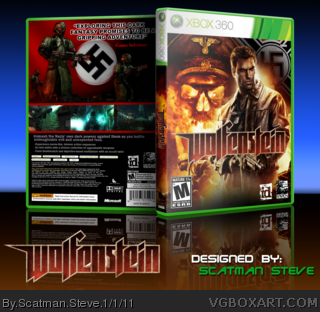
My first box! Please view in full so that you can get the full effect :) I didn't realize until I was almost finished with the box that it had a similar front with the others but by the time I realized that, I was too far into the process of making the box to make last minute changes by redoing the front. Other than that I hope you like it :) took me a few long days to complete and in the end I think it turned out to be worth it!
#11 Yeah I noticed that while I was finishing the box but by that time I was too far along to call it quits. Glad you like it and I appreciate the comment
The front is quite good, even more so for your first submission. The game logo could use a drop shadow though, to help it stand out.
The back's decent, although a bit too much red and shadow. Lightening it up and maybe using some flashier imagery (the way you did with the explosion/fire on the front) would work best, as of now it looks bland.
This is actually pretty nice for a first. Front looks very nice even if a bit generic, the back on the other hand needs improvement. It needs more details and some kind of a background.
 Wolfenstein Box Cover Comments
My first box! Please view in full so that you can get the full effect :) I didn't realize until I was almost finished with the box that it had a similar front with the others but by the time I realized that, I was too far into the process of making the box to make last minute changes by redoing the front. Other than that I hope you like it :) took me a few long days to complete and in the end I think it turned out to be worth it!
[ Reply ]
This is plain amazing.
+Fav
[ Reply ]
This is really good, especially the front. I don't really like the plain background of the back, but overall this is great for a first box!
[ Reply ]
#2, #3 Thank you! :) I appreciate it
[ Reply ]
Not bad for a first box! +fav.
[ Reply ]
Great first man! +fav +aut fav
[ Reply ]
#5, #6 Thank you!!
[ Reply ]
Very, very good for a first. The front is awesome, but the back seems a little dull... 4/5 +fav
[ Reply ]
#8 Thanks, I'll see what I can do to spice up the back a little more. Any suggestions?
[ Reply ]
This is absolutely brilliant,
I love this one :D
[ Reply ]
Pretty similar to Sentroavium's but hey it's a first. I can tell you'll be a fantastic artist soon.
[ Reply ]
#10 Thank you very much :D
#11 Yeah I noticed that while I was finishing the box but by that time I was too far along to call it quits. Glad you like it and I appreciate the comment
[ Reply ]
Not bad, the back is good however it doesn't match the front when it comes to the colors and feel.
[ Reply ]
#13 Okay I'll take that advice for the next box I work on :) thank you
[ Reply ]
The front is quite good, even more so for your first submission. The game logo could use a drop shadow though, to help it stand out.
The back's decent, although a bit too much red and shadow. Lightening it up and maybe using some flashier imagery (the way you did with the explosion/fire on the front) would work best, as of now it looks bland.
Still, nice job on the front.
[ Reply ]
#16 Thank you I appreciate it :)
[ Reply ]
This is actually pretty nice for a first. Front looks very nice even if a bit generic, the back on the other hand needs improvement. It needs more details and some kind of a background.
[ Reply ]
#17 Alright :) I'm hard at work with my next box so once thats done I'll edit this one more. Thank you for the critique
[ Reply ]
I think the front beats the hell out of the actual retail version, to be honest! Very cool!
[ Reply ]