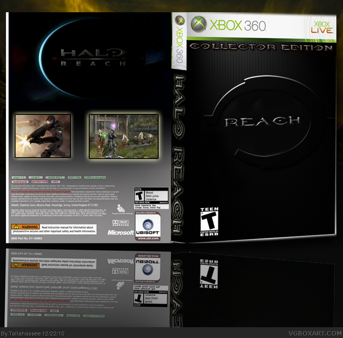
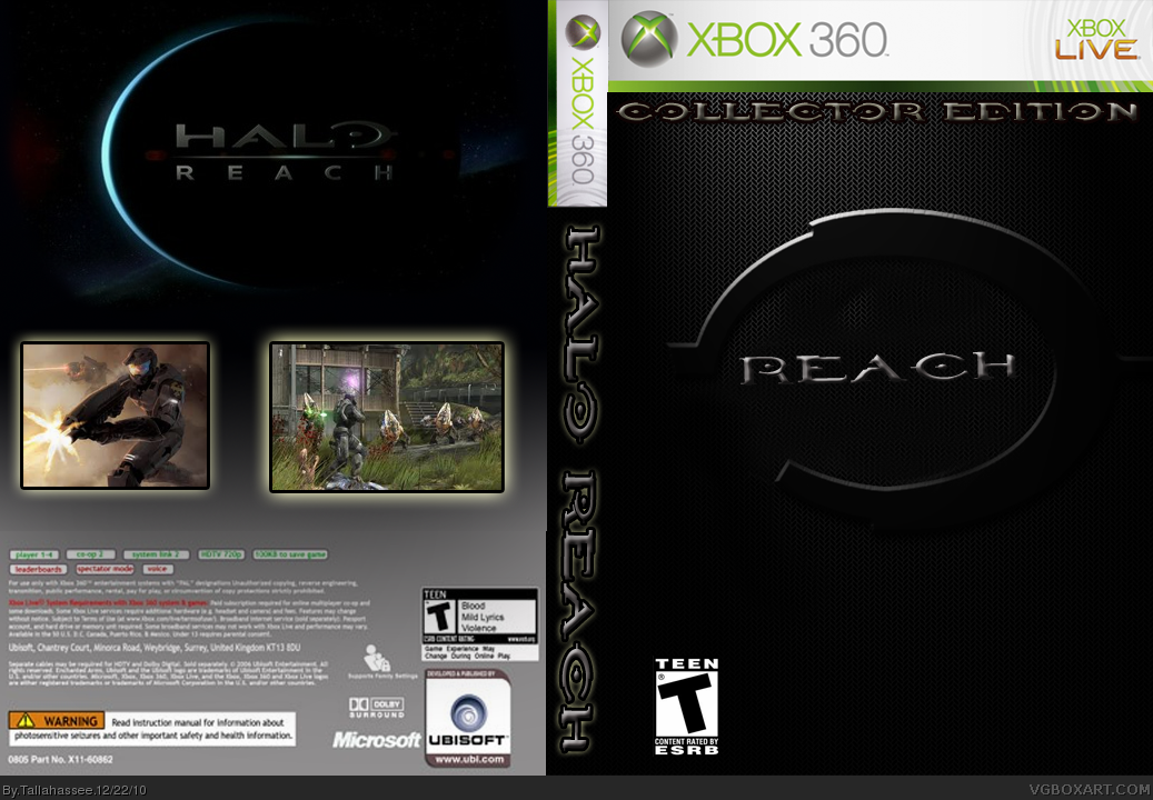
Where to begin? Without being too harsh, this box is not good. The front logo looks cheesy, as does the text on the spine. On the back, the oval shaped planet totally defies logic, and since when did Ubisoft make Reach? The legal text is blurry and the reflection in no way lines up with the box.
My advice, if you want it, is to look at as many boxarts as you can, see what works and what doesn't.
 Halo Reach Box Cover Comments
5th..? box. Haven't been on here since last December. Made something simple, and decided to share.
Thanks.
[ Reply ]
Comments are appreciated,
[ Reply ]
plain and pixilated but still decent
[ Reply ]
I was going for the plain look. I didn't want anything to maginificint. Just wanted something to look like a Collector's Edition. Thanks.
[ Reply ]
Where to begin? Without being too harsh, this box is not good. The front logo looks cheesy, as does the text on the spine. On the back, the oval shaped planet totally defies logic, and since when did Ubisoft make Reach? The legal text is blurry and the reflection in no way lines up with the box.
My advice, if you want it, is to look at as many boxarts as you can, see what works and what doesn't.
[ Reply ]