I agree in that this isn't your most original box, but it is awesome like always. I don't really like the repetition of renders on the bird and the mask claw thingy :P hahah. Other than that, I love it.
the optical impression is very good. great concept, it fits the game, etc. but what I don't like is the texture of the plastic case (it should be something real without that "grunge/old paper look) and the inconsequence on the "logos". you made every white spot transparent (at the ninteno-logo, the rating, and the seal of quality), yet you did not on the barcode. this looks weird to me and besides you should not change these elements that way. I know - it's just a fake box - but such stuff are specified and you, the designer, are not allowed to change ' em that way.
#22, wasa-bi - Thanks man! I really like the texture of the plastic case. Special games have special boxes, like the New Super Mario Bros. Wii one. It's completely red. Plus, it's not like its REALLY made of wood. It's just a texture on a plastic thingy.
I made the barcode white because I don't think there would be a point of the barcode otherwise. I don't think the barcode reader can read the barcode if the background isn't white, haha.
Yepp, it is just a fake box :) so I AM allowed to change em hahah. I understand that if this was official, I would have to change a lot of it, but its not. :)
#23, Sentroavium - lol its a pet peeve of mine when people call something in this kind of art 'unnecessary'. I mean, what really IS necessary? Boxarts about the aesthetics, not so much the functionality. If there is no functionality, why would something be necessary and something be unnecessary?
I made it like that because I like how it looks like that :) I like to have an overwhelming feeling of the game throughout the entire box. All aesthetics :)
Oh oh, and I've been reading some of your comments and they've been confusing me a lot lol.
For one, why is the front boring? I tried to make it not boring haha. If you guys could temme some reasons why it is I could go back and make it a lil better. :)
Twoo, what's not original about this? Not saying it IS or anything, but the closest box to this is my Kirby's Epic Yarn, which is still not very similar. I thought this was quite unique ... even the back layout, as I've never done anything like that before lol.
#24, well special box is one thing (the donkey kong package in japan is completely green), however there's a difference: you use a texture, while the other ones - the real ones - just have a colored plastic-case. if you wanna have a brown-ish one you can make one, but please not with such a texture (that's kinda not existent IRL too)
#25, I think by boring, people mean generic. I don't know, but I just feel like I have seen this layout a hundred times, not on your boxes, but on other people's. Its not terrible, its just not amazingly innovative.
#28, Haha, well I didn't mean it should be actually made out of wood. I was under the impression that there are fake textures on plastic all the time? Like a plastic wood texture. Imagine its painted on top of the plastic rather than actual wood, ya know? That's how I always saw it lol. And whoops lol. I didn't know a barcode could be read like that. My baaad.
#31, Ahhh okay! Gotcha! Yeah you're probably right lol.
 Donkey Kong Country Returns Box Cover Comments
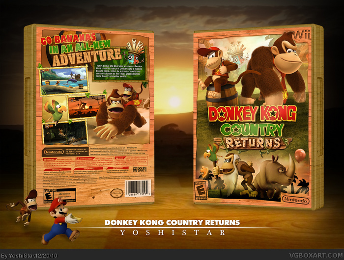
Hey guys!
Things to note:
- Wanted to make a cool different type of Donkey Kong Country Returns box that still matches the game.
- Went for a soothing brown theme. :) I always wanted to make a box in a nice jungly-brown theme.
- The Diddy Kong render is edited to remove the jetpack, so I could make it look like he's chillin on the barrel.
- It was REALLY hard to find good resources, which weren't the same ones used over and over again.
- Thanks to everyone in the critiques forum!
- I love this box. ;)
[ Reply ]
Well. Um... yeah.
[ Reply ]
Just had an orgasm...
[ Reply ]
Where did you find the Donkey and Diddy renders?
Anyway, I don't the layout is particularly inspired, but I love the colors. Plus, it's nice to see something different.
And it probably helps that I'm totally in love with this game right now.
[ Reply ]
*think
Sorry, double post, but I can't edit. >__>
[ Reply ]
Half pure awesomeness, half jealousy.
[ Reply ]
I agree in that this isn't your most original box, but it is awesome like always. I don't really like the repetition of renders on the bird and the mask claw thingy :P hahah. Other than that, I love it.
[ Reply ]
Preety nice (that joke's probably been used before,) but why would you have the description text on the back horizontally angled?
[ Reply ]
Still not entirely a fan of the front, but the backs good. Nice work on that.
[ Reply ]
Mario.. stole the bannanas.. that bastard.
[ Reply ]
Ps. link
[ Reply ]
MW...
[ Reply ]
All i can say is awesome job.
So...awesome job! :D
[ Reply ]
Awesome!
[ Reply ]
Awesome.
Please add a printable.
[ Reply ]
Wow, the whole colour composition and arrangement is great. I love that evening/jungle theme. It's also clean and very professional. Nice job.
[ Reply ]
The front was the biggest problem before, but it looks great now. The back looks a bit like many of your other designs, but I like it.
[ Reply ]
Another excellent box!
The front is boring though.
[ Reply ]
Damn this Tron ad. Now I can't fave.
[ Reply ]
yes just yes...
[ Reply ]
One of my favorites from you man and definitely a worthy box for a phenomenal game. Really looks great.
[ Reply ]
the optical impression is very good. great concept, it fits the game, etc. but what I don't like is the texture of the plastic case (it should be something real without that "grunge/old paper look) and the inconsequence on the "logos". you made every white spot transparent (at the ninteno-logo, the rating, and the seal of quality), yet you did not on the barcode. this looks weird to me and besides you should not change these elements that way. I know - it's just a fake box - but such stuff are specified and you, the designer, are not allowed to change ' em that way.
[ Reply ]
To me, the way you re-create Wii templates seems unnecessary, I think these covers would look better if you used the actual templates.
[ Reply ]
#22, wasa-bi - Thanks man! I really like the texture of the plastic case. Special games have special boxes, like the New Super Mario Bros. Wii one. It's completely red. Plus, it's not like its REALLY made of wood. It's just a texture on a plastic thingy.
I made the barcode white because I don't think there would be a point of the barcode otherwise. I don't think the barcode reader can read the barcode if the background isn't white, haha.
Yepp, it is just a fake box :) so I AM allowed to change em hahah. I understand that if this was official, I would have to change a lot of it, but its not. :)
#23, Sentroavium - lol its a pet peeve of mine when people call something in this kind of art 'unnecessary'. I mean, what really IS necessary? Boxarts about the aesthetics, not so much the functionality. If there is no functionality, why would something be necessary and something be unnecessary?
I made it like that because I like how it looks like that :) I like to have an overwhelming feeling of the game throughout the entire box. All aesthetics :)
Thanks again :)
[ Reply ]
Oh oh, and I've been reading some of your comments and they've been confusing me a lot lol.
For one, why is the front boring? I tried to make it not boring haha. If you guys could temme some reasons why it is I could go back and make it a lil better. :)
Twoo, what's not original about this? Not saying it IS or anything, but the closest box to this is my Kirby's Epic Yarn, which is still not very similar. I thought this was quite unique ... even the back layout, as I've never done anything like that before lol.
[ Reply ]
Quality = amazing.
Great job.
[ Reply ]
Nice. Worthy of a masterworks.
[ Reply ]
#24, well special box is one thing (the donkey kong package in japan is completely green), however there's a difference: you use a texture, while the other ones - the real ones - just have a colored plastic-case. if you wanna have a brown-ish one you can make one, but please not with such a texture (that's kinda not existent IRL too)
[ Reply ]
Really well done!
[ Reply ]
btw: the barcode reader can read it otherwise ;)
[ Reply ]
#25, I think by boring, people mean generic. I don't know, but I just feel like I have seen this layout a hundred times, not on your boxes, but on other people's. Its not terrible, its just not amazingly innovative.
[ Reply ]
This box works. How do i know? Because i looked at it and instantly wanted to buy the game... And i dont even have a Wii, amazing work man
[ Reply ]
#28, Haha, well I didn't mean it should be actually made out of wood. I was under the impression that there are fake textures on plastic all the time? Like a plastic wood texture. Imagine its painted on top of the plastic rather than actual wood, ya know? That's how I always saw it lol. And whoops lol. I didn't know a barcode could be read like that. My baaad.
#31, Ahhh okay! Gotcha! Yeah you're probably right lol.
[ Reply ]
#24, I understand, also, lol crazy are we?
[ Reply ]
lol lol lol lol
what are you talking about? ... lol
[ Reply ]
Love the soothing, delicious earthy groove this boxart has going on - its a fresh change from the usual vivid green rainforest!
[ Reply ]
i like how you take the original wii box template and make it to fit the theme of the game
[ Reply ]
I love the wooden case!
[ Reply ]
Congrats! Something I am gonna point out which you should be stoked about- You now have the same amount of MasterWorks as Marker.
[ Reply ]
MastaWok!!!!
[ Reply ]
.............. that's awesome fav from me.
[ Reply ]
MastaWokOfChina!!!!
[ Reply ]
I hate you.
I'm kidding...or am I? O.o
[ Reply ]
WOW I actually think its better than the real box
nice job!
[ Reply ]
Gee, these guys are tough critics. Nice work mate.
[ Reply ]
Nice
[ Reply ]
awesome!
[ Reply ]
u should make it so ppl can use it
[ Reply ]
Please tell me where you got the title font for the back!?
[ Reply ]