Well took me a while on this one, more than the others. I tried to go for something different and am quite happy with how it turned out. Please tell me whAt you think
well thanks for that man but i really dont care what you say.
i would of been happier to hear possibly a good comment or a way to improve my work.
thank you people who faved my work:)
why are you always in such unenthusiastic attitude #3
#2 is only saying your work is getting worse since you made that brilliant dead space 2 box
i agree with #2
big expectations fro you man...
forget the other box.if you have any criticism about THIS box then i would like to here it.obviously you cant find any negatives about it.so that means it must be a really good box.
hey don't bump your own boxes mate
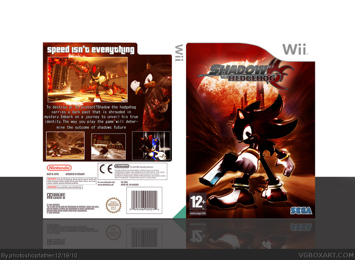
well now i can say that the two types of texts on the back do not go well with the theme of the game
change it and it'll be much better...
#6. the back cover look looks poor. the fact that theres so much going on in the front cover and the back being neglected shows a huge gulf in quality between the two sides.
#6. the back cover look looks poor. the fact that theres so much going on in the front cover and the back being neglected shows a huge gulf in quality between the two sides.
#3, Wow, get off your high horse mate. Stop acting like you're better than the rest of us. There's always room for improvement, and your unwillingness to even listen to the comments shows just how hard-headed you are.
#13 quite right. the morons on this site need to take critiscm on the chin and stop whining to further their development. those who are willing to do this will succeed.
#14 your actually right
and #12 to be honest i never actually liked soundwave and i absolutely dislike photoshopfathers horendous attitude how he seems to answer back to the criticism we give him
we say whats true and this box needs some improvements...
I, like others before me, feel that your work has slowly degraded, compared to previous pieces by you. I feel that the back is very lacking, the front is bland as all hell, and that you could do so much better than this, at least you could.
I, like others before me, feel that your work has slowly degraded, compared to previous pieces by you. I feel that the back is very lacking, the front is bland as all hell, and that you could do so much better than this, at least you could.
Seriously, just get Photoshopfather, 5-star general, and Tinie Tempah out of here, please. Excellent work is being bumped off the page by their horrendous work and childish arguing.
 Shadow the Hedgehog Box Cover Comments
Well took me a while on this one, more than the others. I tried to go for something different and am quite happy with how it turned out. Please tell me whAt you think
[ Reply ]
Is it me, or is the quality of your work slowly degrading. I mean it's not bad, but its certainly not up to par with your Dead Space 2 box.
[ Reply ]
well thanks for that man but i really dont care what you say.
i would of been happier to hear possibly a good comment or a way to improve my work.
thank you people who faved my work:)
[ Reply ]
why are you always in such unenthusiastic attitude #3
#2 is only saying your work is getting worse since you made that brilliant dead space 2 box
i agree with #2
big expectations fro you man...
[ Reply ]
it's a good box but compared to your dead space 2 box you could definetley do better
[ Reply ]
forget the other box.if you have any criticism about THIS box then i would like to here it.obviously you cant find any negatives about it.so that means it must be a really good box.
[ Reply ]
hey don't bump your own boxes mate
well now i can say that the two types of texts on the back do not go well with the theme of the game
change it and it'll be much better...
[ Reply ]
try alos putting an outline over the writing
but change the fonts
[ Reply ]
#6. the back cover look looks poor. the fact that theres so much going on in the front cover and the back being neglected shows a huge gulf in quality between the two sides.
[ Reply ]
#6. the back cover look looks poor. the fact that theres so much going on in the front cover and the back being neglected shows a huge gulf in quality between the two sides.
[ Reply ]
#10 your poor...
[ Reply ]
#11. ahhhh nice to see you've finally got your head out of soundwaves nerdy arse. so glad you could join us for this debate
[ Reply ]
#3, Wow, get off your high horse mate. Stop acting like you're better than the rest of us. There's always room for improvement, and your unwillingness to even listen to the comments shows just how hard-headed you are.
[ Reply ]
#13 quite right. the morons on this site need to take critiscm on the chin and stop whining to further their development. those who are willing to do this will succeed.
[ Reply ]
What's with the screenshot of the "fusion" of Sonic and Shadow?
[ Reply ]
#14 your actually right
and #12 to be honest i never actually liked soundwave and i absolutely dislike photoshopfathers horendous attitude how he seems to answer back to the criticism we give him
we say whats true and this box needs some improvements...
[ Reply ]
I, like others before me, feel that your work has slowly degraded, compared to previous pieces by you. I feel that the back is very lacking, the front is bland as all hell, and that you could do so much better than this, at least you could.
[ Reply ]
I, like others before me, feel that your work has slowly degraded, compared to previous pieces by you. I feel that the back is very lacking, the front is bland as all hell, and that you could do so much better than this, at least you could.
[ Reply ]
awsome work man! +fav
[ Reply ]
Seriously, just get Photoshopfather, 5-star general, and Tinie Tempah out of here, please. Excellent work is being bumped off the page by their horrendous work and childish arguing.
[ Reply ]