hi im new here this is my first box i know ill need to improve but its my first attempt
i dont remember who to give credit to so whoevers wii template it is thank you
hope you like it
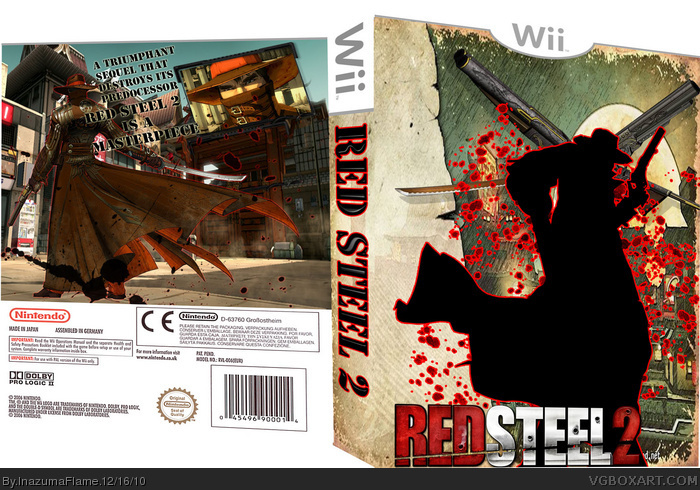
the front is kinda good for a first one, however there are a lot of flaws.
- no rating
- no publisher/developer
- the logo on the front is too close on the lower edge (high chance it will be cut off during printing/cutting if this was the real thing)
- the font you used on the spine seems off - there's enough room for the original logo, or try using a font without serifes (would fit the logo better)
- the spine is way too wide! if you want it like that you should at least change the wii logo, because it's not natural the wii-logo get's deformed in its height using this perspektive (compare it with the one on the front)
- the font on the back and it's color are not good, because it blends right into the background and the serifes are way too small for this fonts size. Again: try one without serifes, something more similar to the original logo.
- I (personally) am no fan of this template
Anyways, you can see some potential in this one. Keep it up.
Really nice for a first. I gotta agree with #3 about the template, I think it would look much better on a normal one. I actually see alot of potential in this cover too. On the back if you just added 1 or 2 more screen shots below the one you have and some more text items like a tag line on the top and a game description too it would be really good. And on the front if you threw some bad guys and explosions behind your silhouette and put some of the main characters inside your silhouette I think it would be very cool.
 Red Steel 2 Box Cover Comments
hi im new here this is my first box i know ill need to improve but its my first attempt
i dont remember who to give credit to so whoevers wii template it is thank you
hope you like it
[ Reply ]
wow very good for a first box
heres a few things wrong with it
1.theres no rating or publisher logos
2.the back needs a sypnosis and a few my gameplay screenshots
other than that i like it oh and check mine out to just click on my name above this comment
[ Reply ]
the front is kinda good for a first one, however there are a lot of flaws.
- no rating
- no publisher/developer
- the logo on the front is too close on the lower edge (high chance it will be cut off during printing/cutting if this was the real thing)
- the font you used on the spine seems off - there's enough room for the original logo, or try using a font without serifes (would fit the logo better)
- the spine is way too wide! if you want it like that you should at least change the wii logo, because it's not natural the wii-logo get's deformed in its height using this perspektive (compare it with the one on the front)
- the font on the back and it's color are not good, because it blends right into the background and the serifes are way too small for this fonts size. Again: try one without serifes, something more similar to the original logo.
- I (personally) am no fan of this template
Anyways, you can see some potential in this one. Keep it up.
[ Reply ]
#2, #3, thanks i know it has lots of flaws but ill improve
[ Reply ]
Really nice for a first. I gotta agree with #3 about the template, I think it would look much better on a normal one. I actually see alot of potential in this cover too. On the back if you just added 1 or 2 more screen shots below the one you have and some more text items like a tag line on the top and a game description too it would be really good. And on the front if you threw some bad guys and explosions behind your silhouette and put some of the main characters inside your silhouette I think it would be very cool.
[ Reply ]