Ok, first of all...what's up with the crusty view on this? Is it because it's in the PSX section? What a bummer....this view simply does not give this piece justice!
Anyway, I think this actually turned out better than my MGS3: SE boxart.
In any case, now ALL the Metal Gears have a consistent art style that suits MGS2's.
I hope people like it...took me at least 6 hours. More or less...
And duuuude. MGS2 official was great, but it didn't really pay "homage" to the game as a cover should. All PAL officials do, esp. the MGS3 one. Beastly.
 Metal Gear Solid Box Cover Comments
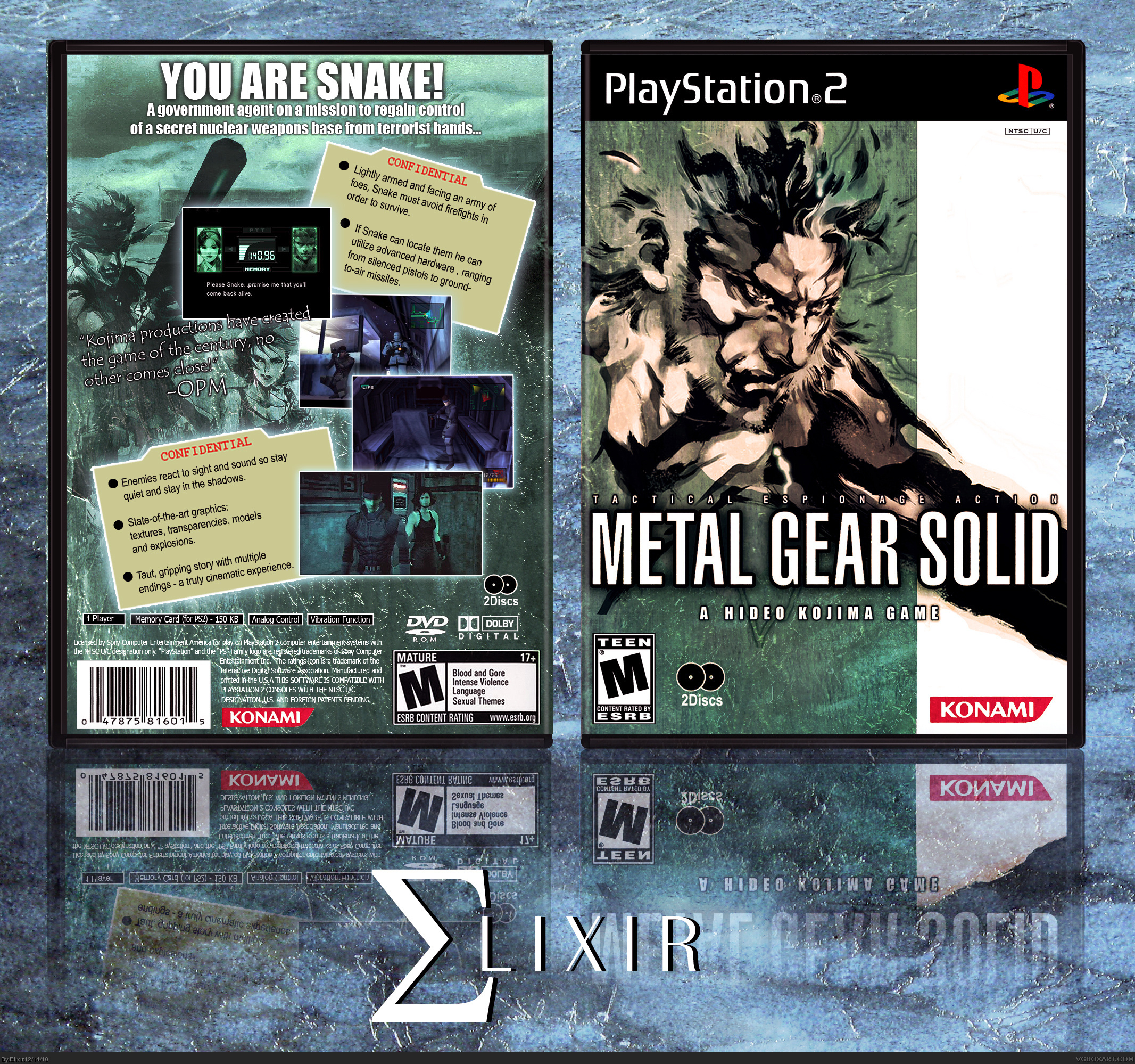
Ok, first of all...what's up with the crusty view on this? Is it because it's in the PSX section? What a bummer....this view simply does not give this piece justice!
Anyway, I think this actually turned out better than my MGS3: SE boxart.
In any case, now ALL the Metal Gears have a consistent art style that suits MGS2's.
I hope people like it...took me at least 6 hours. More or less...
[ Reply ]
i like it,it has style
[ Reply ]
Awesome, although I always hated the American official. You should have a look at the PAL official, pure art.
[ Reply ]
I like this, good job.
[ Reply ]
Clean and simple, looks good
[ Reply ]
#3, Wow, you really hated the MGS2 official American cover??? It's one of my favourite covers.
[ Reply ]
#5, That's exactly what I love about this design...I don't usually like covers that look like they should be posters haha.
[ Reply ]
If you make the width greater than the height, then you'll get the standard "widescreen" view.
As for the box, it's great! I like how you've managed to retain that classic MGS style while managing to incorporate some new features as well.
[ Reply ]
Another awesome box Elixir.
[ Reply ]
#6, this is MGS1.
And duuuude. MGS2 official was great, but it didn't really pay "homage" to the game as a cover should. All PAL officials do, esp. the MGS3 one. Beastly.
[ Reply ]
Excellent. I love the icy motif.
[ Reply ]