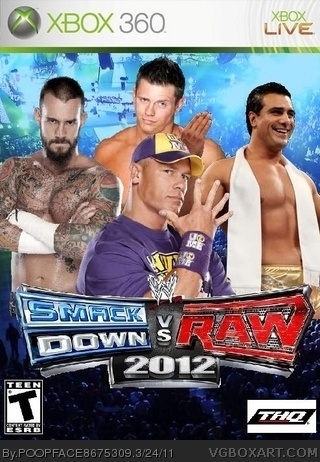
[ Box updated on March 24th, 2011 ] [ original ]
 Smackdown vs. Raw 2012 Box Cover Comments
Comment on POOPFACE8675309's Smackdown vs. Raw 2012 Box Art / Cover.

[ Box updated on March 24th, 2011 ] [ original ]
Comment on POOPFACE8675309's Smackdown vs. Raw 2012 Box Art / Cover.
At first I thought it was too early for a 2012, but then I thought, eh why not? I thought i came out alright
[ Reply ]
#1, it came out alright**
[ Reply ]
first thing you havn't even bothered to cut out the images corectly. second thing the the images don't really blend in together. third thing the person in the middle looks like the tip of his head has been cropped off. overall it's not a good box so i suggest you do it again. sorry no fav from me.
[ Reply ]
#3, yeah but that picture of cena (the middle guy) was the only modern pic i could find with a PNG format
[ Reply ]
I've found a pic of Cena that was way better. Also the logos are terrible. I could barely tell that Santino, Miz, and Sheamus were in the bg. I don't even know who is behind the RAW logo.
[ Reply ]
#5, well since they aren't really supposed to be the main part I was kinda careless about them (sorry). But it is Kane and Dolph Ziggler behing the Raw logo
[ Reply ]
#5, also, was the picture of cena you found with his purple attire, because i want it as recent as possible
[ Reply ]
#7, link
link
[ Reply ]
#8, thanks, i'll try redoing this box
[ Reply ]
k i updated it
[ Reply ]
Better...weird that u used WM 22 for bg but one thing...Barret's a little choppy
[ Reply ]
#11, yeah i tried to cover up as much of i could that gave away it was WM 22. and i kind of agree about the way Barrett came out
[ Reply ]
it is really awesome but barrett is a little squished together
[ Reply ]
#13, Thanks, and yeah I know Barrett looks squished
[ Reply ]
link
faves: 4
this
faves: 0
wow.
[ Reply ]
#15, lol corndog corndog
[ Reply ]
my old one was outdated with John Cena, Nexus Wade Barrett, and Rey Mysterio. Barrett is no longer in Nexus so I changed it all with John Cena, The Miz, Alberto Del Rio, and CM Punk
[ Reply ]
You need to fix the logo. The 2012 is off center. It is in the correct font, though, so I give you points for that. You need to update the THQ logo. Yeah, I don't like the new logo either, but still. Also, if you're gonna keep Punk, you'd need to photoshop the Pepsi and Cobra tattoos out, because WWE doesn't want to be sued by Pepsi or Hasbro. Other than those things, it's pretty good.
[ Reply ]
#18, I agree on everything except for CM Punk. I understand the WWE can't, but I just did what I think it should look like. I don't see why Vince McMahon can't spare a few thousand dollars to Hasbro and Pepsi out of his billions to make the video games accurate.
[ Reply ]