Love it :D
But the only thing that bothers me (you don't have to change it) is the wii logo in the corner of the front part, it looks odd in that black box, couldn't you make the logo red or something?
Oh it's not a major fault or anything, just i think i'd prefer it without, but anyway this box needs HoF, or even Masterworks, plus this is better than the killer 7 one that you did, and that was good aswelll :)
Stylish, but one thing: the text on the back is too far on the edges. If this was the real thing, I bet there was a big amount of rejects due to the high possibility of flaws during cutting the printed sheets.
Oh and I guess I have to admit I agree on the "collection" on the front.
I've only got two complaints, and they've already been spotted by others, and you have good reasons for it. But it's the template (looks great on your other boxes and works better than the normal one on this box, but it still somehow doesn't fit the rest of the box, in my opinion.)
And the Collection logo it a bit squished, but I don't know where else you could place it without miss-placing it.
it's not about printing, it's about cutting! yeah and a professional will tell you this would not work, because if this was printed for real you gotta cut a big stack of printed paper at once, not just one by one. the pressure on the paper when the knive goes down tends to slide the lover parts of the stack a bit and this results in a rather unclean cut, which can result in your text being cut off, because it's too close at the edges.
 No More Heroes Box Cover Comments
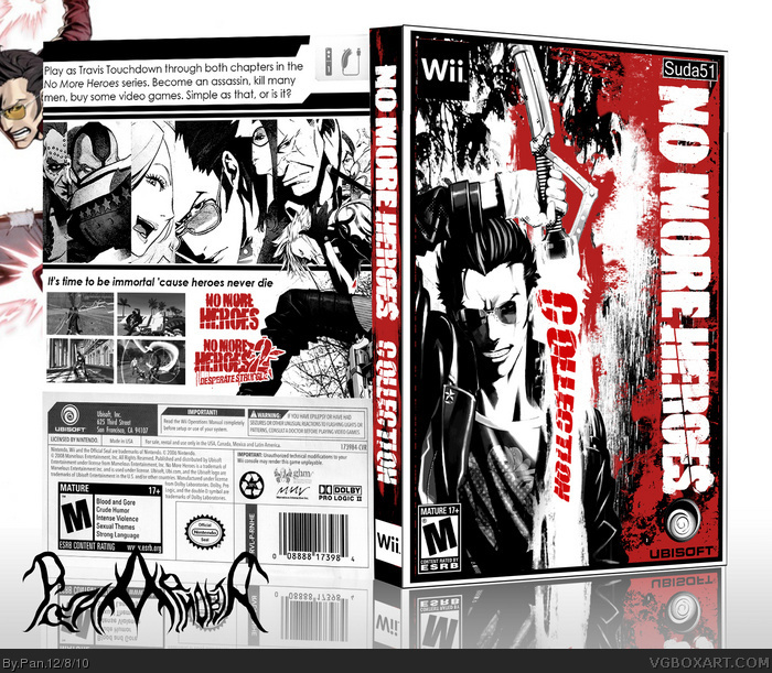
My no more heroes compilation box to go with my Killer7 box.
[ Reply ]
Love it :D
But the only thing that bothers me (you don't have to change it) is the wii logo in the corner of the front part, it looks odd in that black box, couldn't you make the logo red or something?
[ Reply ]
#2, The reason it's black is cause of my template, I have a series of boxes with templates like this and they're all black and white.
link
link
link
If you wanted to print this however, you could change the color to anything you wanted. : )
[ Reply ]
Oh it's not a major fault or anything, just i think i'd prefer it without, but anyway this box needs HoF, or even Masterworks, plus this is better than the killer 7 one that you did, and that was good aswelll :)
[ Reply ]
This rapes my eyes, pan nice job!
[ Reply ]
O_O
[ Reply ]
HOLY SHEET THATS SICK
[ Reply ]
Nice one, Pan. The front really captures the chaotic, badass nature of the games.
[ Reply ]
Awesome, but the collection feels like its in a random spot
[ Reply ]
I don't know anything about the game, but the style of this box is so in your face and aggressive. It's really a great piece of art. Phenomenal job.
[ Reply ]
#9, I made the collection text look like it was on his saber. May have looked better in another spot, but works for me.
[ Reply ]
Stylish, but one thing: the text on the back is too far on the edges. If this was the real thing, I bet there was a big amount of rejects due to the high possibility of flaws during cutting the printed sheets.
Oh and I guess I have to admit I agree on the "collection" on the front.
[ Reply ]
I've only got two complaints, and they've already been spotted by others, and you have good reasons for it. But it's the template (looks great on your other boxes and works better than the normal one on this box, but it still somehow doesn't fit the rest of the box, in my opinion.)
And the Collection logo it a bit squished, but I don't know where else you could place it without miss-placing it.
Great box nonetheless.
[ Reply ]
fuckin great!!!
[ Reply ]
want it! All i need is the second one and i can use this box!
(I hate my No More Heroes box now
[ Reply ]
This sucks ass. Go away. XD kidding, love it, the text on the back looks kinda basic/blandish though.
[ Reply ]
#16, The back text is kinda plain, but that's how I wanted it since the back itself was meant to look kinda plain.
#12, A professional may not except this, but I printed it out and the text looks fine. No cut off.
[ Reply ]
it's not about printing, it's about cutting! yeah and a professional will tell you this would not work, because if this was printed for real you gotta cut a big stack of printed paper at once, not just one by one. the pressure on the paper when the knive goes down tends to slide the lover parts of the stack a bit and this results in a rather unclean cut, which can result in your text being cut off, because it's too close at the edges.
[ Reply ]
The back seems a bit cramped, but the front is gorgeous.
[ Reply ]