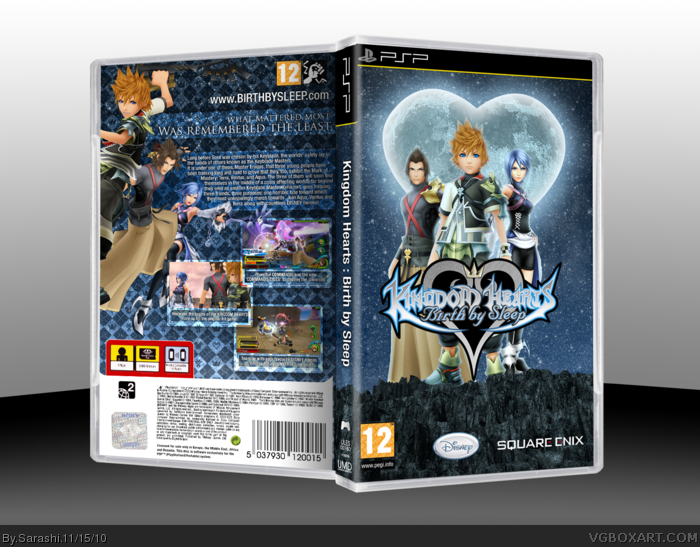
The back is quite good with good layout and use of text (though it could be bigger) but the front is frankly not good at all. The rock looks like something pasted on in the last minute and it doesn't give the illusion that they are even standing on it. The moon and the things around it creates an badly edited colorful mess.
I really like the back, possibly your best as you said. It has a nice, clean arrangement, and I like screenshot layout. Nice work there.
The front however, feels rushed. What stands out right away, to me at least, is the rock ledge. The perspective is different between them and the is different, so they look more like they're floating behind it than standing on it. The second noticeable issue, is the colors, which are all over the place. The green ledge, yellowed toned characters, and blue background clash and make it seem more cluttered than it actually is.
I've seen some really nice front designs from you, so I know your capable of fixing these issues. Still, that back is great.
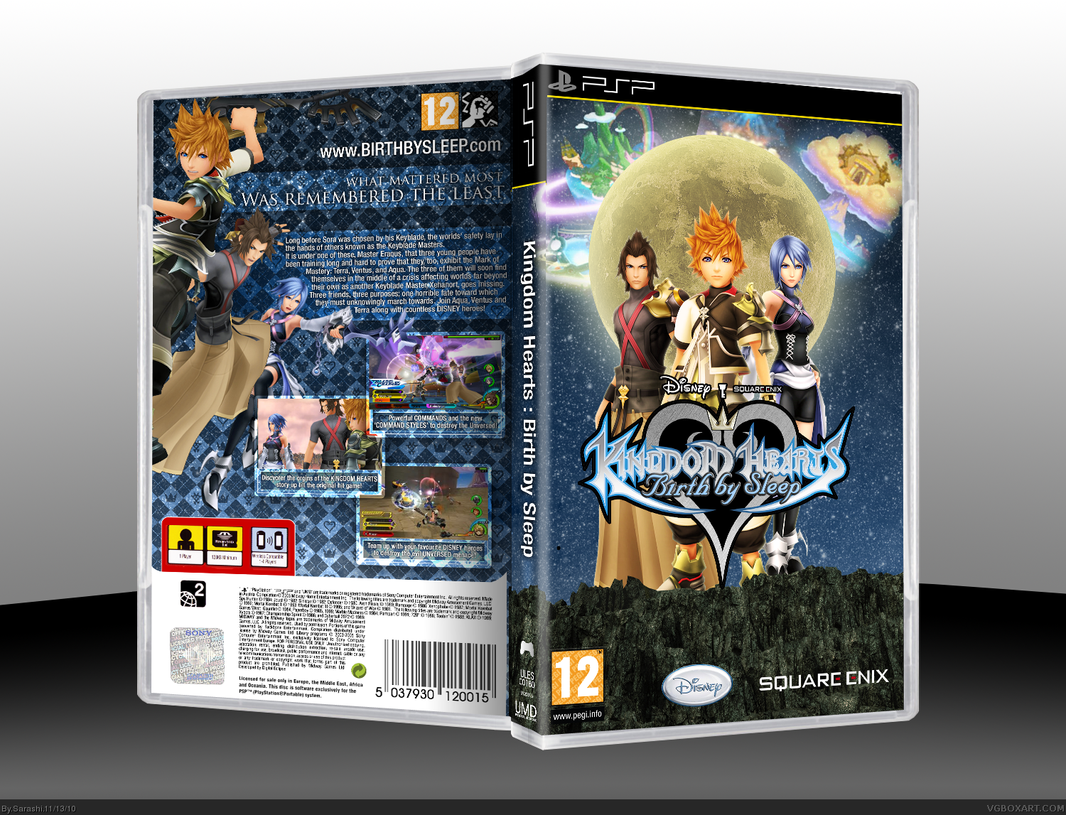
Looks much better. The ledge still needs fixing though, I'd suggest finding an entirely new image to use, if possible. It'd really help things come together as a complete design.
 Kingdom Hearts: Birth by Sleep Box Cover Comments
Credit to Jevangod for the PSP Plastic... And that's about it really.
My newest, and best box (At least my best back)
[ Reply ]
interesting and nice to look at, but I want more Disney characters on the cover, not just Final Fantasy. 9/10
[ Reply ]
#2, If I'm going to be really pedantic, There's one Final Fantasy character, and one Disney one. And they're both in the bottom screenshot.
[ Reply ]
I quite like it, but I have to say the cliff and the moon look just a little weird.
[ Reply ]
The text on the back is too small, but otherwise it's great. :D
[ Reply ]
The back is quite good with good layout and use of text (though it could be bigger) but the front is frankly not good at all. The rock looks like something pasted on in the last minute and it doesn't give the illusion that they are even standing on it. The moon and the things around it creates an badly edited colorful mess.
[ Reply ]
I really like the back, possibly your best as you said. It has a nice, clean arrangement, and I like screenshot layout. Nice work there.
The front however, feels rushed. What stands out right away, to me at least, is the rock ledge. The perspective is different between them and the is different, so they look more like they're floating behind it than standing on it. The second noticeable issue, is the colors, which are all over the place. The green ledge, yellowed toned characters, and blue background clash and make it seem more cluttered than it actually is.
I've seen some really nice front designs from you, so I know your capable of fixing these issues. Still, that back is great.
[ Reply ]
OK. Update fixing the colours and the moon. I have no idea what to do with the floating...
[ Reply ]
Looks much better. The ledge still needs fixing though, I'd suggest finding an entirely new image to use, if possible. It'd really help things come together as a complete design.
[ Reply ]
I agree about fixing the ledge. also, I dont like the filled in black of the logo, but I have no idea if thats official or not.
[ Reply ]
I absolutely love the texture and detail. faved.
[ Reply ]