I likey!
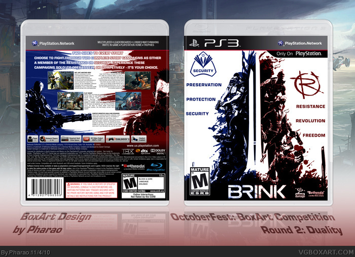
The front is awesome, but the back has a few problems... The Resistance guy on the back just ends on the bottom, I think it would look better if he were faded out or some kind of scratching effect, maybe. The tagline(s) on the back look kinda weird- how they change color. The best way to do it would be to kinda do what this box has on the front for the logo (but more scratching than paint splatters) link
Overall 4/5 +fav
#2,#4 thx
#3 yeah you're right with the resistance guy, i must overlooked it in the last rush to get it done in time for the comp, if i find time i'll change that.
This is a fantastic box. I really like the front and the theme of duality you have. My only criticism is the the text on the back. There's too much all caps and bold text next to each other. I would also tighten up the header and make it a solid color. Otherwise, great job man, fav!
#9 thx and you are right, i've changed the text and the resistance guy. But i couldn't upload the new version, if the site let me upload the changed version then i'll do that.
 Brink Box Cover Comments
This is my entry for the second round of the OctoberFest Comp "Duality".
The style of the box should represent the opposite sides of one story, security vs resistance, preservation vs revolution, protection vs freedom.
comments and favs are welcome.
[ Reply ]
Nice box dude. fav :)
[ Reply ]
I likey!
The front is awesome, but the back has a few problems... The Resistance guy on the back just ends on the bottom, I think it would look better if he were faded out or some kind of scratching effect, maybe. The tagline(s) on the back look kinda weird- how they change color. The best way to do it would be to kinda do what this box has on the front for the logo (but more scratching than paint splatters) link
Overall 4/5 +fav
[ Reply ]
more attention is definitely needed here
loving the contrast between the blues and reds. FAV
[ Reply ]
#2,#4 thx
#3 yeah you're right with the resistance guy, i must overlooked it in the last rush to get it done in time for the comp, if i find time i'll change that.
[ Reply ]
Lovin the front dude
[ Reply ]
love it, wow
[ Reply ]
#6,#7 thx for faving
Any comments about hitting the nail of the OctoberFest theme :"Duality"?
[ Reply ]
This is a fantastic box. I really like the front and the theme of duality you have. My only criticism is the the text on the back. There's too much all caps and bold text next to each other. I would also tighten up the header and make it a solid color. Otherwise, great job man, fav!
[ Reply ]
#9 thx and you are right, i've changed the text and the resistance guy. But i couldn't upload the new version, if the site let me upload the changed version then i'll do that.
[ Reply ]
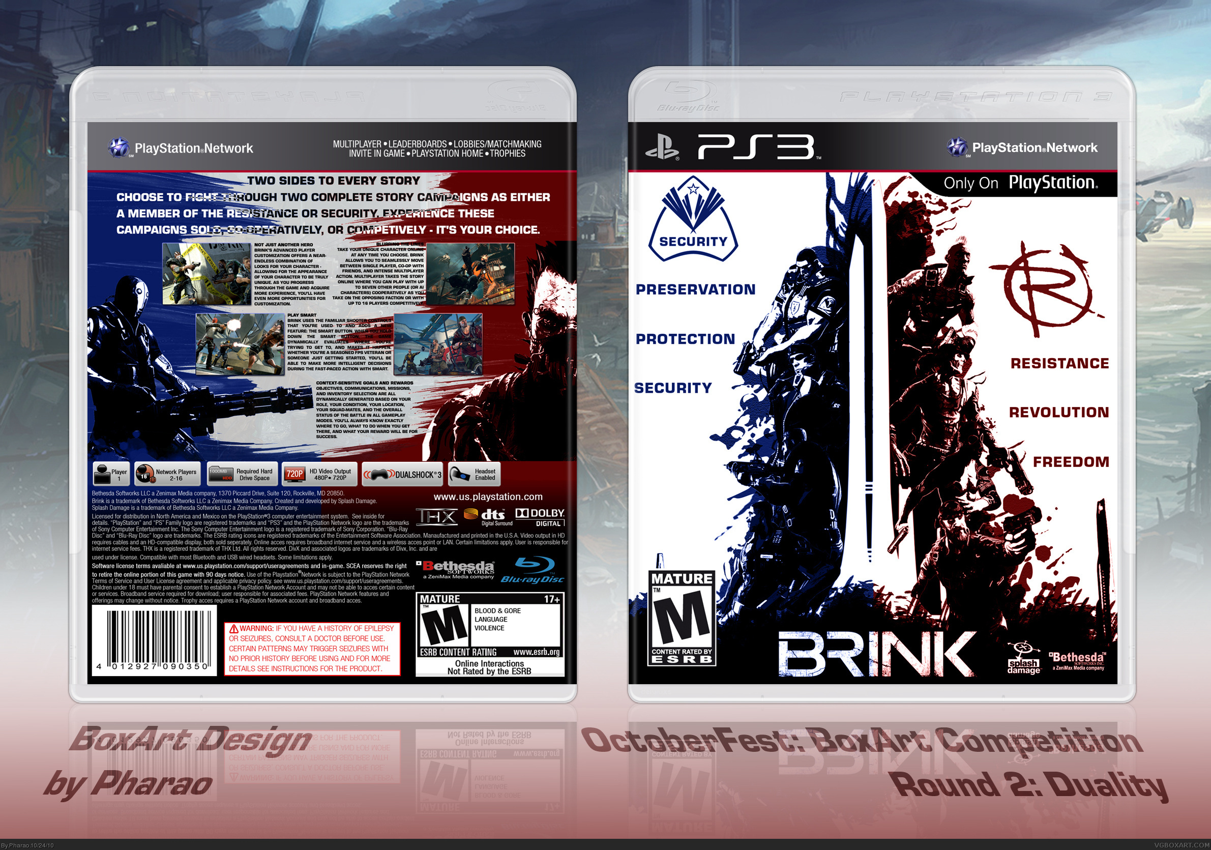
So, now i uploaded the second version of that box with a fixed back.
[ Reply ]
The back looks much better now.
[ Reply ]
where can i get the template????
[ Reply ]