I printed it and cut it out, then put it inside a 360 case. Even though it was printed on plain paper, when you look at it from a distance, it looks like it could be the real thing. ::pats self on back:: lol
Now that you have the two parts of the slogan right next to each other, you probably dont need the 3 periods on each line....but thats just my oppinion.
Anyway, about the update, I took in the consideration that the back template was kind of lacking, so what I did was go back and redo EVERYTHING! So now, all the tiny words you see, from the game features to the rights reserved... all that was retyped. Enjoy, I've put a lot into this!
i LOVE the back on this one, but the front is merely a wallpaper from the site.
HENCE! bob's being better.
but bob doesn't have a back so you're got him there ;)
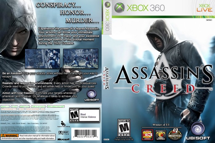
 Assassin's Creed Box Cover Comments
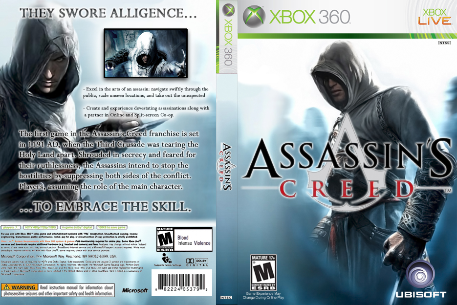
This is my first front-n-back boxart; I hope you guys like it! :)
[ Reply ]
Awesome work Mist, the only thing that isn't really perfect would be the back part of the template, other than that awesome :)
[ Reply ]
This is THE greatest Assasssins Creed box so far! 5/5
[ Reply ]
Though it it is a bit plain, i really like it. The back, i think, needs a few more screenshots.
Overall, nice work.
[ Reply ]
the back needs a bit more screenshots, but overall a 4.5
nice job
[ Reply ]
Alright, I actually added in-game screenshots this time. ;) And thanks to everyone for the positive feedback!
P.S.: How does everybody like the slogan, "THEY SWORE ALLIGENCE... ...TO EMBRACE THE SKILL."? Just wondering if I need to change it.
[ Reply ]
I love that slogan :D
Anyways, i like the added screenshots. It loks much more official and could very well pass as the real box art.
[ Reply ]
I printed it and cut it out, then put it inside a 360 case. Even though it was printed on plain paper, when you look at it from a distance, it looks like it could be the real thing. ::pats self on back:: lol
[ Reply ]
Looks great and the slogan fits very well with the theme of the game. FYI, when using ... you don't need to have it on the second line. ^_^
Again, nice job.
[ Reply ]
Brilliant box.
[ Reply ]
After four updates, I never realized "allegiance" was spelled wrong...
[ Reply ]
Now that you have the two parts of the slogan right next to each other, you probably dont need the 3 periods on each line....but thats just my oppinion.
[ Reply ]
#12, Nah, I like it with the periods...
Anyway, about the update, I took in the consideration that the back template was kind of lacking, so what I did was go back and redo EVERYTHING! So now, all the tiny words you see, from the game features to the rights reserved... all that was retyped. Enjoy, I've put a lot into this!
[ Reply ]
this is deffinitly one of your best, the update did good things too ;)
[ Reply ]
*UPDATE* I removed the three periods before "To Embrace the Skill."
[ Reply ]
i LOVE the back on this one, but the front is merely a wallpaper from the site.
HENCE! bob's being better.
but bob doesn't have a back so you're got him there ;)
[ Reply ]
*UPDATE*... *AGAIN* #16, Well, there isn't much to work with, and I also kind of like less complex fronts.
[ Reply ]
#17 it looks alot nicer, oh and where did you get all those E3 logos from ive been looking for them for a long time !?
[ Reply ]
#18, I got them off the official Assassin's Creed website; they're locating down at the bottom. ;)
[ Reply ]
#19, located*
[ Reply ]