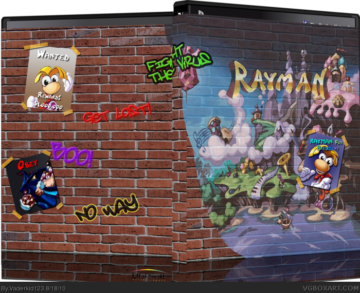
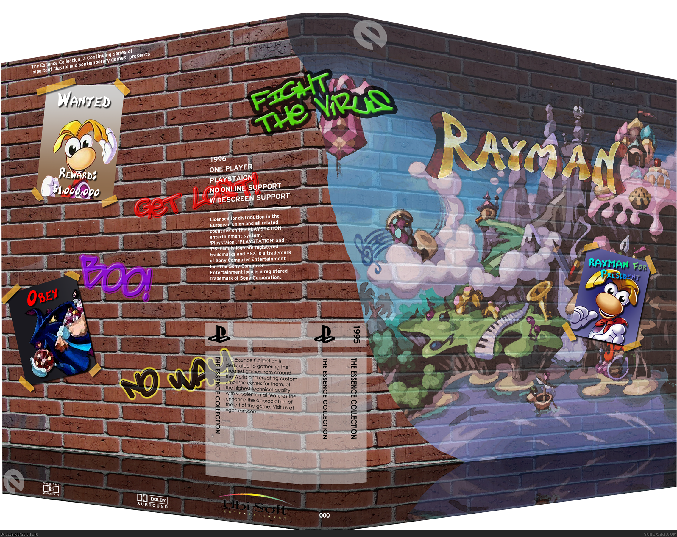
My latest project. Anyone who has played the original Rayman probably already gets the design, but for those of you who haven't, whenever you got a gameover in game, Rayman would walk beside a wall. Half of the wall would be full of posters such as Vote for Rayman with a cheerful and bright painting, while the other half was dark and depressing, and would have hateful grafitti and wanted posters. This box is based off of said wall.
IMO, this is actually pretty bad. I've never play Rayman, but I doubt it has anything to do with brick walls, even if you were using that as a place to put the wanted posters. I have new idea why some people faved this. If it is artwork, horribly merged to a brick wall with a logo and effortless posters tacked on, I just don't like it one bit. Also, what's with the essence template? This shouldn't be essence, and the logos are on the reflection.
#11, Meh, you really wouldn't get it unless you played the original rayman. Oh and the reflection is part of the actual box, its not the reflection of the box.
#24, Inorite? Since when has a parent cared what a game they bought for their children was rated. If they did, maybe online games would be a bit more enjoyable *Nods head*
The idea is really good. The execution is terrible. You have fallen ill with the plague known as "Over Filter Disorder", the only known cure is to remove all of your filters off of this box as soon as possible. Followed by a redo in the "3d"ing of this box it is terrible.
#26, "Honestly, boxes like this are the reason everyone hates essence." Uhhh, no. Boxes that are pointless silhouettes is why a lot of people hate essence. This is FAR FAR FAR more unique than lots of boxes on this site, and I guarantee you, more thought out than any of your boxes. Just shut up.
I think this is really cool idea, that's not suited for the essence template, but still a cool idea. Execution could be better, but it's still not thaat bad.
#37, "more thought out than any of your boxes" what the hell is that suppose to mean? I don't like it for the sole reason that it's ugly, the spine has no indicator, no ERSB and the fact the author used "It's essence" as a fucking excuse to be lazy.
And please do tell... how are my boxes "Not thought out".
#46, I like your boxes, actually. I'm not certain what Yoshistar meant. And, essence boxes don't usually have esrbs on the front, I just usually put mine smaller on the back.
you know... must be a real good adhesive tape. it's holding posters on a brick wall. (that's for your "standing in space is not possible")
is there any reason for the ubi-logo on this version? it got the angle of the reflection and stuff, but it's not mirrored and NOT on the actual package - just in the reflection. Kinda weird.
#4 yes, there is plastic, but I guess #3 just didn't notice that's supposed to be a cardboard sleeve
#49, The reflection is part of the box. It was meant to be a floor, which is why its not "on the box"
And I love how you keep bringing up perfectly good criticism on other boxes as an attack against me. If you hoenstly think that you can stand in space you're a fucking moron.
That is all.
#50, for the record: you fail if you say you cannot stand in space, but use adhesive tape to put posters on a brick wall!!! not to mention your ryu is standing ins space on that capcom vs marvel package.
and what did you learn? right! don't drama at others images if yours got the same lack of realism!
btw: you sure can stand in space... the moon is IN SPACE for example and people did stand on it. link Oh sorry, my fault. It wasn't the moon, it was some studio in Hollywood. My bad :(
#56, Ever thought about that Mario Galaxy thing was just portrait, painting or whatever...? No? It's called ARTWORK for a reason. And it was set up in a fanatsy world!
#62, you're the expert on lack of creativity... I, however, would call you pissflitsche or rückseitenstreichinstrument, or maybe even arschkrapfen... but most of the people would not understand it.
I don't even know why I am bothering to give you reasonable critique based on your recent comment-history but whatever.
The low transparency brick wall on the front is very unappealing, not only that but since the wall itself isn't cartoony it really goes against the games design. The graffiti isn't pulled of well either, it doesn't look like it is painted on the wall. What is the deal with the rounded cutoff from the brick wall to the level map? It should be a brick-by-brick cutoff or some other kind of effect. I also question your choice to overlay the logo, that if anything should stand out.
#46, I guess I was just a bit angry cause I saw so much effort and potential in this, and you just leave a "Now I see this is ugly" comment. Yeah, not saying your opinion is wrong or anything. I mean, it can't be, it's an opinion ... but phrasing it in such a bad way and then continually saying it's 'cringe worthy and ugly' and STILL going on even when he relatively nicely accepted your point just kinda pissed me off a bit. That's why I took that lil jab at you. I do still believe that this is more thought out than any of your boxes and my boxes. Just cause it doesn't look nice, doesn't mean it wasn't thought out.
And it wasn't an excuse to be lazy. He thought essence was about being unique, but he made a mistake. And you know what? He fixed the mistake too.
I feel bad for him, man. He posted an effortful box and got all insults and maybe 2 constructive comments.
I'm not out for a fight here, unless you really want one.
I honestly do not at all like this box. Regardless of whether or not I've played Rayman, which I have not, the box shouldn't include complex symbolism like some masterful piece of poetry. I do not at all think that this is a good design. When you go into a store and look at a boxart, you rarely have to think about it, I think the same principle should apply here. The symbolism should be blatantly obvious.
"Fight the virus"? There was a virus in Rayman!? As for the box, good idea, bad execution. The font for the graffiti looks cheap and I feel that the "dark" side should be, y'know, dark. And I don't know what you did to the bricks in the middle (I assume it was an attempt at 3D)
#72, No, there was no virus. All the graffiti is direct reference to the Rayman game over screen, where one of the messages was "Fight the virus" Personally I didn't get it, but whatev.
#71, I suppose the fact that it's a sleeve makes a little more sense but the fact of the matter is that it doesn't look like much effort went into this. Honestly, how can you tell me than one side is good and the other evil when it looks nothing like that. And the fact that it's an essence box is no excuse to make it look like no effort was put into the back. From the looks of it, this would take me 10 minutes in Photoshop and I can't see how you can say this took a lot of effort.
#84, How can you not see how each side represents good and evil? One side is bright, vivid, and happy. The other is dull, and over run by propaganda and graffiti.
Holy cow, what the hell is wrong with this site? I've never seen so much personal remarks in my life on a forum...I can see that vaderkid is banned off this, but I can still offer critique nonetheless.
it's a cool box, it really is...I like the idea you have going for it, and it works quite well as an Essence box. The fact that it isn't the same as every cartoony Rayman box is a big plus, but there are a few "realism" flaws. I personally wouldn;t have a bevel on the wall drawing and I might get rid of the drop shadow of the tape, cos it looks just like its floating right now. Your drop shadows also aren't too consistent...some shadows are very heavy while others are not.
All in itself a great box, and a cool concept! Just needs some more polish.
#92, I don't know what I lol'd at more. the fact that there is no official artwork on this box or the fact that you got pissed about my comments on your box, clicked my username, nd then purposely looked for a box I made to insult.
Either way, I lol'd.
And on that note. Herp.
 Rayman Box Cover Comments
Great box, horrible presentation angle. Fix that.
+Fav
[ Reply ]
My latest project. Anyone who has played the original Rayman probably already gets the design, but for those of you who haven't, whenever you got a gameover in game, Rayman would walk beside a wall. Half of the wall would be full of posters such as Vote for Rayman with a cheerful and bright painting, while the other half was dark and depressing, and would have hateful grafitti and wanted posters. This box is based off of said wall.
Credit to Master General for the template.
EDIT: #1, Temporary. I plan on replacing it.
Edited at 1 decade ago
[ Reply ]
a poster and a brick wall... impressive.
plus the design is overlapping the plastic
[ Reply ]
#3, There is no plastic
[ Reply ]
There's no ESRB and the title isn't on the spine.
[ Reply ]
Love the box but that angle makes me nauseous.
[ Reply ]
I only saw the thumbnail, I faved without looking.
Now I see this is ugly.
Also,
Essence =/= Ingame areas stretched to a box.
Edited at 1 decade ago
[ Reply ]
#7, lolwut
I didn't stretch an ingame area
#5 No shit sherlock, its an escense box
[ Reply ]
#8, no need to be rude to him, hes new, how is he supposed to know what essence is?
[ Reply ]
#9, Actually no, hes not
Hes been here for a while, he left after his first box then came back a few months later.
[ Reply ]
IMO, this is actually pretty bad. I've never play Rayman, but I doubt it has anything to do with brick walls, even if you were using that as a place to put the wanted posters. I have new idea why some people faved this. If it is artwork, horribly merged to a brick wall with a logo and effortless posters tacked on, I just don't like it one bit. Also, what's with the essence template? This shouldn't be essence, and the logos are on the reflection.
Edited at 1 decade ago
[ Reply ]
#10, still, no need to attack him
[ Reply ]
#11, Meh, you really wouldn't get it unless you played the original rayman. Oh and the reflection is part of the actual box, its not the reflection of the box.
[ Reply ]
#8, And essence boxes suddenly have to be simple? Since when?
Essence =/= Simplicity, Get that in your thick head people.
In my book, these: link link and link (I know I used my own as an example, I am not advertising, thank you) are essence boxes in their truest form.
[ Reply ]
#14, Er... No one sad anything about them being simple.
At all.
[ Reply ]
#15, "#5 No shit sherlock, its an escense box"
Cool hypocrisy, bro.
[ Reply ]
#16, No, I'm saying that escense boxes don't have the title on the spine or the ESRB logo. Never said anything about it being simple.
[ Reply ]
It still needs an ESRB. And the logo on the spine!!!
[ Reply ]
#18, No, it doesn't.
[ Reply ]
#17, link
link
I can go at this for a week.
[ Reply ]
#20, You'll also see that the first one you linked has no ESRB.
Title on the spine and ESRB is completely optional when it comes to essence boxes.
[ Reply ]
How would parents who didn't have internet connection know what it was rated, huh? HUH?
[ Reply ]
#22, Look on the back with all the information on the game, ask the store clerk, or not buy it at all? OSHI-
[ Reply ]
#22, I don't even know where that applies?
[ Reply ]
#24, Inorite? Since when has a parent cared what a game they bought for their children was rated. If they did, maybe online games would be a bit more enjoyable *Nods head*
[ Reply ]
#21, No, It isn't. Essence boxes started out with ERSB and Spine but shits like you who said:
1. Make simple box with no substence.
2. ????
3. HoF.
Honestly, boxes like this are the reason everyone hates essence.
[ Reply ]
#26, I don't want HOF or anything like that. I make boxes for fun. Anyone who makes boxes for the intent of HOF is an asshole, pure and simple.
Anyway, I'm done with this argument. It doesn't need an ESRB or title o nthe spine. End of discussion. Back on topic.
[ Reply ]
#27, I still don't see a valid reason.
and this is still cringe worthy and ugly.
[ Reply ]
#28, The point has been recieved, MOVING ON.
[ Reply ]
The idea is really good. The execution is terrible. You have fallen ill with the plague known as "Over Filter Disorder", the only known cure is to remove all of your filters off of this box as soon as possible. Followed by a redo in the "3d"ing of this box it is terrible.
[ Reply ]
Oh well, you ignored me. I tried to help, but oh well.....1/5.
See my new box! I accept help!
Edited at 1 decade ago
[ Reply ]
#29, uh, no it hasn't.
You have an ego, now, don't you, I am sorry your majesty, you are gods gift to photoshop.
Inflate it enough?
[ Reply ]
#32, Seriously WTF. I'm tryign to end this argument, just drop it.
[ Reply ]
#33, You should be giving a reason to exclude it instead of going 'waah'
[ Reply ]
this box is cool.
[ Reply ]
#11,the real rayman1 boxart shows rayman busting out of a brick wall
link
[ Reply ]
What are your guys' problems? Serious?
#26, "Honestly, boxes like this are the reason everyone hates essence." Uhhh, no. Boxes that are pointless silhouettes is why a lot of people hate essence. This is FAR FAR FAR more unique than lots of boxes on this site, and I guarantee you, more thought out than any of your boxes. Just shut up.
I think this is really cool idea, that's not suited for the essence template, but still a cool idea. Execution could be better, but it's still not thaat bad.
[ Reply ]
#36, The introduction also had a wall being broken open, so really the wall had a lot to do in Rayman
#37, Thanks
[ Reply ]
I will fav this box if Yoshistar does.
[ Reply ]
#39, Whatever floats your boat. It's not going to be an essence box for much longer and instead its going to be a sleeve.
[ Reply ]
UPDATE
Version 3 Is a sleeve-a-tized version of the originla (Although I epically failed at it :/) and version 2 is the actual box now. That is all.
[ Reply ]
#41, Holy low quality.
[ Reply ]
#42, Meh I couldn't get the sleeve right, Shoulda just uploaded a 2D version :P
[ Reply ]
#43, It would still be low quality either way.
[ Reply ]
#44, Wait the sleeve or the box?
[ Reply ]
#37, "more thought out than any of your boxes" what the hell is that suppose to mean? I don't like it for the sole reason that it's ugly, the spine has no indicator, no ERSB and the fact the author used "It's essence" as a fucking excuse to be lazy.
And please do tell... how are my boxes "Not thought out".
Edited at 1 decade ago
[ Reply ]
#25, Uh, always?
#46, I like your boxes, actually. I'm not certain what Yoshistar meant. And, essence boxes don't usually have esrbs on the front, I just usually put mine smaller on the back.
[ Reply ]
#47, Well you must live in Parentsville USA or something, cause in reality, parents don't give a crap.
[ Reply ]
you know... must be a real good adhesive tape. it's holding posters on a brick wall. (that's for your "standing in space is not possible")
is there any reason for the ubi-logo on this version? it got the angle of the reflection and stuff, but it's not mirrored and NOT on the actual package - just in the reflection. Kinda weird.
#4 yes, there is plastic, but I guess #3 just didn't notice that's supposed to be a cardboard sleeve
[ Reply ]
#49, The reflection is part of the box. It was meant to be a floor, which is why its not "on the box"
And I love how you keep bringing up perfectly good criticism on other boxes as an attack against me. If you hoenstly think that you can stand in space you're a fucking moron.
That is all.
[ Reply ]
#50, for the record: you fail if you say you cannot stand in space, but use adhesive tape to put posters on a brick wall!!! not to mention your ryu is standing ins space on that capcom vs marvel package.
and what did you learn? right! don't drama at others images if yours got the same lack of realism!
btw: you sure can stand in space... the moon is IN SPACE for example and people did stand on it. link Oh sorry, my fault. It wasn't the moon, it was some studio in Hollywood. My bad :(
Edited at 1 decade ago
[ Reply ]
#51, Again, you gonna comment abotu this box, or you gonna bitch and complain about comments I made.
Also, I don't know where you live, but tape works pretty damn good on brick walls where I do.
[ Reply ]
right... and nobody can stand in space, except ryu... and only on your images!
[ Reply ]
#53, Cause Ryu was in space...
Riiiiiiighhhtttttttttttttt
[ Reply ]
#54, sorry... it was a colorful wormhole
in space!
[ Reply ]
#55, Right, cause theres no such things as portraits, paintings, or anything of that sort, it has to be in space, mirite?
[ Reply ]
#56, Ever thought about that Mario Galaxy thing was just portrait, painting or whatever...? No? It's called ARTWORK for a reason. And it was set up in a fanatsy world!
you sure are... *insert something here*
Edited at 1 decade ago
[ Reply ]
#57, Nice, you can't even think of a way to insult me.
[ Reply ]
Use IMANDIX to 3D it. The 3D of this box is horrible
[ Reply ]
#59, No shit sherlock, I said that like 15 posts back
[ Reply ]
#58, no... this way everyone can enter something on his own :)
[ Reply ]
#61, Or you just lack the creativity to come up with an insult.
[ Reply ]
#62, you're the expert on lack of creativity... I, however, would call you pissflitsche or rückseitenstreichinstrument, or maybe even arschkrapfen... but most of the people would not understand it.
[ Reply ]
I don't even know why I am bothering to give you reasonable critique based on your recent comment-history but whatever.
The low transparency brick wall on the front is very unappealing, not only that but since the wall itself isn't cartoony it really goes against the games design. The graffiti isn't pulled of well either, it doesn't look like it is painted on the wall. What is the deal with the rounded cutoff from the brick wall to the level map? It should be a brick-by-brick cutoff or some other kind of effect. I also question your choice to overlay the logo, that if anything should stand out.
[ Reply ]
#60 You will be banned if you don't knock off the shit bro
[ Reply ]
#65, And that would make a difference to me how?
[ Reply ]
#66, see you will soon that bet I *lol*
[ Reply ]
#67, The fuck does that mean?
[ Reply ]
#46, I guess I was just a bit angry cause I saw so much effort and potential in this, and you just leave a "Now I see this is ugly" comment. Yeah, not saying your opinion is wrong or anything. I mean, it can't be, it's an opinion ... but phrasing it in such a bad way and then continually saying it's 'cringe worthy and ugly' and STILL going on even when he relatively nicely accepted your point just kinda pissed me off a bit. That's why I took that lil jab at you. I do still believe that this is more thought out than any of your boxes and my boxes. Just cause it doesn't look nice, doesn't mean it wasn't thought out.
And it wasn't an excuse to be lazy. He thought essence was about being unique, but he made a mistake. And you know what? He fixed the mistake too.
I feel bad for him, man. He posted an effortful box and got all insults and maybe 2 constructive comments.
I'm not out for a fight here, unless you really want one.
[ Reply ]
I honestly do not at all like this box. Regardless of whether or not I've played Rayman, which I have not, the box shouldn't include complex symbolism like some masterful piece of poetry. I do not at all think that this is a good design. When you go into a store and look at a boxart, you rarely have to think about it, I think the same principle should apply here. The symbolism should be blatantly obvious.
[ Reply ]
#69, Finally someone who can post a nice constructive comment.
Thanks Yoshi, much appreciated.
#70, Whats not to understand, one side represented good and hope and the other represents evil and despair.
Besides, thats just the sleeve.
Edited at 1 decade ago
[ Reply ]
"Fight the virus"? There was a virus in Rayman!? As for the box, good idea, bad execution. The font for the graffiti looks cheap and I feel that the "dark" side should be, y'know, dark. And I don't know what you did to the bricks in the middle (I assume it was an attempt at 3D)
[ Reply ]
#72, No, there was no virus. All the graffiti is direct reference to the Rayman game over screen, where one of the messages was "Fight the virus" Personally I didn't get it, but whatev.
[ Reply ]
#60, Uncool. Watsonator117 didn't do anything.
#75, Don't tell me what to do, Good Sir. At least I edit my comments to put 50+ into 1.
Edited at 1 decade ago
[ Reply ]
#74, Stop rageing
[ Reply ]
#69, I think I was a bit angry too, life has been hard on me a bit these days.
Now to be constructive, make the back have some good features, the back looks too boring right now.
[ Reply ]
#76, For the sleeve or the box?
[ Reply ]
#77, The sleeve, even sleeves have some info of the game on them.
[ Reply ]
#78, I don't usually find games with sleeves, So I was unaware if this. I'll keep it in mind next time I update.
[ Reply ]
#71, there's a lot of constructive critism... you just don't accept it
[ Reply ]
#80, You gonna bitch and complain about it for the next 3 hours again?
[ Reply ]
#81, For the love of god, please stop bumping your box.
And don't give me a little smart ass comment about how I'm bumping it.
[ Reply ]
#82, *Smart ass comment about how you're bumping it*
[ Reply ]
#71, I suppose the fact that it's a sleeve makes a little more sense but the fact of the matter is that it doesn't look like much effort went into this. Honestly, how can you tell me than one side is good and the other evil when it looks nothing like that. And the fact that it's an essence box is no excuse to make it look like no effort was put into the back. From the looks of it, this would take me 10 minutes in Photoshop and I can't see how you can say this took a lot of effort.
[ Reply ]
#84, How can you not see how each side represents good and evil? One side is bright, vivid, and happy. The other is dull, and over run by propaganda and graffiti.
[ Reply ]
I'd hardly call it "overrun" and I'd hardly call any of this box vivid or bright. Both sides look incomplete to be honest.
[ Reply ]
#86, Fair enough, but I think the general point stands.
[ Reply ]
Holy cow, what the hell is wrong with this site? I've never seen so much personal remarks in my life on a forum...I can see that vaderkid is banned off this, but I can still offer critique nonetheless.
it's a cool box, it really is...I like the idea you have going for it, and it works quite well as an Essence box. The fact that it isn't the same as every cartoony Rayman box is a big plus, but there are a few "realism" flaws. I personally wouldn;t have a bevel on the wall drawing and I might get rid of the drop shadow of the tape, cos it looks just like its floating right now. Your drop shadows also aren't too consistent...some shadows are very heavy while others are not.
All in itself a great box, and a cool concept! Just needs some more polish.
[ Reply ]
#89, he was just banned for arguing, not for the personal stuff...
[ Reply ]
#90, I know...the argument was on this box.
[ Reply ]
Offical art on a wall pattern how creative...
[ Reply ]
#92, Oh, god, you commented NEGATIVELY on Vaderkid's box? Prepare for a 40+ comment barrage.
*puts on flame shield*
[ Reply ]
#92, I don't know what I lol'd at more. the fact that there is no official artwork on this box or the fact that you got pissed about my comments on your box, clicked my username, nd then purposely looked for a box I made to insult.
Either way, I lol'd.
And on that note. Herp.
[ Reply ]