Well, what can I say? This site has grown on me. I don't think I can ever leave.
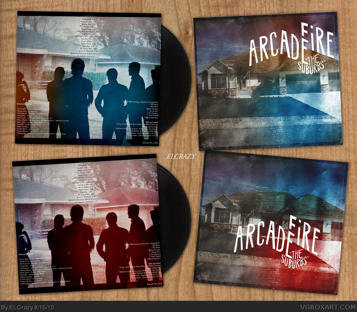
My studies are going great so far, and I've managed to find time to do another box. I recently got the new album by Arcade Fire, The Suburbs. It is simply amazing. I won't be surprised if this album reaches legendary status in modern music. Every song is a gem.
I wanted to do a vinyl box because well, vinyls rule. If vinyls were the only medium of music available, I'll be so happy. Out of all, album art is most crucial to a vinyl, and as an album art lover, I just had to do at least one.
I tried to follow the style of the official cover, but with my own twist. The official covers are bright in general, and as you guys know, my power lies in dark art. I decided to do two covers with different variations, similar to what Arcade Fire has done.
I hope you enjoy this. Expect me to be back full-time in November onwards. ;)
Too textured up for me. I don't see the point in overlaying resources like that unless it truly looks natural. In this case it doesn't. I don't think this matches the feel of the album either. It's a nice graphic but I think it needs some more work. Not really feeling the ideas used to make this.
Experimenting with different textures and overlays. I'm guessing you were trying to go for some sort of aged abstract look? It is really up to you what you add and take away. If I were you however I would drop all the text on the back and all the textures and start from there. Maybe turn those color effects off so they don't distract me.
 Arcade Fire: The Suburbs Cover Comments
Well, what can I say? This site has grown on me. I don't think I can ever leave.
My studies are going great so far, and I've managed to find time to do another box. I recently got the new album by Arcade Fire, The Suburbs. It is simply amazing. I won't be surprised if this album reaches legendary status in modern music. Every song is a gem.
I wanted to do a vinyl box because well, vinyls rule. If vinyls were the only medium of music available, I'll be so happy. Out of all, album art is most crucial to a vinyl, and as an album art lover, I just had to do at least one.
I tried to follow the style of the official cover, but with my own twist. The official covers are bright in general, and as you guys know, my power lies in dark art. I decided to do two covers with different variations, similar to what Arcade Fire has done.
I hope you enjoy this. Expect me to be back full-time in November onwards. ;)
[ Reply ]
Sven's going to love this.
Great job, fits the official's style yet keeps that familiar ELCrazy feel I've come to love about your designs.
[ Reply ]
Not a fan of the band but it looks really good.
[ Reply ]
YES.
[ Reply ]
I am in love.
[ Reply ]
Love the colors.
[ Reply ]
NICE NICE NICE colors and type.
I also love the presentation.
[ Reply ]
Good use of colour!
[ Reply ]
Great color edits Dan. I can easily see you being a go to guy for bands looking for album designs.
[ Reply ]
I agree with what's been said above, the colors look incredible, and I love that presentation too.
[ Reply ]
I knew I would love this before I even entered the thread. Your work is phenomenal every time, Dan.
(Is the Collaboration gonna be scrapped as far as you're concerned now?)
[ Reply ]
Too textured up for me. I don't see the point in overlaying resources like that unless it truly looks natural. In this case it doesn't. I don't think this matches the feel of the album either. It's a nice graphic but I think it needs some more work. Not really feeling the ideas used to make this.
[ Reply ]
these gradients are stylishful. *_*
[ Reply ]
Thanks for the comments and faves guys!
@Beer: We can either redo it or continue with it. Your choice man. We could do a different title, if you want.
@Hawt Es: I see what you mean, so what is the "more work" I need to improve then?
[ Reply ]
Experimenting with different textures and overlays. I'm guessing you were trying to go for some sort of aged abstract look? It is really up to you what you add and take away. If I were you however I would drop all the text on the back and all the textures and start from there. Maybe turn those color effects off so they don't distract me.
[ Reply ]