Wow, probably my favorite part about your work is the excellent colors. This is no different! It's something unique and different as you said, lowering the saturation on the majority of the design gives such a better focus on the characters signature colors. I love this.
The background could have more details like those mountains with eyes that I see a lot in Super Mario World, one of the Koopa's castles, some enemies wandering around... but aside of that, this is a great box and I like the custom artworks of Mario and Luigi you made.
 Super Mario World Box Cover Comments
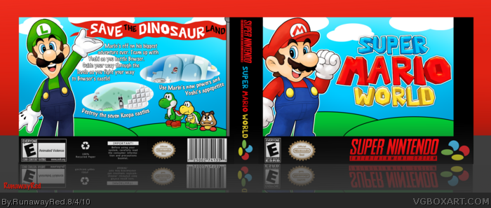
I wanted to do something a little different. I decided to give Mario a different feel, instead of the normal bright colors.
If you don't like this version check out Version 1 (it's normal color).
Also, check out full size.
Template by Del337er
Edited at 1 decade ago
[ Reply ]
Wow, probably my favorite part about your work is the excellent colors. This is no different! It's something unique and different as you said, lowering the saturation on the majority of the design gives such a better focus on the characters signature colors. I love this.
[ Reply ]
This does look very nice, and as sd said, it really focuses on the characters.
[ Reply ]
The colors you have look great and different, but still the colored version looks better imo. Great work anyways.
[ Reply ]
Wonderful job, I love both versions! And nice job on that logo
[ Reply ]
I'm not a fan of the Sepia, but I love Version 1! I'll fav for Version 1 :P
[ Reply ]
#2, Thank you! :)
#5, I made the logo first just for fun and that's what produced this project.
#6, I figured some of you would not like the alternate coloring. That's why I added version 1 for those who like "normal" happy Mario colors.
Edited at 1 decade ago
[ Reply ]
For what you have it's wonderful. It just seems a little plain to me. Interesting use of the colors Red.
[ Reply ]
This is really really neat!
edit: But after seeing version 1, I kinda like it better =\
Edited at 1 decade ago
[ Reply ]
I noticed people liking version 1 a lot better. I updated the box and left version 2 hidden for those who enjoyed that.
[ Reply ]
So simple...yet so nice.
[ Reply ]
LOOKS A LOT BETTER!!
[ Reply ]
Reminds me a lot of the Super Mario World cartoon for some reason.
[ Reply ]
The background could have more details like those mountains with eyes that I see a lot in Super Mario World, one of the Koopa's castles, some enemies wandering around... but aside of that, this is a great box and I like the custom artworks of Mario and Luigi you made.
[ Reply ]