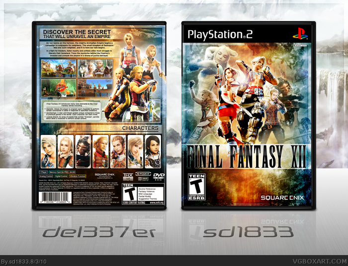
Collaboration oh yes. This time with del337er, who made the kickass back design. I was in charge of front duty and presentation. Hope you all like it, put a good amount of effort into this and was fun working with del.
Edit: Oh and credit to qwerty for the template of course.
Thanks everyone, the kind words are very appreciated. #9, Well I didn't even notice. You could send me another version with the tagline fixed and I'd update.
Wow this looks great. Where did you get the back template though? It looks like an edited version of the two I made del337er. Not an issue, just curious.
EDIT: Haha just realized this was a collab with Del. My bad :D
#30 Think so? I worked hard on doing things like he does, lighting flares, paper textures, high-contrast characters, and of course the color scheme. Turned out nice in my opinion, but not "matching perfectly".
#33 Ah, yea you're right, not to put SD down, but he is much better at fronts than backs, and his layouts for the backs are usually very simple. But thanks
#34, When I say, "it does not look like an sd layout", that isn't a negative comment, I'm just saying that, from observing his artwork, his backs usually aren't that intricate in detail.
Bah, I personally have never been satisfied with the designs I can come up with for backs, they all lack originality. Probably the only one I was really happy with was Valkyria Chronicles.
#41, Basically. Hopefully sometime I'll be able to really improve on my back designs and bring some originality into them. To me it's not really happening at the moment, I'm cool with front's though. =]
@sd1833 - Are you trying to see how many FF boxes you can get HoF? It's cracking me up, like every single FF box you make either gets HoF or MW. You should do I-XIII again.
Text on the back along with the lack of creativity really killed this cover for me. It is nicely done but in all honesty it doesn't look finished. The back text is extremely bland along with the info text. The top tag line is also. The pictures just have strokes around them. The top four could have at least had some sort of interesting border put around them. The sort of outer border that is used on both covers and that middle box on the back just reminds me of simple stuff that feels very basic. The front logo along with the overlay under it also looks rushed. It is pretty good but a lot of the layout and things used in the design just look very basic and boring. Just not feeling this colab at all personally.
The front is great...composition, color, everything so spot on. The back? Ah, its nice idea, but the ugly font choice and all those white bars are really distracting, and it doesn't come together as collab. While the front has a very serene, calm effect, the back is just a mess (albeit an organized one.)
The main problem is front makes excellent use of empty space, while the back is just packed to the brim. If the back can be fixed, this can be much better :)
#46/47, Hmm, I'm personally a fan of the back but oh well. I guess I could see what you mean about it being busy Flexx. If Del want's to do something about it, it's up to him. Thanks for the comments guys.
#43, Well I've only made a few Final Fantasy designs, I would like to make another XIII one but there's so many already I doubt I could do anything to make it stand out.
This is a great cover, just replaced my box art with this one. Only complaint is that the white line is missing beneath the "Playstation 2" so it looks off on the shelf. But I'm not reprinting just to fix that. Thanks.
 Final Fantasy XII Box Cover Comments
This turned out great dude, was nice working with you. Hopefully we can collab again sometime ;)
[ Reply ]
Collaboration oh yes. This time with del337er, who made the kickass back design. I was in charge of front duty and presentation. Hope you all like it, put a good amount of effort into this and was fun working with del.
Edit: Oh and credit to qwerty for the template of course.
#1, Definitely man, great job on the back.
Edited at 1 decade ago
[ Reply ]
Omg!
[ Reply ]
I am picking up the pieces of my brain while looking at this box indeed great work!
Author Favorite Del
Edited at 1 decade ago
[ Reply ]
Nice. I like the colors.
[ Reply ]
This is an awesome box, great job both of you. The back is just breathtaking!!!
[ Reply ]
Shit, had I not read the first two posts, I would not have realized that del337er made that back. Amazing job both of you.
[ Reply ]
I love you guys so much.
[ Reply ]
Wow thank guys, these comments mean a lot :)
EDIT: Oh no, I just realized that I forgot the glare on the first line of the tagline D: Now i can't stop seeing that
Edited at 1 decade ago
[ Reply ]
Awe-inspiring.
[ Reply ]
Amazing!
Edited at 1 decade ago
[ Reply ]
Really nicely done from both of you. I really like the colors.
+FAV
[ Reply ]
Wow, just wow.
[ Reply ]
I think the space behind the "F" on the front logo should be brighter.
[ Reply ]
Incredible!
Edit: Crap, now my Flower-box won't get any attention. :(... lol
Edited at 1 decade ago
[ Reply ]
Unbelievable, period.
[ Reply ]
Thanks everyone, the kind words are very appreciated. #9, Well I didn't even notice. You could send me another version with the tagline fixed and I'd update.
Edited at 1 decade ago
[ Reply ]
#17 Nah its alright, it isn't that big of an issue lol.
And yes, thank you all for your kind words :)
Edited at 1 decade ago
[ Reply ]
Oh man, what a box.
[ Reply ]
My new favorite box on the site. Seriously, this is amazing.
[ Reply ]
Awesome box dude! FAV
[ Reply ]
WOOOOW...
[ Reply ]
#18, Alright if you say so. Looks good to me, I didn't even notice the tagline before you mentioned it.
And seriously thanks Afifan, Box, bk2000, and aelixus. Always means a lot.
[ Reply ]
Wow...
[ Reply ]
Beautiful. Looks really REALLY good!
[ Reply ]
Wow this looks great. Where did you get the back template though? It looks like an edited version of the two I made del337er. Not an issue, just curious.
EDIT: Haha just realized this was a collab with Del. My bad :D
Edited at 1 decade ago
[ Reply ]
#26 Haha yes it was the one you made for me :P How do people not notice this is a collab when my name is right under the back? o_o lol
[ Reply ]
I'm in love with your color choices and over all design <3
[ Reply ]
#26, Damn, people need to pay more attention.
[ Reply ]
#27, Because it matches sd1833's style perfectly.
[ Reply ]
#30, I can tell at first glance, that the back is not something sd1833 would make.
[ Reply ]
#29 I know right? Haha
#30 Think so? I worked hard on doing things like he does, lighting flares, paper textures, high-contrast characters, and of course the color scheme. Turned out nice in my opinion, but not "matching perfectly".
[ Reply ]
#32, sd's back layouts do not look like what you made, I'm not talking about colors, you matched that perfectly however.
[ Reply ]
#33 Ah, yea you're right, not to put SD down, but he is much better at fronts than backs, and his layouts for the backs are usually very simple. But thanks
[ Reply ]
#34, When I say, "it does not look like an sd layout", that isn't a negative comment, I'm just saying that, from observing his artwork, his backs usually aren't that intricate in detail.
[ Reply ]
To put it simply, I suck at backs. A lot. So it's all cool, del's design is better than anything I could have hoped to make.
[ Reply ]
#36, You're being too modest sir.
[ Reply ]
#37 Yea I agree, your back designs are simple, but stunning. Your latest metroid box had an amazing back.
[ Reply ]
Bah, I personally have never been satisfied with the designs I can come up with for backs, they all lack originality. Probably the only one I was really happy with was Valkyria Chronicles.
[ Reply ]
#33, I agree with this statement.
[ Reply ]
#39, Well if you personally feel that your backs aren't up to snuff, then they aren't.
Meaning, if you aren't satisfied, then it's your call, not anyone else's.
Edited at 1 decade ago
[ Reply ]
#41, Basically. Hopefully sometime I'll be able to really improve on my back designs and bring some originality into them. To me it's not really happening at the moment, I'm cool with front's though. =]
[ Reply ]
@sd1833 - Are you trying to see how many FF boxes you can get HoF? It's cracking me up, like every single FF box you make either gets HoF or MW. You should do I-XIII again.
[ Reply ]
#43,
Edited at 1 decade ago
[ Reply ]
This is amazing! Looking really good. Nice work to the both of you.
[ Reply ]
Text on the back along with the lack of creativity really killed this cover for me. It is nicely done but in all honesty it doesn't look finished. The back text is extremely bland along with the info text. The top tag line is also. The pictures just have strokes around them. The top four could have at least had some sort of interesting border put around them. The sort of outer border that is used on both covers and that middle box on the back just reminds me of simple stuff that feels very basic. The front logo along with the overlay under it also looks rushed. It is pretty good but a lot of the layout and things used in the design just look very basic and boring. Just not feeling this colab at all personally.
[ Reply ]
The front is great...composition, color, everything so spot on. The back? Ah, its nice idea, but the ugly font choice and all those white bars are really distracting, and it doesn't come together as collab. While the front has a very serene, calm effect, the back is just a mess (albeit an organized one.)
The main problem is front makes excellent use of empty space, while the back is just packed to the brim. If the back can be fixed, this can be much better :)
[ Reply ]
#46/47, Hmm, I'm personally a fan of the back but oh well. I guess I could see what you mean about it being busy Flexx. If Del want's to do something about it, it's up to him. Thanks for the comments guys.
#43, Well I've only made a few Final Fantasy designs, I would like to make another XIII one but there's so many already I doubt I could do anything to make it stand out.
#45, Thanks man.
Edited at 1 decade ago
[ Reply ]
I didn't see this one. Amazing work from both of you, and your best yet (Del's best too). Should be in MW, now.
Edited at 1 decade ago
[ Reply ]
WOW...nice job guys. where did you get the front logo font from??
[ Reply ]
Congratulations, guys!
[ Reply ]
Woah, MW? Defiantly didn't see that one coming, thanks a lot guys! (:
[ Reply ]
That was unexpected.
Thanks everyone.
[ Reply ]
#53, In your case, I don't see how it was frankly.
[ Reply ]
Most deserving of MW. Looking at it again, I found even more attractive than before. You two should colab more often. :p
[ Reply ]
Now that's a box for an epic game. Excellent job!
[ Reply ]
Great Job Man! This is really good cover!
[ Reply ]
If you can do printable version. Thanks!
[ Reply ]
printable version please!!!
[ Reply ]
Printable's up for any and all interested.
[ Reply ]
I absolutely love the background colors. It's incredibly visually appealing. Great job!!
[ Reply ]
This is a great cover, just replaced my box art with this one. Only complaint is that the white line is missing beneath the "Playstation 2" so it looks off on the shelf. But I'm not reprinting just to fix that. Thanks.
[ Reply ]