Hi guys,
I have been working on this for a while, like 3 days or so and have changed it dramatically along my WIP thread (Thanks to all who helped in there).
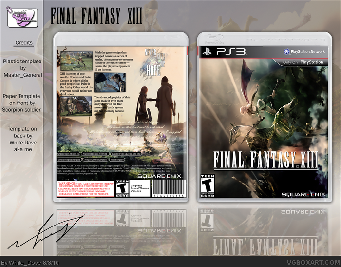
The render on the front took almost 5 hours to render and it was really annoying but no image was available with Lightening positioned in this way with a viewing of Cocoon so I had to do it myself, it might look simple but the front really took a long time to finish.
I wanted to go for a different feeling to the game, generally a sorrowful feeling, no clue why but maybe because I was feeling gloomy myself. Hope I succeded in portrating that feeling.
So, yes, credits are with the presentation on the left column.
Hope you enjoy this. :)
Please, share with me your opinions and thoughts.
Thank you!
The front is what really grabs my attention, it's a very iconic image, and you did a great job with the scene. Maybe you could post that render of Lightning in the resources?
Anyway, the back, it doesn't feel like the back of a game box. Not a bad thing, I just feel more of a book or magazine layout from it. I really like what you did with the tagline, it looks much better with the font you have now.
Front's really great and the back layout is good, I'm glad you went with a different tagline font. The dark colors throughout this design are lovely, specifically on the front.
 Final Fantasy XIII Box Cover Comments
Hi guys,
I have been working on this for a while, like 3 days or so and have changed it dramatically along my WIP thread (Thanks to all who helped in there).
The render on the front took almost 5 hours to render and it was really annoying but no image was available with Lightening positioned in this way with a viewing of Cocoon so I had to do it myself, it might look simple but the front really took a long time to finish.
I wanted to go for a different feeling to the game, generally a sorrowful feeling, no clue why but maybe because I was feeling gloomy myself. Hope I succeded in portrating that feeling.
So, yes, credits are with the presentation on the left column.
Hope you enjoy this. :)
Please, share with me your opinions and thoughts.
Thank you!
[ Reply ]
Into the fav-author book you go!
[ Reply ]
Wow, wonderful job here
[ Reply ]
Epic!
[ Reply ]
Thank you guys. :)
[ Reply ]
Wow, the front is amazing. The back doesn't even compete with the front, but it looks very good as well. Great work.
[ Reply ]
great box, please add printable ver.
[ Reply ]
The front is what really grabs my attention, it's a very iconic image, and you did a great job with the scene. Maybe you could post that render of Lightning in the resources?
Anyway, the back, it doesn't feel like the back of a game box. Not a bad thing, I just feel more of a book or magazine layout from it. I really like what you did with the tagline, it looks much better with the font you have now.
[ Reply ]
Front's really great and the back layout is good, I'm glad you went with a different tagline font. The dark colors throughout this design are lovely, specifically on the front.
[ Reply ]
#7, I will add a printable as soon as I fix the quality of the small black boxes on the back, they are low resolution.
#8, Thank you! I will add the render to the resources section once I reach rank 7 which I am not too far from. :)
Everyone else thank you very much for giving this box your attention. ^^
[ Reply ]
I hope you become rank 7 eventually hopefully my favorite will get you there :)
[ Reply ]
The only thing is that I think that Lightning's blade would look better behind Odin. I must say the back is very touching.
Edited at 1 decade ago
[ Reply ]
I finally got to rank 7 so I uploaded the render as well as a printable. Hope you enjoy them. :)
Render: link
[ Reply ]
#13, Congrats!
[ Reply ]
#14, thank you.
[ Reply ]
This awesomeness has blown my mind....
[ Reply ]
Awesome cover! bad game
[ Reply ]