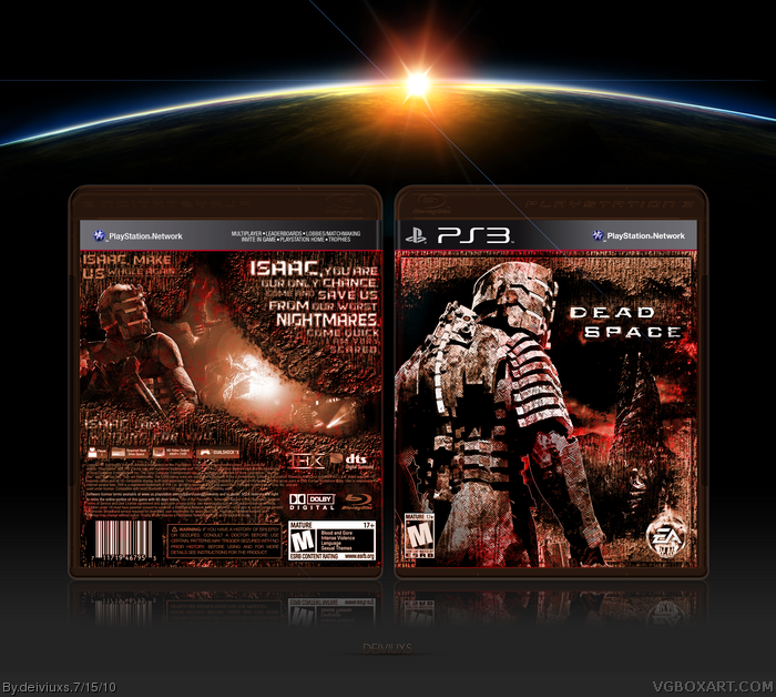
I really wanted to upload a cover before my 10 raodtrip (I am leaving in few days). I decided to do a Dead Space cover, which is my third cover for this game already, but his time I went for a very grungy/harsh look and feel. I did tons of image editing and about half of this cover is edited images and other half is custom made (brushes, filters, effects. etc.).
I really wanted to capture the horror of this game in this cover, thus why I decided to also modify the template in order to keep everything flowing together.
I would to give big thanks to Spiderpig24 who was gave me feedback in the WIP forums.
I would highly suggest viewing this in full size in order to see all the details.
That's great!The only thing that bothers me are these two blue lines.Can't understand their purpose.Other than that it's perfect
#5 Call me crazy but they just bother me.(And I didn't take them under consideration) :D
#4, Not sure which blue lines are you talking about, but you are probably are talking about those lines that are coming from the sun and those lines are part of presentation and not the box itself.
Like I said in the forums, really incredible job on this. The textures and colors work very well together, and add a lot to the box. The font choice is great, and I love what you did with the template. The presentation is nice too, great job!
I personally am not too fond of the rust-like textures throughout the design, but that's just me. You seem to have put quite a bit of effort into it and I respect that, just not my kind of style.
The front and overall worn look is outstanding, but I'm not feeling the back. The writing seems kind of cheesy and unrealistic. But the look is enough for a +fav.
#8, Thant's fine sd1833. I do not expect you to like every cover I make. I knew that people either going to love this or hate this cover. I am glad that some people loved it, but I am also glad to even though you disliked the cover, sd1833, you at least left a comment, which I highly appreciate.
#10, I agree with you. I personally love the way front came out to be and I know the back is not the greatest, but I did not wanted to go for a traditional back (tagline/description/screens) and decided to make something different and unique. Writing is cheesy 'cause I made it up but it's more for filling the space up than making sense.
 Dead Space Box Cover Comments
I really wanted to upload a cover before my 10 raodtrip (I am leaving in few days). I decided to do a Dead Space cover, which is my third cover for this game already, but his time I went for a very grungy/harsh look and feel. I did tons of image editing and about half of this cover is edited images and other half is custom made (brushes, filters, effects. etc.).
I really wanted to capture the horror of this game in this cover, thus why I decided to also modify the template in order to keep everything flowing together.
I would to give big thanks to Spiderpig24 who was gave me feedback in the WIP forums.
I would highly suggest viewing this in full size in order to see all the details.
Comments and favs are appreciated.
Edited at 1 decade ago
[ Reply ]
I like the rusty, wear and tear look of this box! Very creative :) fav+
[ Reply ]
that is really good! probably the best box art i've ever seen +fave
[ Reply ]
That's great!The only thing that bothers me are these two blue lines.Can't understand their purpose.Other than that it's perfect
#5 Call me crazy but they just bother me.(And I didn't take them under consideration) :D
Edited at 1 decade ago
[ Reply ]
#4, Not sure which blue lines are you talking about, but you are probably are talking about those lines that are coming from the sun and those lines are part of presentation and not the box itself.
[ Reply ]
This came out really nice. The texture and colors give it this very unique outer space feel.
[ Reply ]
Like I said in the forums, really incredible job on this. The textures and colors work very well together, and add a lot to the box. The font choice is great, and I love what you did with the template. The presentation is nice too, great job!
[ Reply ]
I personally am not too fond of the rust-like textures throughout the design, but that's just me. You seem to have put quite a bit of effort into it and I respect that, just not my kind of style.
[ Reply ]
great job!!! it really amaze 9/10 fav ;)))
[ Reply ]
The front and overall worn look is outstanding, but I'm not feeling the back. The writing seems kind of cheesy and unrealistic. But the look is enough for a +fav.
[ Reply ]
#8, Thant's fine sd1833. I do not expect you to like every cover I make. I knew that people either going to love this or hate this cover. I am glad that some people loved it, but I am also glad to even though you disliked the cover, sd1833, you at least left a comment, which I highly appreciate.
#10, I agree with you. I personally love the way front came out to be and I know the back is not the greatest, but I did not wanted to go for a traditional back (tagline/description/screens) and decided to make something different and unique. Writing is cheesy 'cause I made it up but it's more for filling the space up than making sense.
[ Reply ]
Printable added.
[ Reply ]
maravilhoso
[ Reply ]