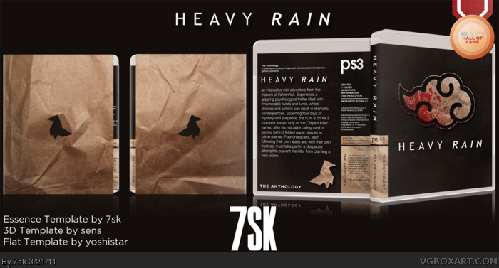
My second box, again very minimal (kinda my thing). I haven't played the game, but my boyfriend has, and he helped me get the right feel of the game. If anything looks jagged, I can assure you that it does not when printed out correctly.
First time working with 3D box/slip-covers. Comments (maybe faves?) are highly encouraged :)
I dont get the Akatsuki-Cloud from the Manga Naruto on the front. I mean, it has like, nothing to do with heavy rain.
But the rest looks good, decent work.
Keep it up.
But sorry, I wont fav because i generally decided not to fav Essence Boxes if they dont look REALLY awesome.
#8, I read Naruto, I know what the Akatsuki symbol is, I'm saying the cover throws me off because it's about Heavy Rain, (the game), while that Naruto originated symbol is there, it throws off the balance.
Agree about the cloud and I really don't like the slip cover.It looks like you bought the game from a grocery store.
Although i will fav the rest of it and as you said for encouragement reasons. :D
I'm not faving because Naruto has nothing to do with Heavy Rain, this is kind of a little fail on your part.
#13, It is a paper bag. And who the hell faves boxes for encouragement?
#6, #7, I don't read Naruto, I just found the cloud brush and I wanted to make a Heavy Rain box that wasn't just the damn origami bird in the forefront. I don't know if having known that it was from Naruto would've changed my design, but having known that so many people on VGBA DO know it's from Naruto might've.
#14, you're not faving ONLY because of the cloud? I ask because I'm not sure if you liked the rest or not.
#13, it's supposed to look like wrinkled paper, it uses the same texture used elsewhere on the box.
#12, thank you for the opinion and the fave. In case you didn't notice, I tried to follow your presentation layout because I like it very much.
#16, I lean ultraminimal, so empty - rather, uncluttered - is my thing. I did try doing rain, tried going about it a few different ways, but I couldn't get it to work right. Any specific suggestions about how to incorporate rain on the box or slip?
I don't know if I can do anything about the cloud, but if anyone has another brush or idea for it, I'm open to suggestions.
#16, Dude, really? "There should at least be some rain on it"?
Does Naruto Ultimate Ninja Storm boxes need lightning on it because it has "Storm" in the title? No. Heavy Rain boxes can look totally fine without rain, this being a prime example. Putting rain in would ruin the overall design he has going. Your just looking for an excuse because you (along with others) thought he ripped it off of Naruto but it's actually a brush. Seriously, GTFO.
Stop talking complete shit Gameninja, I think you yourself just realized that not faving just because of a cloud is pretty damn stupid and you're trying to make up ridiculous excuses. Or it may be that you're nowhere near mature enough to appreciate the simplistic, minimalistic beauty of 7sk's latest artwork. - either is very, very plausible.
Fantastic box, sleek and stylish. Personally I would rethink the position of the origami, try it out in different places.
#24, You're completely right, I am an idiot for having an opinion that is different from yours.
It's not stupid at all, I was trying not to say anything horrible, but fine - I hate the box. I think it is bland, boring, and empty, other than the slip and the Naruto cloud, I feel like no work really went into this.
#24, Thank you very much for the kind words. I've tried different spots for it, but none have worked quite well enough for me. Any specific location you'd prefer?
#25, If you hate the box, why even comment? Good enough to just pass on to another box.
#25: Whatever you say man. I believe ya.
#26: Not particularly, just keep experimenting until you find a great spot, which could well be the current location.
#25, And it's all about the amount of work he put into it, right? There's more to art then just sheer effort, hopefully one day you'll come to realize that.
#31, I would like to say that I did put quite a bit of work into this box, though. Maybe not 30 hours, but I didn't just slap it together during a piss break.
Unfortunately, a huge majority of the site, and many on these comments, do not understand minimalism, and have stupid little facts drilled into their heads that 'The more on the box, the better', and 'the more on the box, the more work they have done'. These are such narrow-minded comments, and need to have more research put into them.
Some people (namely Nothing, GameNinja + Loosejuice) really need to try to understand other art styles rather than what it used on most of the boxes on here. I, for my next few boxes, am looking at doing completely less conventional ideas that break this mould, and I think boxes like this (and your essence and criterion boxes) are twice as good as the everyday boxes that hit the site.
This is an art form, and this box is a prime example of that. Fantastic stuff, and extremely impressive talent. By far my new favourite artist to grace the sight. The slip cover is stunning, and the cloud concept is great, and I also had no idea that it was from 'Naruto'.
As a final comment, the design and actual brainstorming of my own Criterion boxes takes a whole lot more than your conventional used render boxarts. Simplistic boxes have one hell of a lot more thought put into them.
Thank you very much, SO, you know that you're a big inspiration to me, so hearing you say all this is very encouraging. And I know what you mean, sometimes the mental prep work takes longer than the actual designing of the boxes.
- Hall of Fame Medal added to presentation
- presentation made a bit smaller
- updated username logo
- printable lightened a bit to make for clearer printouts
- changed template from Essence to Anthology
 Heavy Rain Box Cover Comments
My second box, again very minimal (kinda my thing). I haven't played the game, but my boyfriend has, and he helped me get the right feel of the game. If anything looks jagged, I can assure you that it does not when printed out correctly.
First time working with 3D box/slip-covers. Comments (maybe faves?) are highly encouraged :)
Edited at 1 decade ago
[ Reply ]
Fantastic. You did a great job with this one. This looks great, but I am not sure if it captures the essence of the game as well as one would hope.
[ Reply ]
Absolutely amazing. Fav +author fav
EDIT: I would love to author fav you, but this account called sarahtaylor hacked my profile, and I can't fav authors anymore D:
Edited at 1 decade ago
[ Reply ]
Very nice and simplistic!
[ Reply ]
Wow...your like a young me xD Im digging it alot
[ Reply ]
I dont get the Akatsuki-Cloud from the Manga Naruto on the front. I mean, it has like, nothing to do with heavy rain.
But the rest looks good, decent work.
Keep it up.
But sorry, I wont fav because i generally decided not to fav Essence Boxes if they dont look REALLY awesome.
Edited at 1 decade ago
[ Reply ]
#6, I don't either, I understand why it's there, but it being connected to Naruto completely throws me off.
[ Reply ]
#7
link
link
[ Reply ]
#8, I read Naruto, I know what the Akatsuki symbol is, I'm saying the cover throws me off because it's about Heavy Rain, (the game), while that Naruto originated symbol is there, it throws off the balance.
[ Reply ]
I like it, I like the design... it's wonderfully done. :)
+fav
[ Reply ]
#9, ah, allright then ;)
[ Reply ]
I think you should replace the cloud by the origami, I just don't like this cloud too much, It's not suitable to the game. But this box is good :)
[ Reply ]
Agree about the cloud and I really don't like the slip cover.It looks like you bought the game from a grocery store.
Although i will fav the rest of it and as you said for encouragement reasons. :D
Edited at 1 decade ago
[ Reply ]
I'm not faving because Naruto has nothing to do with Heavy Rain, this is kind of a little fail on your part.
#13, It is a paper bag. And who the hell faves boxes for encouragement?
[ Reply ]
#6, #7, I don't read Naruto, I just found the cloud brush and I wanted to make a Heavy Rain box that wasn't just the damn origami bird in the forefront. I don't know if having known that it was from Naruto would've changed my design, but having known that so many people on VGBA DO know it's from Naruto might've.
#14, you're not faving ONLY because of the cloud? I ask because I'm not sure if you liked the rest or not.
#13, it's supposed to look like wrinkled paper, it uses the same texture used elsewhere on the box.
#12, thank you for the opinion and the fave. In case you didn't notice, I tried to follow your presentation layout because I like it very much.
#10, #5, #4, #3, #2, thank you very much.
Edited at 1 decade ago
[ Reply ]
It's extremely empty and there should at least be some rain on it, and yes, mostly because of the cloud.
[ Reply ]
#16, I lean ultraminimal, so empty - rather, uncluttered - is my thing. I did try doing rain, tried going about it a few different ways, but I couldn't get it to work right. Any specific suggestions about how to incorporate rain on the box or slip?
I don't know if I can do anything about the cloud, but if anyone has another brush or idea for it, I'm open to suggestions.
[ Reply ]
I think that this is better than the last but still a bit too minimalistic.
Edited at 1 decade ago
[ Reply ]
#16, Dude, really? "There should at least be some rain on it"?
Does Naruto Ultimate Ninja Storm boxes need lightning on it because it has "Storm" in the title? No. Heavy Rain boxes can look totally fine without rain, this being a prime example. Putting rain in would ruin the overall design he has going. Your just looking for an excuse because you (along with others) thought he ripped it off of Naruto but it's actually a brush. Seriously, GTFO.
Anyway, really great box man. I love it.
[ Reply ]
I'm really digging that cloud concept, I just think it could be utilized better...mind if I borrow this idea?
Great box, BTW...I'm digging those paper textures you used.
[ Reply ]
#19, Thanks for the defense :p
#20, Go ahead, I'm looking forward to seeing what you'll do with it.
Thanks both for the faves :)
[ Reply ]
#19, It's not an attack, and it's not an excuse. I think it's really empty and boring. Plus, the cloud looks EXACTLY like the Akatsuki symbol.
[ Reply ]
#22, well, is there any actual advice you can give?
[ Reply ]
Stop talking complete shit Gameninja, I think you yourself just realized that not faving just because of a cloud is pretty damn stupid and you're trying to make up ridiculous excuses. Or it may be that you're nowhere near mature enough to appreciate the simplistic, minimalistic beauty of 7sk's latest artwork. - either is very, very plausible.
Fantastic box, sleek and stylish. Personally I would rethink the position of the origami, try it out in different places.
[ Reply ]
#24, You're completely right, I am an idiot for having an opinion that is different from yours.
It's not stupid at all, I was trying not to say anything horrible, but fine - I hate the box. I think it is bland, boring, and empty, other than the slip and the Naruto cloud, I feel like no work really went into this.
Edited at 1 decade ago
[ Reply ]
#24, Thank you very much for the kind words. I've tried different spots for it, but none have worked quite well enough for me. Any specific location you'd prefer?
#25, If you hate the box, why even comment? Good enough to just pass on to another box.
Edited at 1 decade ago
[ Reply ]
#25: Whatever you say man. I believe ya.
#26: Not particularly, just keep experimenting until you find a great spot, which could well be the current location.
[ Reply ]
So, so good. I really like your style.
[ Reply ]
WTF it's not the Naruto cloud it's a brush how's he supposed to know. It's not like he rendered it off of a Naruto pic or something.
[ Reply ]
#29, I really didn't I haven't checked out Naruto since they were fighting the mist guy with the androgynous assistant.
[ Reply ]
#25, And it's all about the amount of work he put into it, right? There's more to art then just sheer effort, hopefully one day you'll come to realize that.
[ Reply ]
#31, I would like to say that I did put quite a bit of work into this box, though. Maybe not 30 hours, but I didn't just slap it together during a piss break.
[ Reply ]
Unfortunately, a huge majority of the site, and many on these comments, do not understand minimalism, and have stupid little facts drilled into their heads that 'The more on the box, the better', and 'the more on the box, the more work they have done'. These are such narrow-minded comments, and need to have more research put into them.
Some people (namely Nothing, GameNinja + Loosejuice) really need to try to understand other art styles rather than what it used on most of the boxes on here. I, for my next few boxes, am looking at doing completely less conventional ideas that break this mould, and I think boxes like this (and your essence and criterion boxes) are twice as good as the everyday boxes that hit the site.
This is an art form, and this box is a prime example of that. Fantastic stuff, and extremely impressive talent. By far my new favourite artist to grace the sight. The slip cover is stunning, and the cloud concept is great, and I also had no idea that it was from 'Naruto'.
As a final comment, the design and actual brainstorming of my own Criterion boxes takes a whole lot more than your conventional used render boxarts. Simplistic boxes have one hell of a lot more thought put into them.
Edited at 1 decade ago
[ Reply ]
Thank you very much, SO, you know that you're a big inspiration to me, so hearing you say all this is very encouraging. And I know what you mean, sometimes the mental prep work takes longer than the actual designing of the boxes.
[ Reply ]
Awesome man! I see you have the talents to become a great artist!
[ Reply ]
Thanks man, I hope so.
[ Reply ]
Incredible job, the paper effect on the slip cover looks very nice.
[ Reply ]
Wow, two Halls in one day. I'm actually kinda shocked. Thanks guys!
[ Reply ]
Shocked?You better get used to it, you'll be getting a bunch of them soon, trust me
[ Reply ]
#39 This. Get used to it dude haha.
[ Reply ]
Haha, thanks you guys :)
[ Reply ]
Another slightly more significant update:
- Hall of Fame Medal added to presentation
- presentation made a bit smaller
- updated username logo
- printable lightened a bit to make for clearer printouts
- changed template from Essence to Anthology
Thank you :)
[ Reply ]