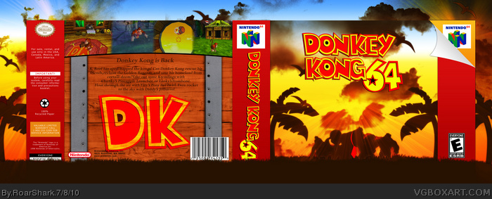
Well, the front looks great, altough DK's tie is kind of hard to dedtect.
On the back, I don't like the way that seems like you just put that DK there to fill (A giant) space. Plus the way the barrel looks like a table instead of looking like a barrel bothers me a lot. The synopsis text looks odd just typed there, without any type of arrangement.
The screenshots look blurry, and I don't like how the grass overlaps the logo on the spine.
Just my opinion.
This is my box for the second session of the Expression Sessions. This was one of my favorite games growing up. I really enjoyed making this, and I am pleased with how it came out. I am sorry about the screen shots, they are low quality but they were the best I could find. Thanks you to Spiderpig who helped me out greatly in the WIP thread, and thanks to Del337er for the awesome template. Sorry if the presentation is too distracting, just tell me and I will change it.
Nice job man, and I personally like the back the way it is, as it looks like you were trying to bring attention to the base elements of the game in your design. Having the description text and features against a classic DK barrel is a nice fit.
The front is pure win. The back is also very good, but i would have liked another font. The box is still very good, you get a 8.6/10 from me and a fav.
I like the presentation a lot, and I don't think it's distracting at all. The box is just awesome, the layout of both the front and the back looks very professional. I don't think the blurry screenshots take away from the box at all, very nice job.
#1, You have great points and I see where you are coming from. The blurry screens are because those are the most high quality I could find. The big DK isn't there because its fills up a ton of space (which it does) but because the barrels have the DK on them sometimes and I thought that it might look cool, and in my opinion it does. The text is by far the downfall of the back, I tried to make it look as though it was engraved or something like that. I don't think that I succeeded in make it look so though. And the presentation covering parts of the spine, well I did not notice that. And I don't care about first comments :P. Thanks to everyone else for the comments and favs.
 Donkey Kong 64 Box Cover Comments
Ha!
Well, the front looks great, altough DK's tie is kind of hard to dedtect.
On the back, I don't like the way that seems like you just put that DK there to fill (A giant) space. Plus the way the barrel looks like a table instead of looking like a barrel bothers me a lot. The synopsis text looks odd just typed there, without any type of arrangement.
The screenshots look blurry, and I don't like how the grass overlaps the logo on the spine.
Just my opinion.
#2, It's an "I've got the first comment!" Ha.
Edited at 1 decade ago
[ Reply ]
This is my box for the second session of the Expression Sessions. This was one of my favorite games growing up. I really enjoyed making this, and I am pleased with how it came out. I am sorry about the screen shots, they are low quality but they were the best I could find. Thanks you to Spiderpig who helped me out greatly in the WIP thread, and thanks to Del337er for the awesome template. Sorry if the presentation is too distracting, just tell me and I will change it.
#1, is that a good Ha, or a bad ha?
Edited at 1 decade ago
[ Reply ]
Good to me +fav
[ Reply ]
The front is awesome, but the back jusst doesn't live up to the front at all. Still fav from me.
[ Reply ]
I absolutely love this box. It would be perfect if you found a better font on the back
[ Reply ]
Pretty damn good!
[ Reply ]
The front is pretty good, but I don't like the layout or idea of the back at all. I would have preferred something that matched the front.
[ Reply ]
Nice job man, and I personally like the back the way it is, as it looks like you were trying to bring attention to the base elements of the game in your design. Having the description text and features against a classic DK barrel is a nice fit.
[ Reply ]
The front is pure win. The back is also very good, but i would have liked another font. The box is still very good, you get a 8.6/10 from me and a fav.
[ Reply ]
I like the presentation a lot, and I don't think it's distracting at all. The box is just awesome, the layout of both the front and the back looks very professional. I don't think the blurry screenshots take away from the box at all, very nice job.
[ Reply ]
#1, You have great points and I see where you are coming from. The blurry screens are because those are the most high quality I could find. The big DK isn't there because its fills up a ton of space (which it does) but because the barrels have the DK on them sometimes and I thought that it might look cool, and in my opinion it does. The text is by far the downfall of the back, I tried to make it look as though it was engraved or something like that. I don't think that I succeeded in make it look so though. And the presentation covering parts of the spine, well I did not notice that. And I don't care about first comments :P. Thanks to everyone else for the comments and favs.
Edited at 1 decade ago
[ Reply ]
I almost missed this. I am in love with that front. +Fav and +Author fav
Edited at 1 decade ago
[ Reply ]
Bad ass
[ Reply ]
Such an ultrageous high-quality box. Could I make one like this quality? =O
[ Reply ]
Those palmtree are brushes?
[ Reply ]
#15, No, custom.
[ Reply ]
#16, Wow, nice xD
[ Reply ]
Very nice, i really like the color contrast on the front, very well done.
[ Reply ]
Congrats on hall!
[ Reply ]
Thanks for the Hall. I am honestly surprised that it got in.
[ Reply ]
For some reason, I like how the box instills a sense of serenity. The sunset and the shadows just make the box... pure awesome. Awesome job.
[ Reply ]